18. Classification
18.1 Overview
One of the most important and interesting problems is the classification problem, where we want to predict whether an outcome variable Y is categorical/dichotomous (0-1, Yes-No).
In 2012, Forbes published an article on How Target Figured Out A Teen Girl Was Pregnant Before Her Father Did detailing how they classified one of their customers as pregnant.

In Target’s example, they used a set of variables and a classification method to predict a binary outcome, namely whether a customer was pregnant or not.
As a different example, consider university admissions: we want to predict whether an applicant will be admitted or not, and we are interested in how variables, such as the GMAT, GPA (grade point average) and prestige of the undergraduate institution, effect admission into graduate programmes. The outcome variable, admit/don’t admit, is binary.
This (fictitious) dataset has data on 400 cases. There is a binary response (outcome, dependent) Y variable called admit and there are three predictor variables: gmat, gpa, and rank. We will treat gmat and gpa as continuous. The variable rank takes on the values 1 through 4. Institutions with a rank of 1 have the highest prestige, while those with a rank of 4 have the lowest. While rank is stored as an integer, it is best to think about it as a categorical (or factor) variable.
18.2 Exploratory Data Analysis (EDA)
Let us load our data, glimpse its structure, and look at its first few rows.
## Rows: 400
## Columns: 4
## $ admit <dbl> 0, 1, 1, 1, 0, 1, 1, 0, 1, 0, 0, 0, 1, 0, 1, 0, 0, 0, 0, 1, 0, 1, 0, 0, 1, 1, 1, 1, 1, 0, 0, 0, 0, 1, 0, 0, 0, 0, 1, ...
## $ gmat  <dbl> 380, 660, 800, 640, 520, 760, 560, 400, 540, 700, 800, 440, 760, 700, 700, 480, 780, 360, 800, 540, 500, 660, 600, 68...
## $ gpa   <dbl> 3.61, 3.67, 4.00, 3.19, 2.93, 3.00, 2.98, 3.08, 3.39, 3.92, 4.00, 3.22, 4.00, 3.08, 4.00, 3.44, 3.87, 2.56, 3.75, 3.8...
## $ rank  <fct> 3, 3, 1, 4, 4, 2, 1, 2, 3, 2, 4, 1, 1, 2, 1, 3, 4, 3, 2, 1, 3, 2, 4, 4, 2, 1, 1, 4, 2, 1, 4, 3, 3, 3, 1, 2, 1, 3, 2, ...
## # A tibble: 20 x 4
## admit gmat gpa rank
## <dbl> <dbl> <dbl> <fct>
## 1 0 380 3.61 3
## 2 1 660 3.67 3
## 3 1 800 4 1
## 4 1 640 3.19 4
## 5 0 520 2.93 4
## 6 1 760 3 2
## 7 1 560 2.98 1
## 8 0 400 3.08 2
## 9 1 540 3.39 3
## 10 0 700 3.92 2
## 11 0 800 4 4
## 12 0 440 3.22 1
## 13 1 760 4 1
## 14 0 700 3.08 2
## 15 1 700 4 1
## 16 0 480 3.44 3
## 17 0 780 3.87 4
## 18 0 360 2.56 3
## 19 0 800 3.75 2
## 20 1 540 3.81 118.2.1 Summary statistics
We will start our analysis by calculating summary statistics, and looking at the number of students admitted by rank.
## Descriptive Statistics
##
##                      admit     gmat      gpa
## ----------------- -------- -------- --------
##              Mean     0.32   587.70     3.39
##           Std.Dev     0.47   115.52     0.38
##               Min     0.00   220.00     2.26
##                Q1     0.00   520.00     3.13
##            Median     0.00   580.00     3.40
##                Q3     1.00   660.00     3.67
##               Max     1.00   800.00     4.00
##               MAD     0.00   118.61     0.40
##               IQR     1.00   140.00     0.54
##                CV     1.47     0.20     0.11
##          Skewness     0.78    -0.14    -0.21
##       SE.Skewness     0.12     0.12     0.12
##          Kurtosis    -1.39    -0.36    -0.60
##           N.Valid   400.00   400.00   400.00
##         Pct.Valid   100.00   100.00   100.00
## admit
## 0 1
## 273 127## rank
## admit 1 2 3 4
## 0 28 97 93 55
## 1 33 54 28 12
## Total 61 151 121 67## rank
## admit 1 2 3 4
## 0 0.459 0.642 0.769 0.821
## 1 0.541 0.358 0.231 0.179
## Total 1.000 1.000 1.000 1.000127 out of the 400, or just over 30% of the students were admitted to graduate programmes. There seems to be some variation in the proportion of students admitted vs. rank of the institution students came from; For rank 1 schools, more than half (54.1%) of students were admitted, whereas rank 4 schools only managed to have a third of that (or about 18%) admitted.
#
admit_rank <- admit %>%
  group_by(rank) %>%
  dplyr::summarise( percent_admit = sum(admit)/n() ) %>%
  arrange(desc(percent_admit))

ggplot(admit_rank, aes(x=rank, y=percent_admit, fill=rank)) +
  geom_col(position = position_stack()) +
  scale_y_continuous(labels = scales::percent)+
  geom_text(aes(label = scales::percent(percent_admit)), vjust = -0.5)+
  labs(
    x='Rank of university applying from',
    y='Percentage of students admitted'
  )+
  theme_bw() +
  NULL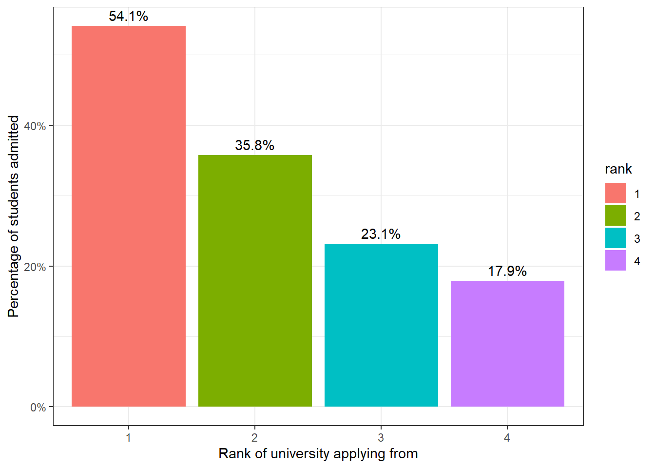
18.2.2 GMAT vs admit
Is GMAT a good predictor of whether a student will be admitted? Let us plot a scatter plot between GMAT and whether a student was admitted or not, and add the best-fine linear model.
# Is GMAT a good predictor?
ggplot(admit, aes(x=gmat, y=admit))+
  geom_point() +
  geom_smooth(method='lm', se=F)+
    labs(
    x='GMAT',
    y='Admitted?'
  ) +
  theme_bw()+
  NULL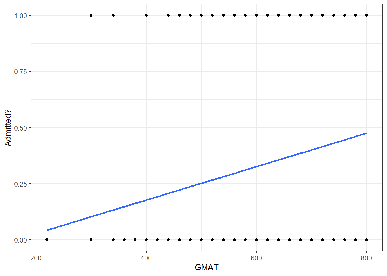
18.2.3 Grade Point Average (GPA) vs admit
Similarly, does a student GPA predict whether she will be admitted or not?
# Is Grade Point Average a good predictor?
ggplot(admit, aes(x=gpa, y=admit))+
  geom_point() +
  geom_smooth(method='lm',se=F)+
  labs(
    x='Grade Point Average (GPA)',
    y='Admitted?'
  ) +
  theme_bw()+
  NULL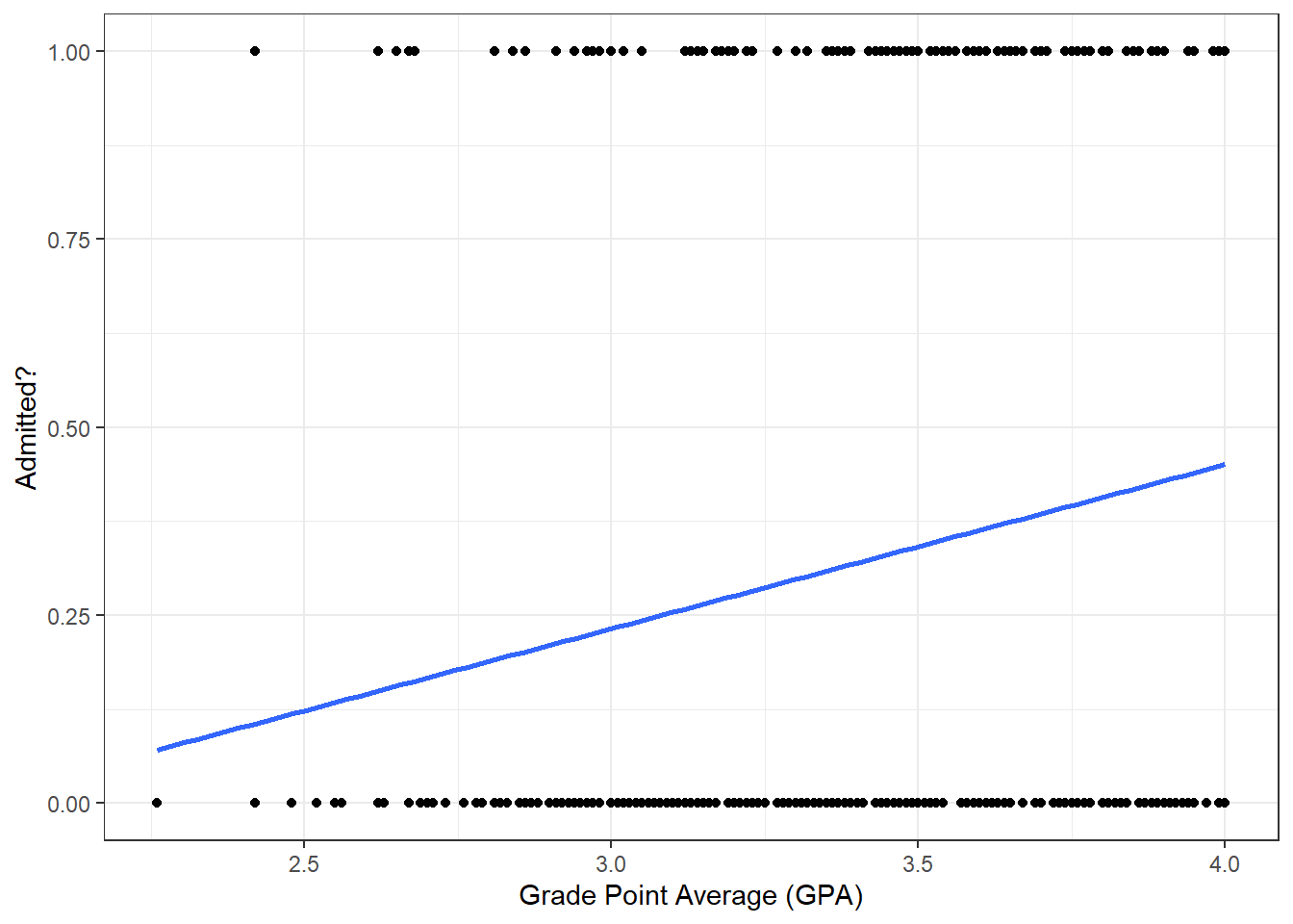
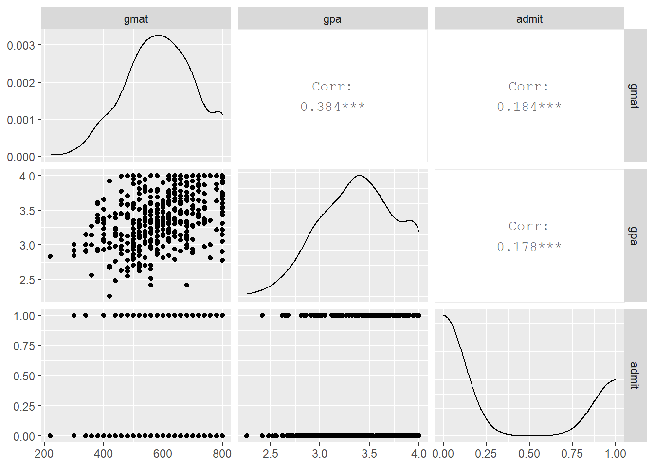
Finally, let us plot a scatterplot matrix of gmat, gpa, and admit
18.3 Logistic regression: glm models
gmat and gpa have a correlation of 0.184 and 0.178 respectively with admit. We would not expect them either of them to individually be a good predictor of whether a student will be admitted to graduate school or not. Still, in our analysis we will start with gpa as the only predictor and see whether we can come up with a better model if we use all three predictors.
##
## Call:
## glm(formula = admit ~ gmat, family = "binomial", data = admit)
##
## Deviance Residuals:
##    Min      1Q  Median      3Q     Max
## -1.162  -0.905  -0.755   1.349   1.988
##
## Coefficients:
##              Estimate Std. Error z value Pr(>|z|)
## (Intercept) -2.901344   0.606038   -4.79  1.7e-06 ***
## gmat         0.003582   0.000986    3.63  0.00028 ***
## ---
## Signif. codes:  0 '***' 0.001 '**' 0.01 '*' 0.05 '.' 0.1 ' ' 1
##
## (Dispersion parameter for binomial family taken to be 1)
##
##     Null deviance: 499.98  on 399  degrees of freedom
## Residual deviance: 486.06  on 398  degrees of freedom
## AIC: 490.1
##
## Number of Fisher Scoring iterations: 4##
## Call:
## glm(formula = admit ~ gmat + gpa + rank, family = "binomial",
## data = admit)
##
## Deviance Residuals:
## Min 1Q Median 3Q Max
## -1.627 -0.866 -0.639 1.149 2.079
##
## Coefficients:
## Estimate Std. Error z value Pr(>|z|)
## (Intercept) -3.98998 1.13995 -3.50 0.00047 ***
## gmat 0.00226 0.00109 2.07 0.03847 *
## gpa 0.80404 0.33182 2.42 0.01539 *
## rank2 -0.67544 0.31649 -2.13 0.03283 *
## rank3 -1.34020 0.34531 -3.88 0.00010 ***
## rank4 -1.55146 0.41783 -3.71 0.00020 ***
## ---
## Signif. codes: 0 '***' 0.001 '**' 0.01 '*' 0.05 '.' 0.1 ' ' 1
##
## (Dispersion parameter for binomial family taken to be 1)
##
## Null deviance: 499.98 on 399 degrees of freedom
## Residual deviance: 458.52 on 394 degrees of freedom
## AIC: 470.5
##
## Number of Fisher Scoring iterations: 418.3.1 Interpreting Logistic Regression Models
Let’s look at the output of our second model. model2. This gives us the coefficients on the logit scale.
## # A tibble: 6 x 5
##   term        estimate std.error statistic  p.value
##   <chr>          <dbl>     <dbl>     <dbl>    <dbl>
## 1 (Intercept) -3.99      1.14        -3.50 0.000465
## 2 gmat         0.00226   0.00109      2.07 0.0385
## 3 gpa          0.804     0.332        2.42 0.0154
## 4 rank2       -0.675     0.316       -2.13 0.0328
## 5 rank3       -1.34      0.345       -3.88 0.000104
## 6 rank4 -1.55 0.418 -3.71 0.000205## (Intercept) gmat gpa rank2 rank3 rank4
## -3.98998 0.00226 0.80404 -0.67544 -1.34020 -1.55146We note that all of our predictors (gmat, gpa, and rank) are significant terms in our model, which indicates that they are useful predictors in our model.
How can we use these coefficients? You cannot interpret the Logistic model coefficients strictly in terms of probabilities, because the logistic model is actually non-linear in terms of probabilities.
However, the coefficients in the model can be interpreted in terms of Odds Ratio. What is the Odds Ratio? Remember that odds can be expressed as numberCases:numberNonCases. For example, an odds of 5:1 (win:lose) means that 5 times out of 6, we expect to win, and 1 times out of 6 we expect not to win. The odds ratio (OR) is just numberCases/numberNonCases. In the case of 5:1 odds, the OR is 5/1 = 5. The probability of winning in this case would be numberCases / (numberCases + numberNonCases) or 5/(1+5) = 0.833333.
So mathematically, the Odds Ratio for our model using gmat as a predictor of admissions can be calculated as:
\[ OddsRatio = \frac{prob(admit=TRUE)}{prob(admit=FALSE)} = \frac{numberAdmitted}{numberNot Admitted} \]
We typicall we use 0 and 1 as shorthand for TRUE and FALSE.
\[ oddsRatio(admit=1) = \frac{prob(admit=1)}{prob(admit=0)} = \frac{prob(admit=1)}{1-prob(admit=1)} \]
because
\[ prob(admit=0) = 1-prob(admit=1) \]
by definition. So, we can define our logistic model as:
\[ log(OddRatio(admit=TRUE)) = Constant + CoefGmat * gmat + coefGpa * gpa + CoefRank2 * rank2 + CoefRank3 * rank3 +CoefRank4 * rank4 \]
We call log(OddsRatio(admit=TRUE)) the logit. Notice that the logit has a linear relation to our predictors gmat, gpa, and rank. Our model parameters are a Constant, CoefGpa is the fitted model coefficient for gpa, etc.
if we exponentiate both sides, remembering that exp(A+B) = exp(A) * exp(B):
\[ OddsRatio(admit=TRUE) = exp(Constant + CoefGmat * gmat + coefGpa * gpa + CoefRank2 * rank2 + CoefRank3 * rank3 +CoefRank4 * rank4) \]
Moving things around, we get:
\[ OddsRatio(admit=TRUE) = exp(\frac{prob(admit=TRUE)}{1-prob(admit=TRUE)}) \\ = Constant + CoefGmat * gmat + coefGpa * gpa + CoefRank2 * rank2 + CoefRank3 * rank3 +CoefRank4 * rank4 \]
So we find that the OddsRatio(admit = TRUE) is calculated by multiplying exp(Constant), exp(CoefGmat * gmat), exp(CoefGpa * gpa), exp(CoefRank2 * rank2),exp(CoefRank3 * Rank3)andexp(CoefRank4 * rank4)`, which is a nice result. This means that in order to interpret the coefficients in terms of odds, we need to exponentiate them. We can then interpret these transformed coefficients in terms of an associated increase in the Odds Ratio. So let’s first transform our coefficients by exponentiating them:
## (Intercept)        gmat         gpa       rank2       rank3       rank4
##      0.0185      1.0023      2.2345      0.5089      0.2618      0.2119
In linear regression, the coefficient of a predictor variable \(X_i\) has a marginal effect interpretation: An increase in variable \(X_i\) by 1 unit, increases variable \(Y\) by 1 unit. In logistic regression marginal effects are complicated to estimate and we focus, instead, on the Odds Ratio.
When a logistic regression is calculated, the regression coefficient \(b_i\) is the estimated increase in the log odds of the outcome \(Y\) per unit increase in the value of \(X_i\). In other words, the exponential function of the regression coefficient \(e^{b_i}\) is the odds ratio associated with a one-unit increase in \(X_i\).
- An odds ratio of exactly 1 means that \(X_i\) has no effect on the odds of \(Y\).
- An odds ratio of more than 1 means that an increase in \(X_i\) increases the odds of \(Y\) happening .
- An odds ratio of less than 1 means that an increase in \(X_i\) decreases the odds of \(Y\) happening.
We ignore the odds ratio for the intercept and we note that gmat has an odds ratio or roughly 1, suggesting that gmat has no effect on the odds of being admitted. However, gpa has an odds ratio of 2.23, which means that a 1-point increase in a candidate’s GPA, greatly increases the odds of being admitted; specifically, the odds ratio increase by 123.454 percent. This means that if you want to interpret the coefficients in the model in terms of increases in units, you need to first multiply the unit increase by the coefficient and then exponentiate. For example, going from 2 to 4 in our gpa (a 2 unit increase), our odds ratio increases by exp(2 * CoefGpa) or 4.993.
In terms of rank, rank1 is the first level of our categorical variable and is not included in the model and thus acts as a ‘baseline’. The interpretation of rank variable is different because it is a categorical variable and we see whatthe change is with respect to the ‘baseline’ of rank1. If a student applies from a rank2 institution, there is a -49.107 percent change in our predicted Odds Ratio. Similarly after adjusting for gmat and gpa, a rank3 applicant’s Odd Ratio is only 26.179 percent compared to a rank1 applicant.
18.3.2 Classification – threshold cutoff values
Having estimated the two logistic regression models, we will use broom::augment to generate the predicted values. You may notice that we have predicted probabilities of admissions for applicant, but we haven’t actually predicted whether an applicant is admitted or not). We can do this by choosing a threshold probability, that is, a cutoff value for our predicted probabilities that separates who we classify as an admitted student and who isn’t.
How do we decide the threshold? We will first use a naive threshold of 0.5, much like flipping a coin. However, one simple way to decide is to plot a histogram of the predicted probabilities. For model 2, we note that there is a drop in the predicted probabilities between 0.3 and 0.4.
cutoff <- 0.5

model1_predictions <- model1 %>%
  augment(type.predict = "response") %>%
  mutate(y_hat = .fitted,
         odds_hat = y_hat / (1 - y_hat),
         log_odds_hat = log(odds_hat),
         admit_hat = if_else(.fitted > cutoff,1,0))

model2_predictions <- model2 %>%
  augment(type.predict = "response") %>%
  mutate(y_hat = .fitted,
         odds_hat = y_hat / (1 - y_hat),
         log_odds_hat = log(odds_hat),
         admit_hat = if_else(.fitted > cutoff,1,0))

ggplot(model2_predictions, aes(x=y_hat))+
  geom_histogram() +
  labs(title = "Predicted probabilities of admission") +
  theme_bw() +
  NULL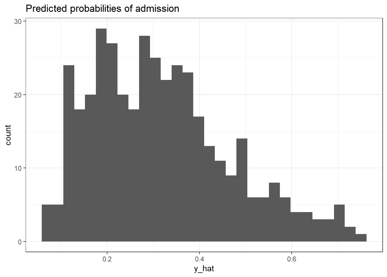
18.3.3 Confusion matrices
In any classification method, there are two types of errors we can make, a false positive and a false negative.
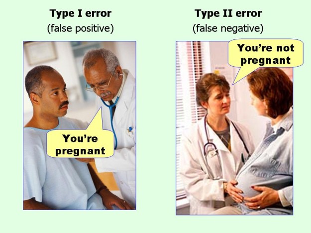
In the context of the admissions model, we could make two mistakes:
- False positive: predict an applicant was admitted, when in reality the individual was rejected.
- False negative: predict an applicant was rejected, when in fact the individual was admitted.
18.3.3.1 Cutoff = 0.5
Let us have a look at the confusion matrices for the two models, using a threshold cutoff of 0.5.
## admit_hat
## admit 0
## 0 273
## 1 127Looking at the first classification 2x2 table, you might notice that we do kind of badly in terms of predicting admissions– Model 1 with the naive cutoff of 0.50 predicts that no-student will be admitted!
The classification matrix for model 2 is
## admit_hat
## admit 0 1
## 0 254 19
## 1 97 30Besides the accuracy of the classifier system, we nust also calculate the \(sensitivity = \frac{TP}{TP+FN}\), namely the true positive rate which in our example is the proportion of admitted students that was correctly classified. In addition, or \(specificity = \frac{TN}{TN+FP}\), is the proportion of true negatives, namely rejected students classified as rejects.
totalCases <- sum(confusionMatrix2)
misclassified <- confusionMatrix2[1,2] + confusionMatrix2[2,1]
misclassified## [1] 116## [1] 0.71truePositives <- confusionMatrix2[2,2]
trueNegatives <- confusionMatrix2[1,1]
falseNegatives <- confusionMatrix2[2,1]
falsePositives <- confusionMatrix2[1,2]
# calculate sensitivity & specificity
sensitivity <- (truePositives)/(truePositives + falseNegatives)
specificity <- (trueNegatives)/(trueNegatives + falsePositives)Our accuracy can be calculated by calculating the total number of misclassifications (where predict does not equal truth). The misclassifications are where we predict admission (1), but in reality the students was rejected (0) (false positives), and where we predict rejection (0), but in reality the student was admitted (1) (false negatives).
In our case, Model 2 with the naive threshold of 0.5 has the following statistics:
- Accuracy of 71 percent,
- Sensitivity of 23.622 percent, and
- Specificity of 93.04 percent
Let us try a different threshold and see that changes.
18.3.3.2 Cutoff = 0.38
cutoff <- 0.38
model1_predictions <- model1 %>%
augment(type.predict = "response") %>%
mutate(y_hat = .fitted,
odds_hat = y_hat / (1 - y_hat),
log_odds_hat = log(odds_hat),
admit_hat = if_else(.fitted > cutoff,1,0))
model2_predictions <- model2 %>%
augment(type.predict = "response") %>%
mutate(y_hat = .fitted,
odds_hat = y_hat / (1 - y_hat),
log_odds_hat = log(odds_hat),
admit_hat = if_else(.fitted > cutoff,1,0))
#confusion matrices
confusionMatrix1 <- model1_predictions %>%
  select(admit, admit_hat) %>%
  table()
confusionMatrix1
## admit_hat
## admit 0 1
## 0 214 59
## 1 87 40## admit_hat
## admit 0 1
## 0 218 55
## 1 65 62totalCases <- sum(confusionMatrix2)
misclassified <- confusionMatrix2[1,2] + confusionMatrix2[2,1]
misclassified## [1] 120## [1] 0.7truePositives <- confusionMatrix2[2,2]
trueNegatives <- confusionMatrix2[1,1]
falseNegatives <- confusionMatrix2[2,1]
falsePositives <- confusionMatrix2[1,2]
# calculate sensitivity & specificity
sensitivity <- (truePositives)/(truePositives + falseNegatives)
specificity <- (trueNegatives)/(trueNegatives + falsePositives)Using a threshold of 0.38, model 2 has the following statistics:
- Accuracy of 70 percent,
- Sensitivity of 48.819 percent, and
- Specificity of 79.853 percent
18.3.4 ROC Curves
We can examine the impact of setting our probability cutoff threshold using the ROCR package (be sure to install it using install.packages("ROCR")).
A Receiver Operator Characteristic (ROC) curve always has the true positive rate (or sensitivity) on the y-axis and the false positive rate (1-specificity) on the x-axis and captures all thresholds simultaneously. An ROC curve is a way of assessing how our probability cutoff threshold affects our Sensitivity (our ability to detect true positives) and Specificity (our ability to detect true negatives). Any test has a sensitivity/specificity tradeoff. Remember that in the previous example, changing the cutoff from 0.5 to 0.38 increased sensitivity (true positive rate) from 23 to 49 percent, but decreased specificity (true negative rate) from 93 to 80%. We can actually use an ROC curve to select a threshold based on whether we value Sensitivity or Specificity.
Remember that \(sensitivity = \frac{TP}{TP+FN}\) is the true positive rate which in our example is the proportion of admitted students that was correctly classified. The false positive rate, or \(1 - specificity = 1 - \frac{TN}{TN+FP}\), is the proportion of rejected students classified as admitted.
We will use the ROCR package to plot ROC curves, sensitivity/specificity curves, and calculate AUC (Area Under the Curve). Every classifier evaluation using the ROCR package starts with creating a prediction object. The ROCR::prediction function is used to transform the input data (which can be in vector, matrix, data frame, or list form) into a standardized format which we use to plot our ROC curves, calculate AUC, etc.
predictions1 <- prediction(model1_predictions$y_hat, model1_predictions$admit)
predictions2 <- prediction(model2_predictions$y_hat, model1_predictions$admit)

# Simple ROC curve - model 1
perf <- performance(predictions1, "tpr", "fpr")
plot(perf, colorize=T, print.cutoffs.at=seq(0,1,by=0.1), text.adj=c(-0.2,1.7),
     main="ROC curve Admissions- Model 1", xlab="False Positive Rate",
     ylab="Sensitivity (TP Rate)")
abline(0, 1) #add a 45 degree line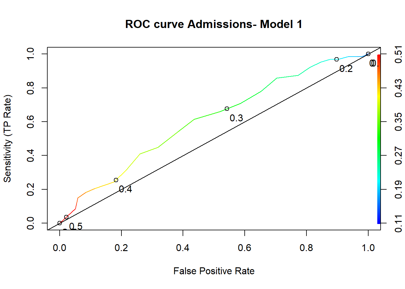
# Simple ROC curve - model 2
perf <- performance(predictions2, "tpr", "fpr")
plot(perf, colorize=T, print.cutoffs.at=seq(0,1,by=0.1), text.adj=c(-0.2,1.7),
     main="ROC curve Admissions- Model 2", xlab="False Positive Rate",
     ylab="Sensitivity (TP Rate)")
abline(0, 1) #add a 45 degree line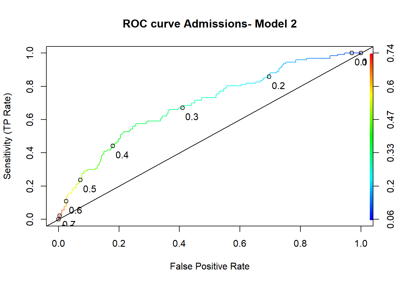
We can also compare the two ROC curves for the two models.
# Comparing ROC curves for models 1 and 2
perf1 <- performance(predictions1, "tpr", "fpr")
perf2 <- performance(predictions2, "tpr", "fpr")

plot(perf1, col = "red", lwd=3, main="ROC Curves: Model 1-Red, Model 2-blue")
plot(perf2, add = TRUE, col = "blue", lwd=3)
abline(a=0, b=1, lty=2, lwd=3, col="black")
18.3.5 Area Under the ROC Curve (AUC)
A key concept in classification is the Area Under the ROC Curve, or AUC. The AUC of a classifier is equivalent to the probability that the classifier will rank a randomly chosen positive instance higher than a randomly chosen negative instance.
A perfect classifier would be described as 100% sensitive, meaning in our case that all truly admitted students are correctly identified as such, and 100% specific, meaning no admitted students are incorrectly classified as rejects. Thus, the maximum value for AUC is 1 and corresponds to perfect classifier, namely when the true positive rate \(TP=1\) and the false positive rate \(FP=0\).
This is the upper left point in the ROC curve where there are no false positives and all of the values are true positives. Thus, we want our ROC curve to approach this upper left point as much as it can (think ‘go northwest!’) and the AUC to approach 1.
The minimum value of AUC = 0.5, and this corresponds to just guessing (or flipping a coin to decide!). Visually, is is the diagonal line
Typically, the greater the Area Under the ROC Curve (AUC), the better our model is. The maximum possible AUC is equal to 1.
# Comparing ROC curves for models 1 and 2
perf1 <- performance(predictions1, "tpr", "fpr")
perf2 <- performance(predictions2, "tpr", "fpr")

plot(perf1, col = "red", lwd=3, main="ROC Curves: Model 1-Red, Model 2-blue")
plot(perf2, add = TRUE, col = "blue", lwd=3)
abline(a=0, b=1, lty=2, lwd=3, col="black")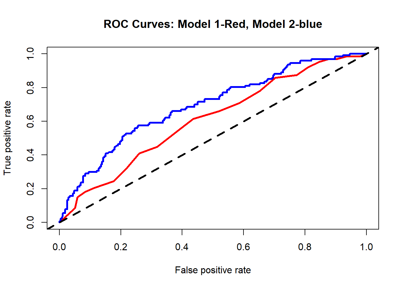
# Calculating AUC
# ROCR creates a formal class performance object, we store it to auc1_tmp and then convert it to a number
auc1_tmp <- performance(predictions1, "auc")
auc1 <- as.numeric(auc1_tmp@y.values)

auc2_tmp <- performance(predictions2, "auc")
auc2 <- as.numeric(auc2_tmp@y.values)
In our case, model 1 has an AUC= 0.609 and model 2 has an AUC= 0.693.
18.3.6 Sensitivity/specificity plots
How can we come up with the best threshold value? We often choose the threshold cutoff value \(t\) based on which errors are “better” or whether we value Sensitivity or Specificity more.
Remember that \(sensitivity = \frac{TP}{TP+FN}\) is the true positive rate which in our example is the proportion of admitted students that was correctly classified. The false positive rate, or \(1 - specificity = 1 - \frac{TN}{TN+FP}\), is the proportion of rejected students classified as admitted.
- If \(t\) is large, we predict admissions rarely.
- More errors where we predict someone was admitted, but in reality there was no admission
- Detects candidates who have low chance of admission
- If \(t\) is small, we predict rejections rarely. – More errors where we predict someone was rejected, but in reality was admitted – Detects candidates who are likely to be admitted
We must choose the threshold cutoff value \(t\) for the best trade-off between
- cost of failing to detect positives
- cost of raising false alarms
We will plot a graph where we show how both sensitivity and specificity change for our second model as we vary the value of the threshold cutoff.
sens <- data.frame(x=unlist(performance(predictions2, "sens")@x.values),
                   y=unlist(performance(predictions2, "sens")@y.values))
spec <- data.frame(x=unlist(performance(predictions2, "spec")@x.values),
                   y=unlist(performance(predictions2, "spec")@y.values))

sens %>% ggplot(aes(x,y)) +
  geom_line() +
  geom_line(data=spec, aes(x,y,col="red")) +
  scale_y_continuous(sec.axis = sec_axis(~., name = "Specificity(1-False Positive Rate)")) +
  labs(x='Cutoff', y="Sensitivity  (True Positive Rate)") +
theme(axis.title.y.right = element_text(colour = "red"), legend.position="none") 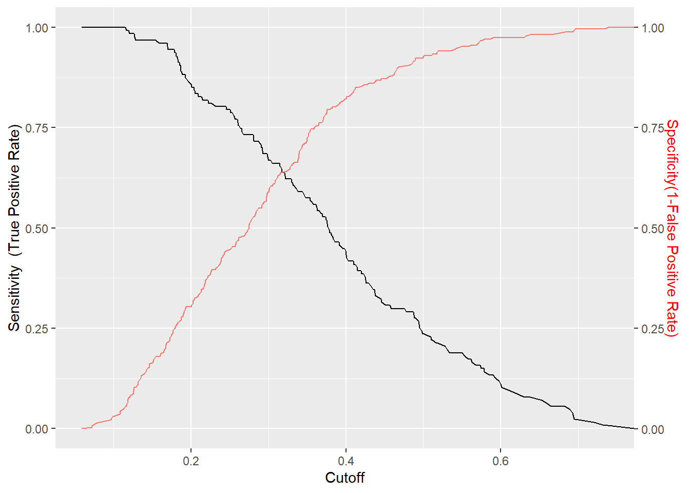
18.3.7 More Info on Logistic Regression
Please note: this is a brief, non-comprehensive introduction to logistic regression for this example. In addition to the R links at the end of this section, we highly recommend texts such as Applied Logistic Regression for more detailed treatment of logistic regression, including topics such as model building strategies, diagnostics and assessment of fit as well as more complex designs which are beyond the scope of this assignment.
Further useful links are:
- https://www.r-bloggers.com/how-to-perform-a-logistic-regression-in-r/ is a good resource for understanding logistic regression models.
- https://www.r-bloggers.com/evaluating-logistic-regression-models/ does a nice job explaining how to run logistic regressions and various ways to evaluate logistic regression models.
- https://stats.idre.ucla.edu/other/mult-pkg/faq/general/faq-how-do-i-interpret-odds-ratios-in-logistic-regression/ is a good page for understanding odds ratios and predicted probabilities.
18.4 Machine Learning approaches
Compare your model2 with models built using MASS:lda (linear discriminant analysis) and rpart::rpart (classification and regression trees) in terms of accuracy. Use the same predictors you used in model 2 to build your models, namely gmat, gpa, and rank. Do either of these methods do any better than logistic regression on this admissions dataset?
18.5 Linear Discriminant Analysis (LDA)
18.6 Classification and regression trees
18.7 k-nearest neighbours (k-NN)
This page last updated on: 2020-07-14