13. Sources of data
“Data!data!data!” he cried impatiently. “I can’t make bricks without clay.”
–Arthur Conan Doyle, The Adventure of the Copper Beeches
The easiest way to download data is if someone makes available a CSV file and we can download it directly off the web with readr::read_csv(). Alternatively, we can use the rio package to download many different types of files (Excel, SPSS, Stata, etc.)
In this section we will look at three packages that use wrapped Application Programming Interface (APIs) to get data off the web:
tidyquanthelps with getting finance data
wbstatsqueries the World Bank database, andeurostathas all relevant functionality to get Eurostat data.
Besides these three API-ready packages, we will list a number of sources of data.
13.1 Finance data with the tidyquant package
The tidyquant package comes with a number of functions- utlities that allow us to download financial data off the web, as well as ways of handling all this data.
We begin by loading the data set into the R workspace. We create a collection of stocks with their ticker symbols and then use the piping operator %>% to use tidyquant’s tq_get to donwload historical data using Yahoo finance and, again, to group data by their ticker symbol.
library(tidyquant)
myStocks <- c("AAPL","JPM","DIS","DPZ","ANF","TSLA","XOM","SPY" ) %>%
  tq_get(get  = "stock.prices",
         from = "2011-01-01",
         to   = "2020-07-14") %>%
  group_by(symbol)

glimpse(myStocks) # examine the structure of the resulting data frame
## Rows: 19,176
## Columns: 8
## Groups: symbol [8]
## $ symbol <chr> "AAPL", "AAPL", "AAPL", "AAPL", "AAPL", "AAPL", "AAPL", "AAPL", "AAPL", "AAPL", "AAPL", "AAPL", "AAPL", "AAPL", "A...
## $ date <date> 2011-01-03, 2011-01-04, 2011-01-05, 2011-01-06, 2011-01-07, 2011-01-10, 2011-01-11, 2011-01-12, 2011-01-13, 2011-...
## $ open <dbl> 46.5, 47.5, 47.1, 47.8, 47.7, 48.4, 49.3, 49.0, 49.3, 49.4, 47.1, 49.8, 48.1, 47.7, 46.7, 48.0, 49.0, 49.1, 49.2, ...
## $ high <dbl> 47.2, 47.5, 47.8, 47.9, 48.0, 49.0, 49.3, 49.2, 49.5, 49.8, 49.3, 49.8, 48.3, 47.8, 48.2, 48.8, 49.4, 49.2, 49.2, ...
## $ low <dbl> 46.4, 46.9, 47.1, 47.6, 47.4, 48.2, 48.5, 48.9, 49.1, 49.2, 46.6, 48.1, 47.2, 46.7, 46.7, 47.8, 48.8, 49.0, 47.6, ...
## $ close <dbl> 47.1, 47.3, 47.7, 47.7, 48.0, 48.9, 48.8, 49.2, 49.4, 49.8, 48.7, 48.4, 47.5, 46.7, 48.2, 48.8, 49.1, 49.0, 48.0, ...
## $ volume <dbl> 111284600, 77270200, 63879900, 75107200, 77982800, 112140000, 111027000, 75647600, 74195100, 77210000, 470249500, ...
## $ adjusted <dbl> 40.8, 41.0, 41.3, 41.3, 41.6, 42.4, 42.3, 42.6, 42.8, 43.1, 42.1, 41.9, 41.1, 40.4, 41.7, 42.2, 42.5, 42.4, 41.6, ...For each ticker symbol, the data frame contains its symbol, the date, the prices for open,high, low and close, and the volume, or how many stocks were traded on that day. More importantly, the data frame contains the adjusted closing price, which adjusts for any stock splits and/or dividends paid and this is what we will be using for our analyses.
13.1.1 Calculating financial returns
Financial performance and CAPM analysis depend on returns and not on adjusted closing prices. So given the adjusted closing prices, our first step is to calculate daily and monthly returns.
#calculate daily returns
myStocks_returns_daily <- myStocks %>%
  tq_transmute(select     = adjusted,
               mutate_fun = periodReturn,
               period     = "daily",
               type       = "log",
               col_rename = "daily.returns",
               cols = c(nested.col))

#calculate monthly  returns
myStocks_returns_monthly <- myStocks %>%
  tq_transmute(select     = adjusted,
               mutate_fun = periodReturn,
               period     = "monthly",
               type       = "arithmetic",
               col_rename = "monthly.returns",
               cols = c(nested.col))

#calculate yearly returns
myStocks_returns_annual <- myStocks %>%
  group_by(symbol) %>%
  tq_transmute(select     = adjusted,
               mutate_fun = periodReturn,
               period     = "yearly",
               type       = "arithmetic",
               col_rename = "yearly.returns",
               cols = c(nested.col))
For yearly and monthly data, we assume discrete changes, so we the formula used to calculate the return for month (t+1) is
\(Return(t+1)= \frac{Adj.Close(t+1)}{Adj.Close (t)}-1\)
For daily data we use log returns, or \(Return(t+1)= LN\frac{Adj.Close(t+1)}{Adj.Close (t)}\)
The reason we use log returns are:
Compound interest interpretation; namely, that the log return can be interpreted as the continuously (rather than discretely) compounded rate of return
Log returns are assumed to follow a normal distribution
Log return over n periods is the sum of n log returns
13.1.2 Summarising the data set
Let us get quick summary statistics of daily returns for each stock, as well as a density plot whwre we usefacet_grid to superimpose all the distributions in one plot.
| symbol | min | median | max | mean | sd | annual_mean | annual_sd |
|---|---|---|---|---|---|---|---|
| AAPL | -0.138 | 0.001 | 0.113 | 0.001 | 0.017 | 0.233 | 0.276 |
| ANF | -0.307 | 0.001 | 0.296 | -0.001 | 0.034 | -0.153 | 0.540 |
| DIS | -0.139 | 0.001 | 0.135 | 0.001 | 0.015 | 0.130 | 0.242 |
| DPZ | -0.106 | 0.001 | 0.228 | 0.001 | 0.018 | 0.351 | 0.287 |
| JPM | -0.162 | 0.001 | 0.166 | 0.000 | 0.018 | 0.112 | 0.285 |
| SPY | -0.116 | 0.001 | 0.087 | 0.000 | 0.011 | 0.115 | 0.172 |
| TSLA | -0.215 | 0.001 | 0.218 | 0.002 | 0.034 | 0.420 | 0.534 |
| XOM | -0.130 | 0.000 | 0.119 | 0.000 | 0.015 | -0.024 | 0.231 |
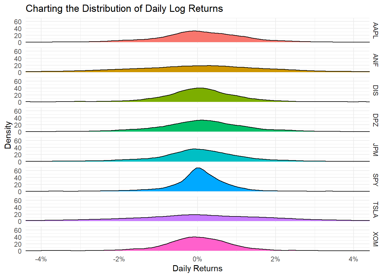
Daily returns seem to follow a normal distribution with a mean close to zero. Since most people think of returns on an annual, rather than on a daily basis, we can calculate summary statistics of annual returns, a boxplot of annual returns, and a bar plot that shows return for each stock on a year-by-year basis.
myStocks_returns_annual %>%
  group_by(symbol) %>%
  mutate(median_return= median(yearly.returns)) %>%

  # arrange stocks by median yearly return, so highest median return appears first, etc.
  ggplot(aes(x=reorder(symbol, median_return), y=yearly.returns, colour=symbol)) +
  geom_boxplot()+
  coord_flip()+
  labs(x="Stock",
       y="Returns",
       title = "Boxplot of Annual Returns")+
  scale_y_continuous(labels = scales::percent_format(accuracy = 2))+
  guides(color=FALSE) +
  theme_bw()+
  NULL
ggplot(myStocks_returns_annual, aes(x=year(date), y=yearly.returns, fill=symbol)) +
  geom_col(position = "dodge")+
  labs(x="Year", y="Returns", title = "Annual Returns")+
  scale_y_continuous(labels = scales::percent)+
  guides(fill=guide_legend(title=NULL))+
  theme_bw()+
  NULL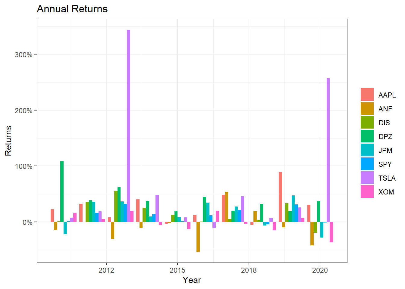
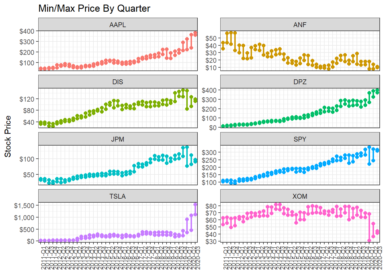
13.1.3 Minimum and maximum price of each stock by quarter
What if we wanted to find out and visualise the min/max price by quarter?
13.1.5 Investment Growth
Finally, we may want to see what our investments would have grown to, if we had invested $1000 in each of the assets on Jan 1, 2011.
13.1.6 Scatterplots of individual stocks returns versus S&P500 Index returns
Besides these exploratory graphs of returns and price evolution, we also need to create scatterplots among the returns of different stocks. ggpairs from the GGally package creates a scattterplot matrix that shows the distribution of returns for each stock along the diagonal, and scatter plots and correlations for each pair of stocks. Running a ggpairs() correlation scatterplot-matrix typically takes a while to run.
#calculate daily returns
table_capm_returns <- myStocks_returns_daily %>%
            spread(key = symbol, value = daily.returns)  #just keep the period returns grouped by symbol

table_capm_returns[-1] %>% #exclude "Date", the first column, from the correlation matrix
  GGally::ggpairs() +
  theme_bw()+
    theme(axis.text.x = element_text(angle = 90, size=8),
         axis.title.x = element_blank())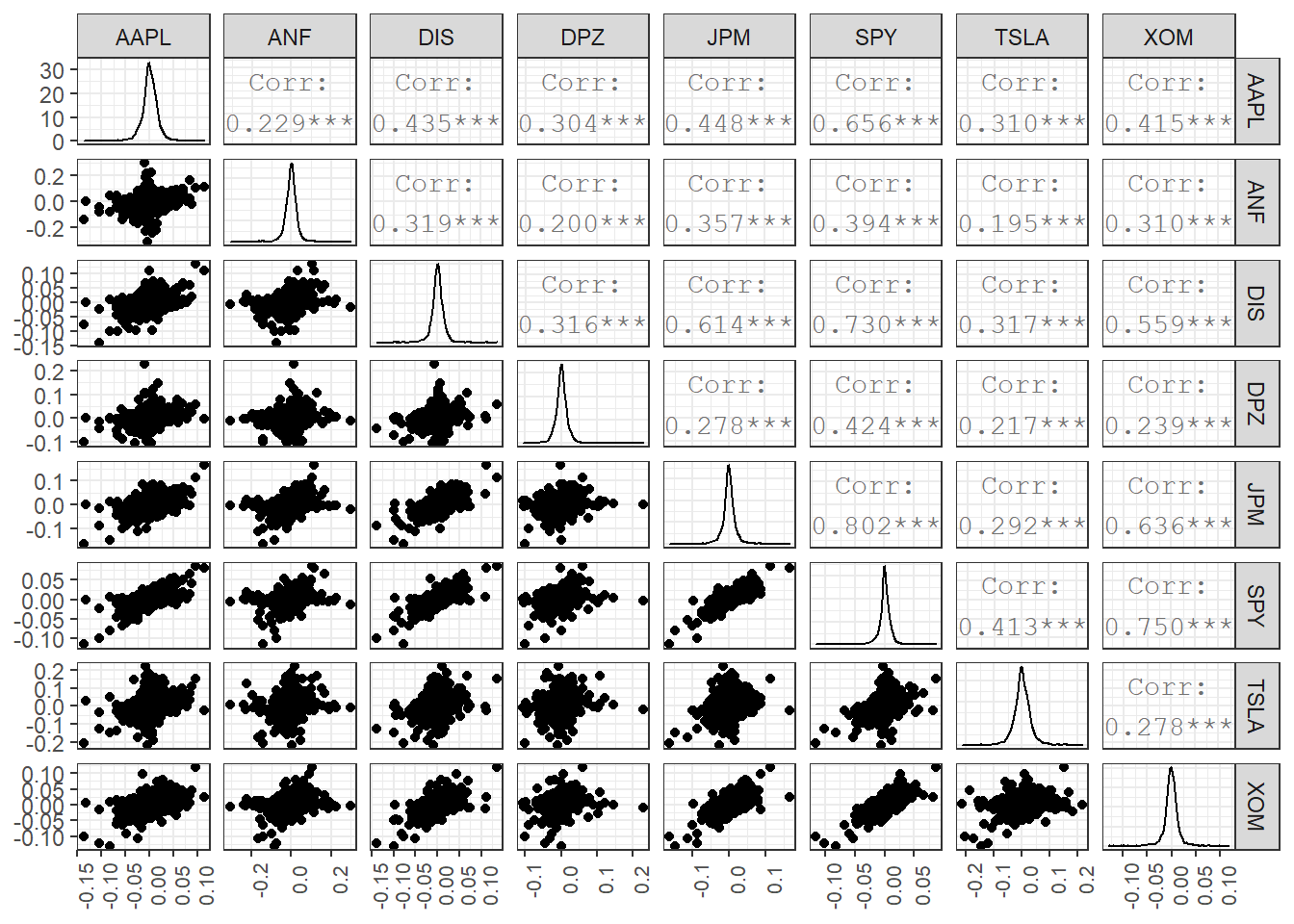
13.1.7 Creating a portfolio of assets
DPZ may have been the best performing stock, but you believe that you can create a portfolio of technology stocks that will beat the relevant sector index, XLK. To create a portfolio, you need to choose a few stocks and then the weights, or how much of your total investment is allocated to each stock. To keep things simple we will assume you will choose among AAPL, GOOG, MSFT, NFLX, and NVDA and you will compare your performance against the sector index, XLK. We will also add two non-tech stocks, TSLA and DPZ so we can their position on the risk/return frontier.
ticker_symbols <- c("AAPL","GOOG","MSFT","NFLX","NVDA", "XLK", "TSLA", "DPZ")

tech_stock_returns_monthly <- ticker_symbols %>%
    tq_get(get  = "stock.prices",
           from = "2011-01-01",
           to   = "2020-07-14") %>%
    group_by(symbol) %>%
    tq_transmute(select     = adjusted,
                 mutate_fun = periodReturn,
                 period     = "monthly",
                 col_rename = "monthly_return")


baseline_returns_monthly <- "XLK" %>%
    tq_get(get  = "stock.prices",
           from = "2011-01-01",
           to   = "2019-07-14") %>%
    tq_transmute(select     = adjusted,
                 mutate_fun = periodReturn,
                 period     = "monthly",
                 col_rename = "baseline_return")

# Summary Stats for individual Stocks
stocks_risk_return <- tech_stock_returns_monthly %>%
  tq_performance(Ra = monthly_return, Rb = NULL, performance_fun = table.Stats) %>%
  select(symbol, ArithmeticMean, GeometricMean, Minimum,Maximum,Stdev, Quartile1, Quartile3)


ggplot(stocks_risk_return, aes(x=Stdev, y = ArithmeticMean, colour= symbol, label= symbol))+
  geom_point(size = 4)+
  labs(title = 'Risk/Return profile of technology stocks',
       x = 'Risk (stdev of monthly returns)',
       y ="Average monthly return")+
  theme_bw()+
  scale_x_continuous(labels = scales::percent)+
  scale_y_continuous(labels = scales::percent)+
  geom_text_repel()+
  theme(legend.position = "none")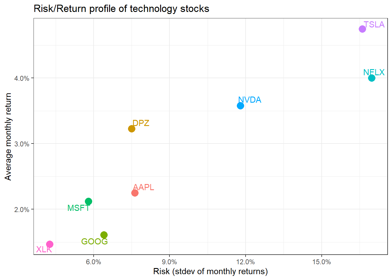
We have the monthly returns of the individual stocks and the relevenant sector index. To create a portfolio, we must specify the weights; as an example, suppose we only choose three stocks and invest 50% in AAPL, 35% in NFLX, and 15% in NVDA. To do this, we create a two-column tibble, with symbols in the first column and weights in the second; any symbol not specified by default gets a weight of zero.
weights_map <- tibble(
    symbols = c("AAPL", "NFLX", "NVDA"),
    weights = c(0.5, 0.35, 0.15)
)

tech_portfolio_returns <- tech_stock_returns_monthly %>%
    tq_portfolio(assets_col  = symbol,
                 returns_col = monthly_return,
                 weights     = weights_map,
                 col_rename  = "monthly_portfolio_return")

tech_portfolio_returns %>%
    ggplot(aes(x = date, y = monthly_portfolio_return)) +
    geom_col() +
    scale_y_continuous(labels = scales::percent) +
    # geom_bar(stat = "identity", fill = palette_light()[[1]]) +
    labs(title = "Tech Portfolio Returns",
         subtitle = "50% AAPL, 35% NFLX, and 15% NVDA",
         x = "", y = "Monthly Returns") +
theme_bw() 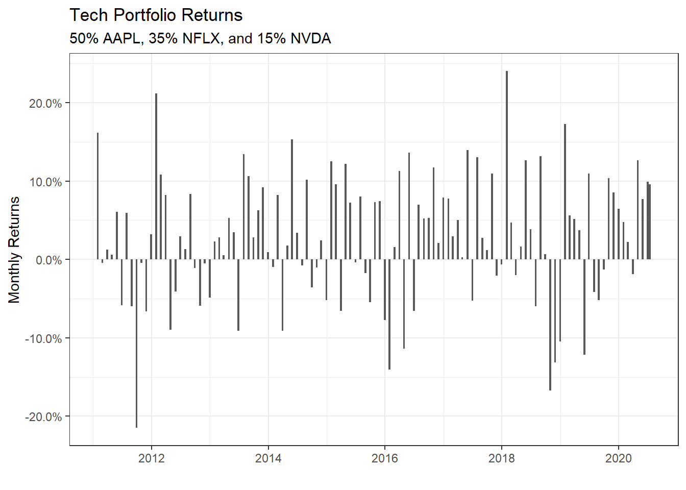
portfolio_growth_monthly <- tech_stock_returns_monthly %>%
    tq_portfolio(assets_col   = symbol,
                 returns_col  = monthly_return,
                 weights      = weights_map,
                 col_rename   = "investment.growth",
                 wealth.index = TRUE) %>%
    mutate(investment.growth = investment.growth * 1000)

plot1 <- portfolio_growth_monthly %>%
    ggplot(aes(x = date, y = investment.growth)) +
    geom_line(size = 2) +
    labs(title = "Portfolio Growth",
         subtitle = "50% AAPL, 35% NFLX, and 15% NVDA",
         x = "", y = "Portfolio Value") +
    # geom_smooth(method = "loess", se = FALSE) +
    theme_bw() +
    scale_y_continuous(labels = scales::dollar)

plotly::ggplotly(plot1)
Now that we have our portfolio returns and the baseline returns of the XLK index, we can merge to get our consolidated table of asset and baseline returns, create a scatter plot and fit a CAPM model.
tech_single_portfolio <- left_join(tech_portfolio_returns,
                                   baseline_returns_monthly,
                                   by = "date")
tech_single_portfolio
## # A tibble: 115 x 3
## date monthly_portfolio_return baseline_return
## <date> <dbl> <dbl>
## 1 2011-01-31 0.162 0.0204
## 2 2011-02-28 -0.00466 0.0219
## 3 2011-03-31 0.0122 -0.0155
## 4 2011-04-29 0.00601 0.0261
## 5 2011-05-31 0.0609 -0.0105
## 6 2011-06-30 -0.0586 -0.0248
## 7 2011-07-29 0.0592 0.00428
## 8 2011-08-31 -0.0596 -0.0531
## 9 2011-09-30 -0.215 -0.0307
## 10 2011-10-31 -0.00422 0.102
## # ... with 105 more rowsggplot(tech_single_portfolio, aes(x = baseline_return, y= monthly_portfolio_return)) +
geom_point()+
geom_smooth(method="lm", se=FALSE) +
scale_x_continuous(labels = scales::percent) +
scale_y_continuous(labels = scales::percent) +
labs(x = "Baseline returns (XLK)",
y= "Tech Portfolio Return",
title= "How do our tech fund returns compare to the the sector index XLK")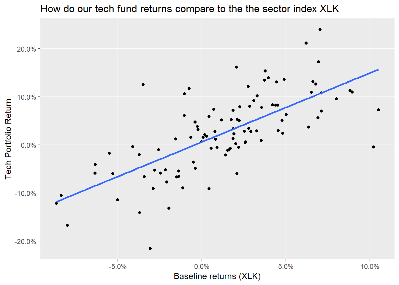
portfolio_CAPM <- lm(monthly_portfolio_return ~ baseline_return, data = tech_single_portfolio)
summary(portfolio_CAPM)
##
## Call:
## lm(formula = monthly_portfolio_return ~ baseline_return, data = tech_single_portfolio)
##
## Residuals:
## Min 1Q Median 3Q Max
## -0.17724 -0.03812 0.00027 0.03238 0.16935
##
## Coefficients:
## Estimate Std. Error t value Pr(>|t|)
## (Intercept) 0.00626 0.00614 1.02 0.31
## baseline_return 1.43295 0.14579 9.83 0.00000000000000024 ***
## ---
## Signif. codes: 0 '***' 0.001 '**' 0.01 '*' 0.05 '.' 0.1 ' ' 1
##
## Residual standard error: 0.0589 on 100 degrees of freedom
## (13 observations deleted due to missingness)
## Multiple R-squared: 0.491, Adjusted R-squared: 0.486
## F-statistic: 96.6 on 1 and 100 DF, p-value: 0.000000000000000235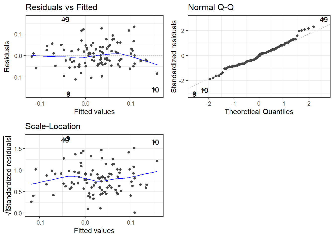
13.1.8 Creating various portfolios by changing weights of assets
Suppose we wanted to examine a few more portfolios by varying the weights.
- Naive portfolio: you split your investment equally among the five stocks, so each of them has a weight of 20%
- Bitcoin mining: you invest 80-20 in
NVDAandGOOG
- Binge TV watching: you invest most (70%) in
NFLXand 10% toAAPL,GOOG, andMSFT
ticker_symbols = c("AAPL", "GOOG", "MSFT", "NFLX", "NVDA")

weights <- c(
    0.2, 0.2, 0.2, 0.2, 0.2,
    0, 0.2, 0, 0, 0.8,
    0.1, 0.1, 0.1, 0, 0.7
)

weights_table <-  tibble(ticker_symbols) %>%
    tq_repeat_df(n = 3) %>%
    bind_cols(tibble(weights)) %>%
    group_by(portfolio)


stock_returns_monthly_multi <- tech_stock_returns_monthly %>%
    tq_repeat_df(n = 3)

# Calculate montly returns for all portfolios
portfolio_returns_monthly_multi <- stock_returns_monthly_multi %>%
    tq_portfolio(assets_col   = symbol,
                 returns_col  = monthly_return,
                 weights      = weights_table,
                 col_rename   = "portfolio_return",
                 wealth.index = FALSE)

# Calculate what an investment of 1000 will grow to
portfolio_growth_monthly_multi <- stock_returns_monthly_multi %>%
    tq_portfolio(assets_col   = symbol,
                 returns_col  = monthly_return,
                 weights      = weights_table,
                 col_rename   = "investment.growth",
                 wealth.index = TRUE) %>%
    mutate(investment.growth = investment.growth * 1000)

portfolio_growth_monthly_multi %>%
  ggplot(aes(x = date, y = investment.growth, colour = as.factor(portfolio))) +
  geom_line(size = 2) +
  labs(title = "Portfolio Growth",
       subtitle = "Comparing Multiple Portfolios",
       x = "", y = "Portfolio Value",
       color = "Portfolio") +
  theme_bw()+
  scale_y_continuous(labels = scales::dollar)+
  scale_colour_discrete(name="Portfolio",
                      labels=c("Naive", "Bitcoiners", "Binge Watchers"))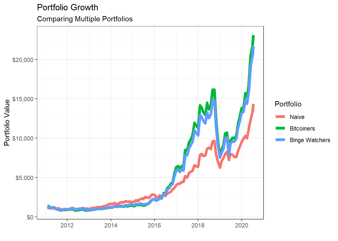
# Returns a basic set of statistics that match the period of the data passed in (e.g., monthly returns
# will get monthly statistics, daily will be daily stats, and so on).

portfolio_risk_return <- portfolio_returns_monthly_multi %>%
  tq_performance(Ra = portfolio_return, Rb = NULL, performance_fun = table.Stats) %>%
  select(portfolio, ArithmeticMean, GeometricMean, Minimum,Maximum,Stdev, Quartile1, Quartile3)

portfolio_risk_return %>%
  kable() %>%
kable_styling(c("striped", "bordered")) | portfolio | ArithmeticMean | GeometricMean | Minimum | Maximum | Stdev | Quartile1 | Quartile3 |
|---|---|---|---|---|---|---|---|
| 1 | 0.026 | 0.024 | -0.176 | 0.232 | 0.069 | -0.017 | 0.076 |
| 2 | 0.033 | 0.028 | -0.242 | 0.408 | 0.104 | -0.028 | 0.076 |
| 3 | 0.032 | 0.027 | -0.232 | 0.360 | 0.097 | -0.026 | 0.073 |
ggplot(portfolio_risk_return,
       aes(x=Stdev,
           y = ArithmeticMean,
           label= portfolio,
           colour= as.factor(portfolio)))+
  geom_point(size = 4)+
  labs(title = 'Risk/Return profile of the three portfolios',
       x = 'Risk (stdev of monthly returns)',
       y ="Average monthly return")+
  theme_bw()+
  scale_x_continuous(labels = scales::percent)+
  scale_y_continuous(labels = scales::percent)+
  scale_colour_discrete(name="Portfolio",
                      labels=c("Naive", "Bitcoiners", "Binge Watchers"))+
  geom_text_repel()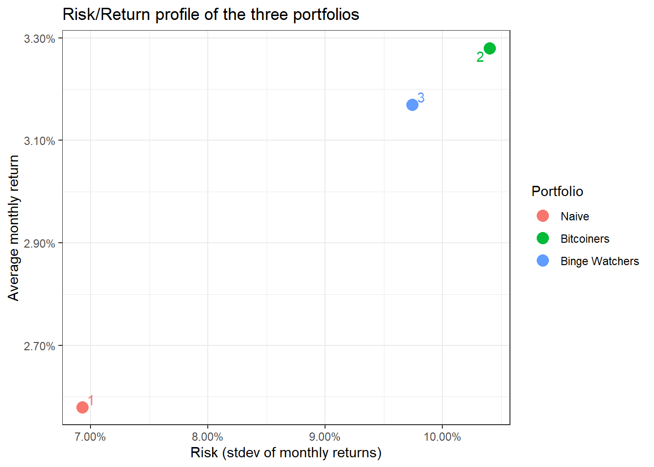
13.2 Data from the Federal Reserve Economic Data with tidyquant
A lot of economic data can be extracted from the Federal Reserve Economic Data (FRED) database. For each data we are interested, we need to get its FRED symbol; for instance, if we cared about commodities, we can select the Henry Hub Natural Gas Spot Price and notice that its FRED symbol is DHHNGSP.
So, if we wanted to download this, as well as prices of WTI crude, gold, and USD:EUR, we first identify the FRED codes which are shown below
- Henry Hub Natural Gas Spot Price:
DHHNGSP - WTI Crude Oil Prices:
DCOILWTICO - Gold Fixing Price:
GOLDAMGBD228NLBM - U.S. / Euro Exchange Rate:
DEXUSEU
To get the data and plot it
natgas_spot  <-   tq_get("DHHNGSP", get = "economic.data",
                       from = "2011-01-01",
                       to   = "2020-07-14")

ggplot(natgas_spot, aes(x=date, y=price)) +
  geom_line()+
  labs(x="Year",
       y="NatGas Spot price",
       title = "Henry Hub Natural Gas Spot Prices")+
  scale_y_continuous(labels = scales::dollar)+
  guides(fill=guide_legend(title=NULL))+
  theme_bw()+
  NULL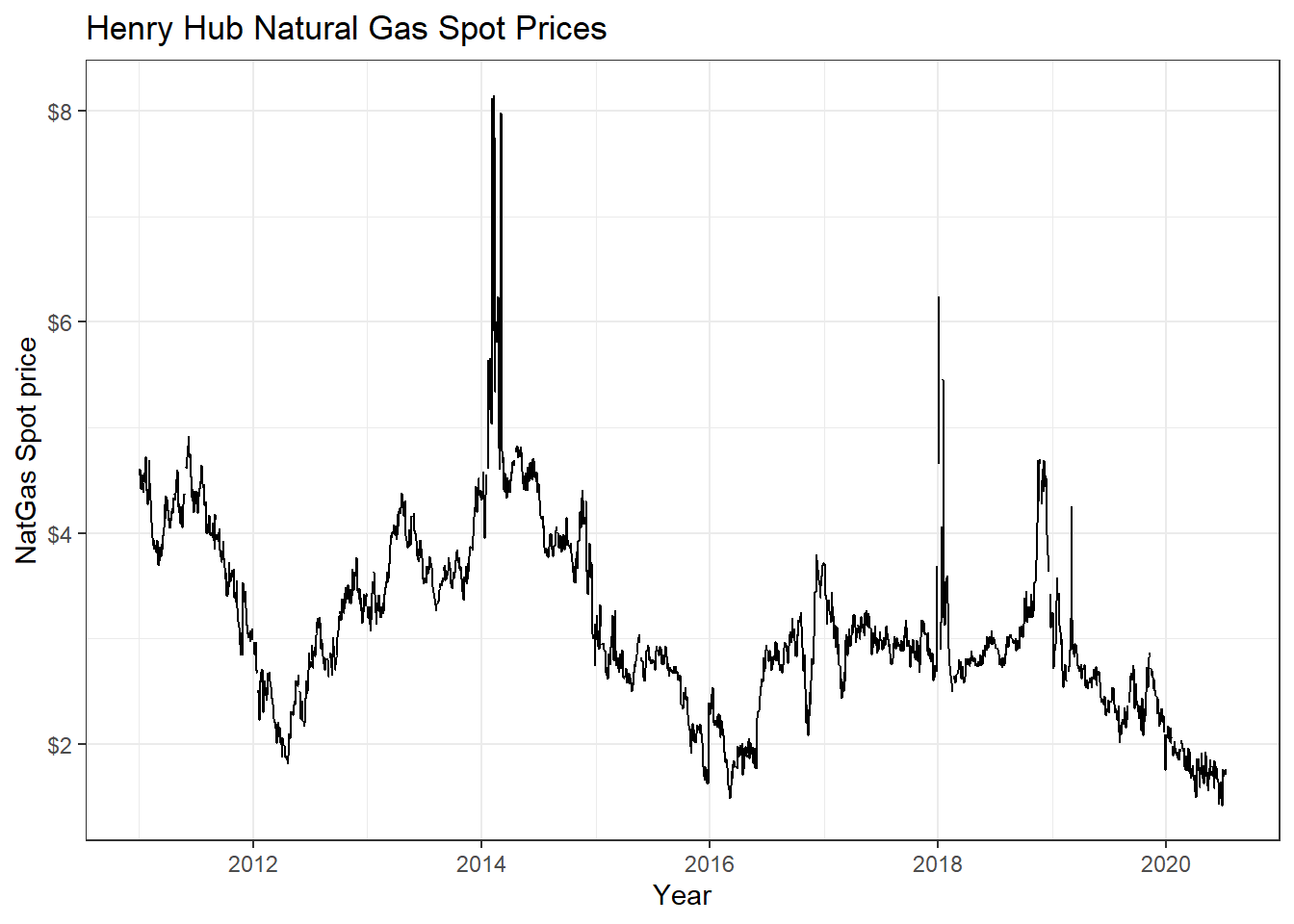
wti_price  <-   tq_get("DCOILWTICO", get = "economic.data",
                       from = "2011-01-01",
                       to   = "2020-07-14")

ggplot(wti_price, aes(x=date, y=price)) +
  geom_line()+
  labs(x="Year",
       y="WTI price",
       title = "West Texas Intermediate Crude Oil (WTI) Prices")+
  scale_y_continuous(labels = scales::dollar)+
  guides(fill=guide_legend(title=NULL))+
  theme_bw()+
  NULL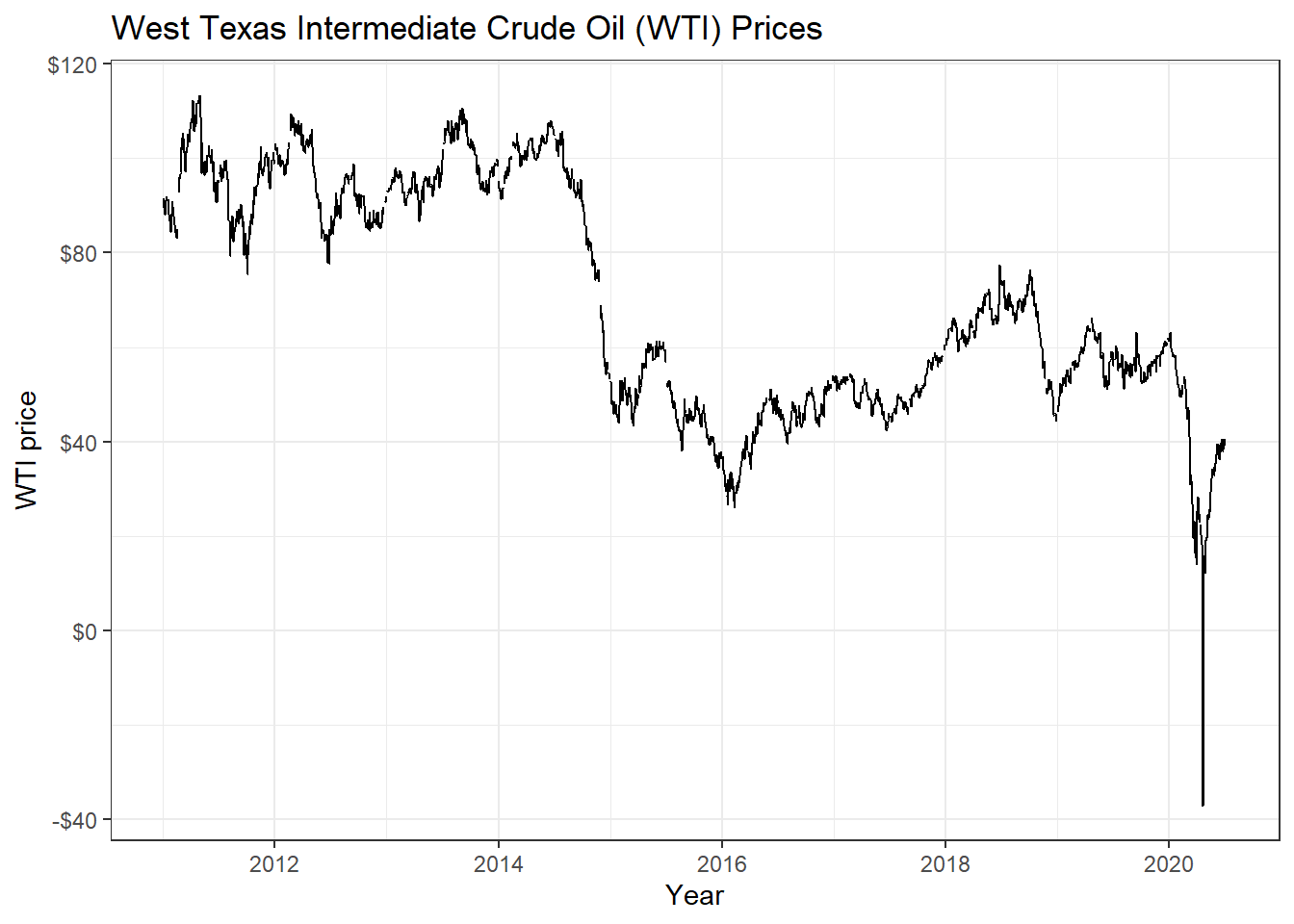
gold_price  <-   tq_get("GOLDAMGBD228NLBM", get = "economic.data",
                        from = "2011-01-01",
                        to   = "2020-07-14")

ggplot(gold_price, aes(x=date, y=price)) +
  geom_line()+
  labs(x="Year",
       y="Gold price",
       title = "Gold Fixing Price 10:30 A.M. (London time) in London Bullion Market")+
  scale_y_continuous(labels = scales::dollar)+
  guides(fill=guide_legend(title=NULL))+
  theme_bw()+
  NULL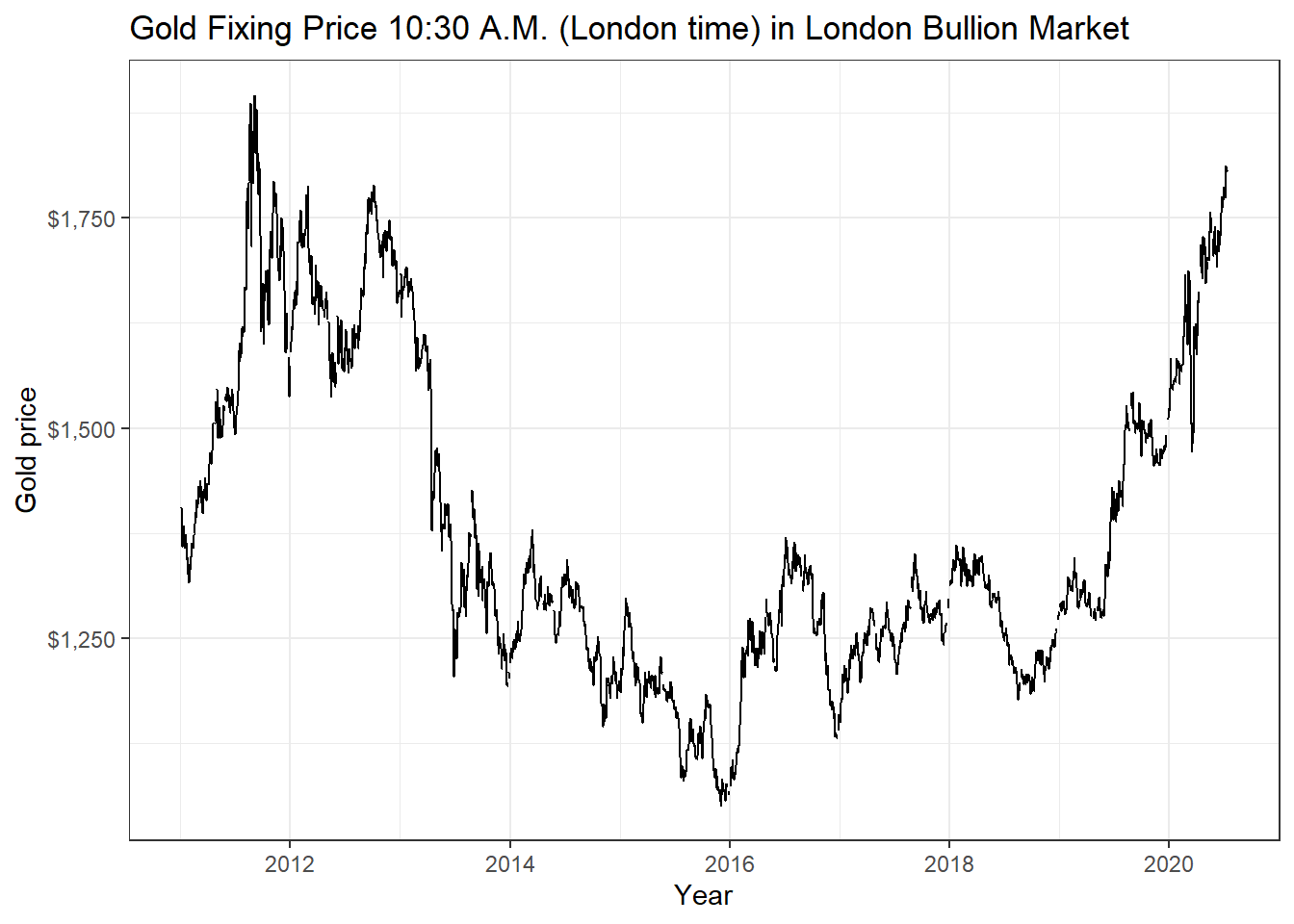
USDEUR_rate <-   tq_get("DEXUSEU", get = "economic.data",
                        from = "2011-01-01",
                        to   = "2020-07-14")

ggplot(USDEUR_rate, aes(x=date, y=price)) +
  geom_line()+
  labs(x="Year",
       y="Exchange rate",
       title = "USD to EUR Exchange Rate")+
  scale_y_continuous(labels = scales::dollar)+
  guides(fill=guide_legend(title=NULL))+
  theme_bw()+
  NULL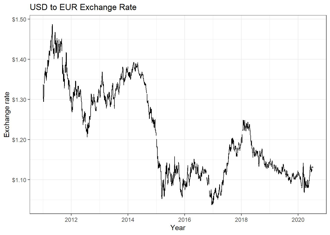
Now suppose we wanted to check if there is any correlation between natgas spot prices, WTI, and Gold prices. We will download prices, then calculate returns, calculate statistics on daily returns, and visualise some of the returns.
commodities <- c("DHHNGSP", "DCOILWTICO", "GOLDAMGBD228NLBM")

commodities_prices  <- tq_get(commodities, get = "economic.data",
                              from = "2011-01-01",
                              to   = "2020-07-14") %>%
  group_by(symbol)


commodities_returns_daily <- commodities_prices %>% na.omit() %>%
  tq_transmute(select     = price,
               mutate_fun = periodReturn,
               period     = "daily",
               type       = "log",
               col_rename = "daily.returns")

#calculate monthly  returns
commodities_returns_monthly <- commodities_prices %>%
  tq_transmute(select     = price,
               mutate_fun = periodReturn,
               period     = "monthly",
               type       = "arithmetic",
               col_rename = "monthly.returns")

favstats(daily.returns ~ symbol,  data=commodities_returns_daily) %>%
  mutate(
    annual_mean = mean *250,
    annual_sd = sd * sqrt(250)
  ) %>%
  select(symbol, min, median, max, mean, sd, annual_mean, annual_sd)  %>%
  kable() %>%
kable_styling(c("striped", "bordered")) | symbol | min | median | max | mean | sd | annual_mean | annual_sd |
|---|---|---|---|---|---|---|---|
| DCOILWTICO | -0.281 | 0 | 0.426 | 0 | 0.030 | -0.010 | 0.475 |
| DHHNGSP | -0.476 | 0 | 0.525 | 0 | 0.042 | -0.098 | 0.669 |
| GOLDAMGBD228NLBM | -0.089 | 0 | 0.068 | 0 | 0.010 | 0.026 | 0.154 |
ggplot(commodities_returns_daily, aes(x=daily.returns, fill=symbol))+
  geom_density()+
  coord_cartesian(xlim=c(-0.05,0.05)) +
  scale_x_continuous(labels = scales::percent_format(accuracy = 2))+
  facet_grid(rows = (vars(symbol))) +
  theme_bw()+
  labs(x="Daily Returns",
       y="Density",
       title = "Charting the Distribution of Daily Log Returns")+
  guides(fill=FALSE) +
  NULL
ggplot(commodities_returns_daily, aes(x=symbol, y=daily.returns))+
  geom_boxplot(aes(colour=symbol))+
  coord_flip()+
  scale_y_continuous(labels = scales::percent_format(accuracy = 2))+
  theme_bw()+
  labs(x="Daily Returns",
       y="",
       title = "Boxplot of Daily Log Returns")+
  theme(legend.position="none") +
  NULL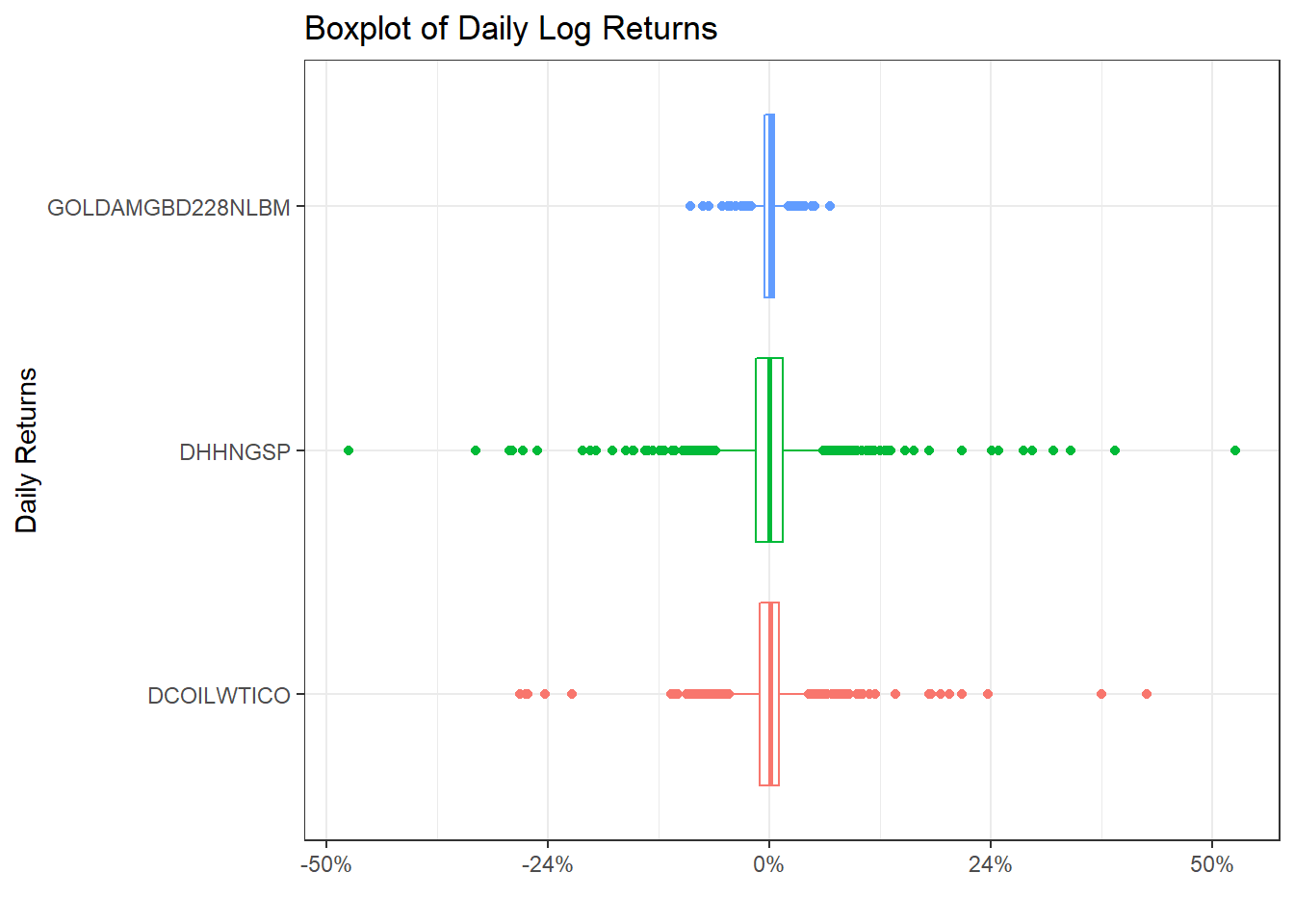
commodities_returns_daily %>%
  pivot_wider(names_from="symbol", values_from="daily.returns") %>%
  na.omit() %>%
  select(-date) %>%
  dplyr::rename(
    "NatGas" = 'DHHNGSP',
    "WTI Oil" = 'DCOILWTICO',
    "Gold" = 'GOLDAMGBD228NLBM'
  ) %>%
  ggpairs()+
  theme_bw()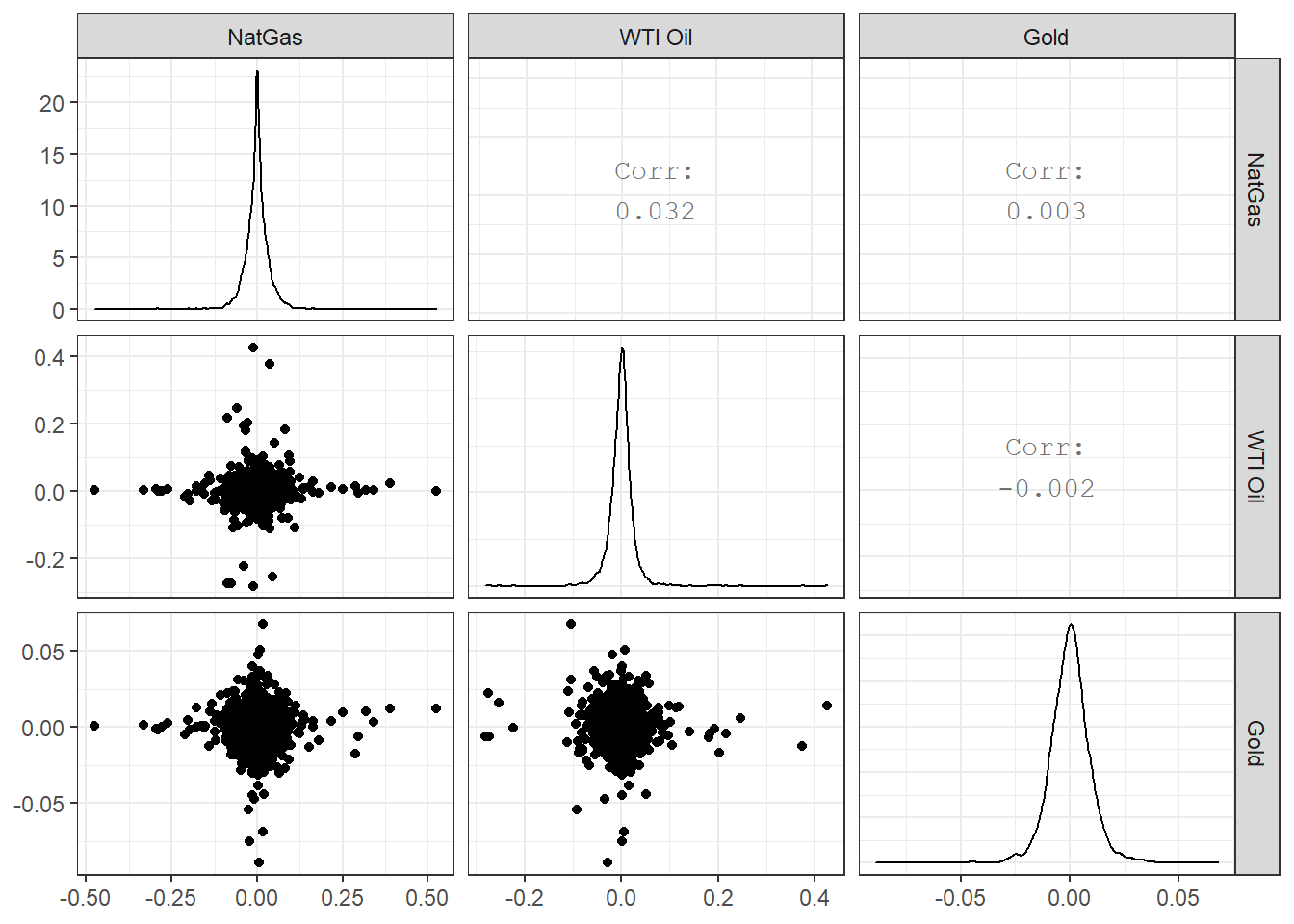
13.3 World Bank Data with the wbstats package
The World Bank is one of the world’s largest producers of development data and research. It is a great source of global socio-economic data, spanning several decades and many topics. For example, you can read their 2018 Atlas of Sustainable Development Goals or a blog post on their all-new visual guide to data and development.
The wbstats package allows you to search for and download any open World Bank dataset. To identiy the actual indicator you want, you have to find its code either in the World Bank datacatalog or, even better, through wbstats.
Suppose we wanted to get data on population growth. Manually, we would navigate to the World Bank datacatalog website, and search for population growth.
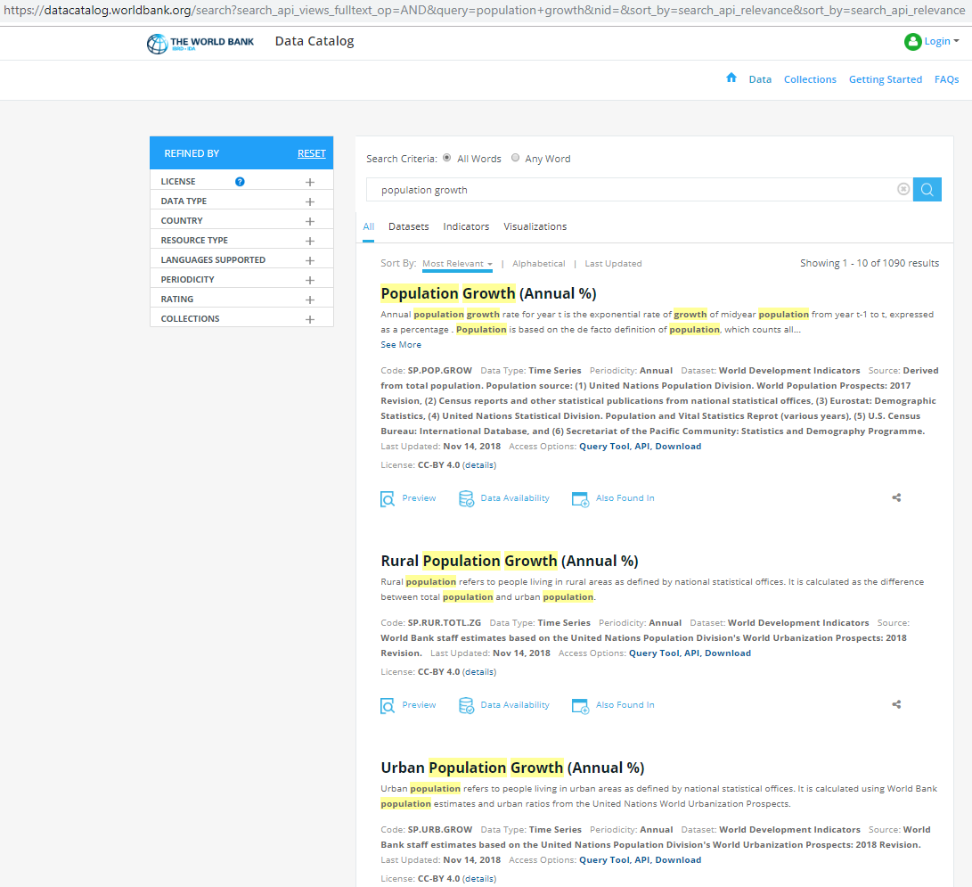
We get various results, but the more important ones are usually at the top with data on Population Growth (Annual %) with code SP.POP.GROW, on Rural Population Growth (Annual %) with code SP.RUR.TOTL.ZG, and on Urban Population Growth (Annual %) with code SP.URB.GROW.
Alternatively, we would load the wbstats package, and use pop_growth_codes <- wbsearch(pattern = "population growth") to get a dataframe with the codes that the search function returns.
##              indicatorID                          indicator
## 4368         SP.URB.GROW Urban population growth (annual %)
## 4382      SP.RUR.TOTL.ZG Rural population growth (annual %)
## 4415         SP.POP.GROW       Population growth (annual %)
## 8825 IN.EC.POP.GRWTHRAT.   Decadal Growth of Population (%)
Either way, the indicator we are interested in is Population Growth Annual and its code = SP.POP.GROW. The next step is to download the data with the wbstats::wb() function.
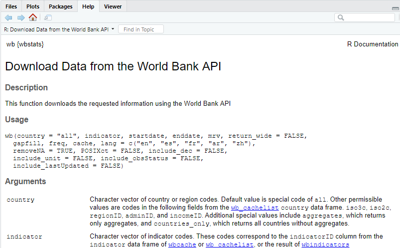
The first argument the wb function takes is a list of countries; if left empty, is will download all data for individual countries and aggregate regions like Arab World, Euro area, etc. In our example, let us download data for individuals countries only starting at 1970 and ending in 2017.
# Download data for Population Growth Annual% SP.POP.GROW
pop_growth_data <- wb(country = "countries_only", indicator = "SP.POP.GROW", startdate = 1970, enddate = 2017)

glimpse(pop_growth_data)
## Rows: 10,335
## Columns: 7
## $ iso3c <chr> "ABW", "ABW", "ABW", "ABW", "ABW", "ABW", "ABW", "ABW", "ABW", "ABW", "ABW", "ABW", "ABW", "ABW", "ABW", "ABW",...
## $ date <chr> "2017", "2016", "2015", "2014", "2013", "2012", "2011", "2010", "2009", "2008", "2007", "2006", "2005", "2004",...
## $ value <dbl> 0.4699, 0.5076, 0.5449, 0.5944, 0.5823, 0.5024, 0.3701, 0.2107, 0.0957, 0.1343, 0.3841, 0.7995, 1.3020, 1.7574,...
## $ indicatorID <chr> "SP.POP.GROW", "SP.POP.GROW", "SP.POP.GROW", "SP.POP.GROW", "SP.POP.GROW", "SP.POP.GROW", "SP.POP.GROW", "SP.PO...
## $ indicator <chr> "Population growth (annual %)", "Population growth (annual %)", "Population growth (annual %)", "Population gro...
## $ iso2c <chr> "AW", "AW", "AW", "AW", "AW", "AW", "AW", "AW", "AW", "AW", "AW", "AW", "AW", "AW", "AW", "AW", "AW", "AW", "AW...
## $ country <chr> "Aruba", "Aruba", "Aruba", "Aruba", "Aruba", "Aruba", "Aruba", "Aruba", "Aruba", "Aruba", "Aruba", "Aruba", "Ar...The wb_cachelist is a cached version of useful information from the World Bank API and provides a snapshot of available countries, indicators, and other relevant information. The structure of wb_cachelist is as follows
## List of 7
##  $ countries  :'data.frame': 304 obs. of  18 variables:
##  $ indicators :'data.frame': 16978 obs. of  7 variables:
##  $ sources    :'data.frame': 43 obs. of  8 variables:
##  $ datacatalog:'data.frame': 238 obs. of  29 variables:
##  $ topics     :'data.frame': 21 obs. of  3 variables:
##  $ income     :'data.frame': 7 obs. of  3 variables:
##  $ lending    :'data.frame': 4 obs. of  3 variables:
and as we can see it contains data on countries and aggregate regions, well over 16,000 indicators, etc. If we wanted to see the data on countries, let us create a dataframecountries` and glimpse its contents.
## Rows: 304
## Columns: 18
## $ iso3c         <chr> "ABW", "AFG", "AFR", "AGO", "ALB", "AND", "ANR", "ARB", "ARE", "ARG", "ARM", "ASM", "ATG", "AUS", "AUT", "AZE...
## $ iso2c         <chr> "AW", "AF", "A9", "AO", "AL", "AD", "L5", "1A", "AE", "AR", "AM", "AS", "AG", "AU", "AT", "AZ", "BI", "B4", "...
## $ country       <chr> "Aruba", "Afghanistan", "Africa", "Angola", "Albania", "Andorra", "Andean Region", "Arab World", "United Arab...
## $ capital       <chr> "Oranjestad", "Kabul", NA, "Luanda", "Tirane", "Andorra la Vella", NA, NA, "Abu Dhabi", "Buenos Aires", "Yere...
## $ long          <chr> "-70.0167", "69.1761", NA, "13.242", "19.8172", "1.5218", NA, NA, "54.3705", "-58.4173", "44.509", "-170.691"...
## $ lat           <chr> "12.5167", "34.5228", NA, "-8.81155", "41.3317", "42.5075", NA, NA, "24.4764", "-34.6118", "40.1596", "-14.28...
## $ regionID      <chr> "LCN", "SAS", NA, "SSF", "ECS", "ECS", NA, NA, "MEA", "LCN", "ECS", "EAS", "LCN", "EAS", "ECS", "ECS", "SSF",...
## $ region_iso2c  <chr> "ZJ", "8S", NA, "ZG", "Z7", "Z7", NA, NA, "ZQ", "ZJ", "Z7", "Z4", "ZJ", "Z4", "Z7", "Z7", "ZG", NA, NA, "Z7",...
## $ region        <chr> "Latin America & Caribbean ", "South Asia", "Aggregates", "Sub-Saharan Africa ", "Europe & Central Asia", "Eu...
## $ adminID       <chr> NA, "SAS", NA, "SSA", "ECA", NA, NA, NA, NA, "LAC", "ECA", "EAP", NA, NA, NA, "ECA", "SSA", NA, NA, NA, "SSA"...
## $ admin_iso2c   <chr> NA, "8S", NA, "ZF", "7E", NA, NA, NA, NA, "XJ", "7E", "4E", NA, NA, NA, "7E", "ZF", NA, NA, NA, "ZF", "ZF", "...
## $ admin         <chr> NA, "South Asia", NA, "Sub-Saharan Africa (excluding high income)", "Europe & Central Asia (excluding high in...
## $ incomeID      <chr> "HIC", "LIC", NA, "LMC", "UMC", "HIC", NA, NA, "HIC", "UMC", "LMC", "UMC", "HIC", "HIC", "HIC", "UMC", "LIC",...
## $ income_iso2c  <chr> "XD", "XM", NA, "XN", "XT", "XD", NA, NA, "XD", "XT", "XN", "XT", "XD", "XD", "XD", "XT", "XM", NA, NA, "XD",...
## $ income        <chr> "High income", "Low income", "Aggregates", "Lower middle income", "Upper middle income", "High income", "Aggr...
## $ lendingID     <chr> "LNX", "IDX", NA, "IBD", "IBD", "LNX", NA, NA, "LNX", "IBD", "IBD", "LNX", "IBD", "LNX", "LNX", "IBD", "IDX",...
## $ lending_iso2c <chr> "XX", "XI", NA, "XF", "XF", "XX", NA, NA, "XX", "XF", "XF", "XX", "XF", "XX", "XX", "XF", "XI", NA, NA, "XX",...
## $ lending       <chr> "Not classified", "IDA", "Aggregates", "IBRD", "IBRD", "Not classified", "Aggregates", "Aggregates", "Not cla...
The dataframe contains the ISO country codes, the country name, its capital with its longitude and latitude, the region the country is in, the regions associated ISO code, as well as a classification on the income group, the country’s classification by income level, etc.
We can merge the dataframes pop_growth_data and countries with a left join, so we have a dataframe that contains data from both of them
countries <-  wb_cachelist$countries


# Merge with a left_join (a) country data with (b) population growth data
pop_growth <-
  left_join(countries, pop_growth_data, by="iso3c") %>%
              mutate(year = as.integer(date), #make year an integer, rather than a character value
                     long = as.numeric(long), #make longitude a decimal number, rather than a character value
                      lat = as.numeric(lat)) %>%  #make longitude a decimal number, rather than a character value
              select(iso3c, country.x, region, income, value, indicator, year, long, lat) %>%
              na.omit()
Let us calculate and plot the average population growth for all countries between 1970 and 2017, faceted by region.
average_pop_growth <- pop_growth %>%
              dplyr::group_by(region, country.x, iso3c, long, lat) %>%
              rename(lng = long) %>% #needed for mapping purposes; creating choropleths in leaflet
              summarise(average_growth = mean(value)) %>%
              arrange(average_growth) %>%
              ungroup()
## `summarise()` regrouping output by 'region', 'country.x', 'iso3c', 'lng' (override with `.groups` argument)ggplot(data = average_pop_growth, aes(x = reorder(country.x, average_growth), y = average_growth, fill = region))+
geom_col()+
coord_flip()+
theme_minimal(7)+
expand_limits(y=c(-1,8))+
facet_wrap(~region, nrow=4, scales="free")+
labs(title = 'Average annual population growth, 1970-2017',
x = "",
y = "Average Annual Population Growth (in %)",
caption = 'Source: Worldbank') +
theme(legend.position="none")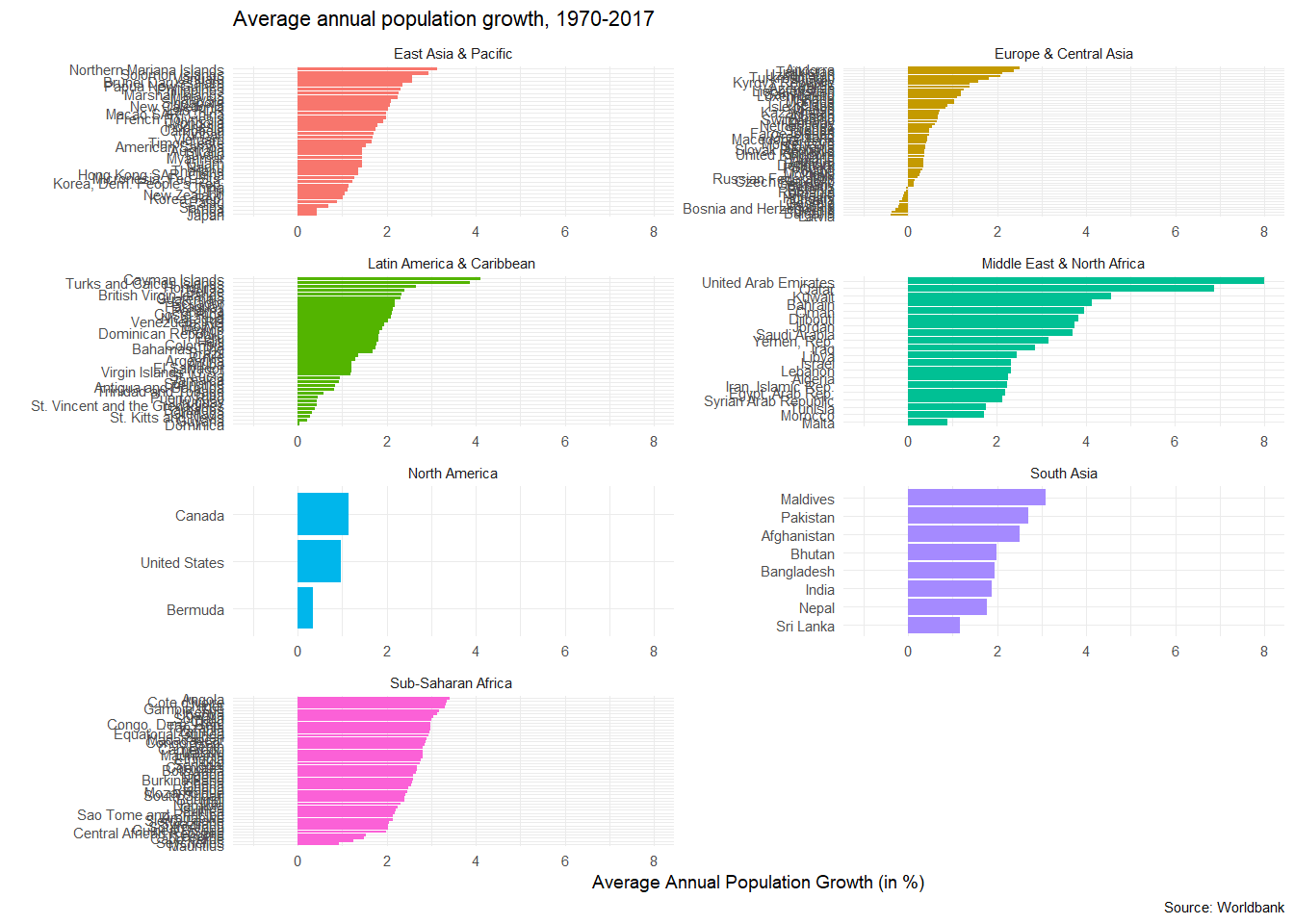
13.3.1 World Happiness: how does it correlate with various indicators
Data from the UN’s World Happiness Report is available at Kaggle. We have downloaded the 2015 report in a CSV file, and have a quick glimpse at its structure.
## Rows: 158
## Columns: 12
## $ Country                         <chr> "Switzerland", "Iceland", "Denmark", "Norway", "Canada", "Finland", "Netherlands", "Sweden"...
## $ Region                          <chr> "Western Europe", "Western Europe", "Western Europe", "Western Europe", "North America", "W...
## $ `Happiness Rank`                <dbl> 1, 2, 3, 4, 5, 6, 7, 8, 9, 10, 11, 12, 13, 14, 15, 16, 17, 18, 19, 20, 21, 22, 23, 24, 25, ...
## $ `Happiness Score`               <dbl> 7.59, 7.56, 7.53, 7.52, 7.43, 7.41, 7.38, 7.36, 7.29, 7.28, 7.28, 7.23, 7.20, 7.19, 7.12, 6...
## $ `Standard Error`                <dbl> 0.0341, 0.0488, 0.0333, 0.0388, 0.0355, 0.0314, 0.0280, 0.0316, 0.0337, 0.0408, 0.0347, 0.0...
## $ `Economy (GDP per Capita)`      <dbl> 1.397, 1.302, 1.325, 1.459, 1.326, 1.290, 1.329, 1.332, 1.250, 1.334, 1.229, 0.956, 1.337, ...
## $ Family                          <dbl> 1.350, 1.402, 1.361, 1.331, 1.323, 1.318, 1.280, 1.289, 1.320, 1.309, 1.224, 1.238, 1.297, ...
## $ `Health (Life Expectancy)`      <dbl> 0.941, 0.948, 0.875, 0.885, 0.906, 0.889, 0.893, 0.911, 0.908, 0.932, 0.914, 0.860, 0.890, ...
## $ Freedom                         <dbl> 0.666, 0.629, 0.649, 0.670, 0.633, 0.642, 0.616, 0.660, 0.639, 0.651, 0.413, 0.634, 0.624, ...
## $ `Trust (Government Corruption)` <dbl> 0.4198, 0.1414, 0.4836, 0.3650, 0.3296, 0.4137, 0.3181, 0.4384, 0.4292, 0.3564, 0.0779, 0.1...
## $ Generosity                      <dbl> 0.2968, 0.4363, 0.3414, 0.3470, 0.4581, 0.2335, 0.4761, 0.3626, 0.4750, 0.4356, 0.3317, 0.2...
## $ `Dystopia Residual`             <dbl> 2.52, 2.70, 2.49, 2.47, 2.45, 2.62, 2.47, 2.37, 2.26, 2.27, 3.09, 3.18, 2.53, 3.60, 2.51, 3...
As you notice, some of the variable names include a space, like Happiness Rank, all start with a capital letter, etc. We will use the janitor package to clean the variable names, so they are easier to deal with.
library(janitor)

world_happiness_2015 <- world_happiness_2015 %>%
  clean_names()

glimpse(world_happiness_2015)
## Rows: 158
## Columns: 12
## $ country <chr> "Switzerland", "Iceland", "Denmark", "Norway", "Canada", "Finland", "Netherlands", "Sweden", "N...
## $ region <chr> "Western Europe", "Western Europe", "Western Europe", "Western Europe", "North America", "Weste...
## $ happiness_rank <dbl> 1, 2, 3, 4, 5, 6, 7, 8, 9, 10, 11, 12, 13, 14, 15, 16, 17, 18, 19, 20, 21, 22, 23, 24, 25, 26, ...
## $ happiness_score <dbl> 7.59, 7.56, 7.53, 7.52, 7.43, 7.41, 7.38, 7.36, 7.29, 7.28, 7.28, 7.23, 7.20, 7.19, 7.12, 6.98,...
## $ standard_error <dbl> 0.0341, 0.0488, 0.0333, 0.0388, 0.0355, 0.0314, 0.0280, 0.0316, 0.0337, 0.0408, 0.0347, 0.0445,...
## $ economy_gdp_per_capita <dbl> 1.397, 1.302, 1.325, 1.459, 1.326, 1.290, 1.329, 1.332, 1.250, 1.334, 1.229, 0.956, 1.337, 1.02...
## $ family <dbl> 1.350, 1.402, 1.361, 1.331, 1.323, 1.318, 1.280, 1.289, 1.320, 1.309, 1.224, 1.238, 1.297, 0.91...
## $ health_life_expectancy <dbl> 0.941, 0.948, 0.875, 0.885, 0.906, 0.889, 0.893, 0.911, 0.908, 0.932, 0.914, 0.860, 0.890, 0.81...
## $ freedom <dbl> 0.666, 0.629, 0.649, 0.670, 0.633, 0.642, 0.616, 0.660, 0.639, 0.651, 0.413, 0.634, 0.624, 0.48...
## $ trust_government_corruption <dbl> 0.4198, 0.1414, 0.4836, 0.3650, 0.3296, 0.4137, 0.3181, 0.4384, 0.4292, 0.3564, 0.0779, 0.1058,...
## $ generosity <dbl> 0.2968, 0.4363, 0.3414, 0.3470, 0.4581, 0.2335, 0.4761, 0.3626, 0.4750, 0.4356, 0.3317, 0.2550,...
## $ dystopia_residual <dbl> 2.52, 2.70, 2.49, 2.47, 2.45, 2.62, 2.47, 2.37, 2.26, 2.27, 3.09, 3.18, 2.53, 3.60, 2.51, 3.26,...First, we can look how happiness_score correlates with its of the variables the UN uses. We will use GGally:ggpairs() to get a correlation- scatterplot matrix. We do not want to include in our analyses the country name, its region, the happiness_rank and the standard error associated with the estimate of the happiness score.
world_happiness_2015 %>%
  select(-country, -region, -happiness_rank, -standard_error) %>%
  GGally::ggpairs()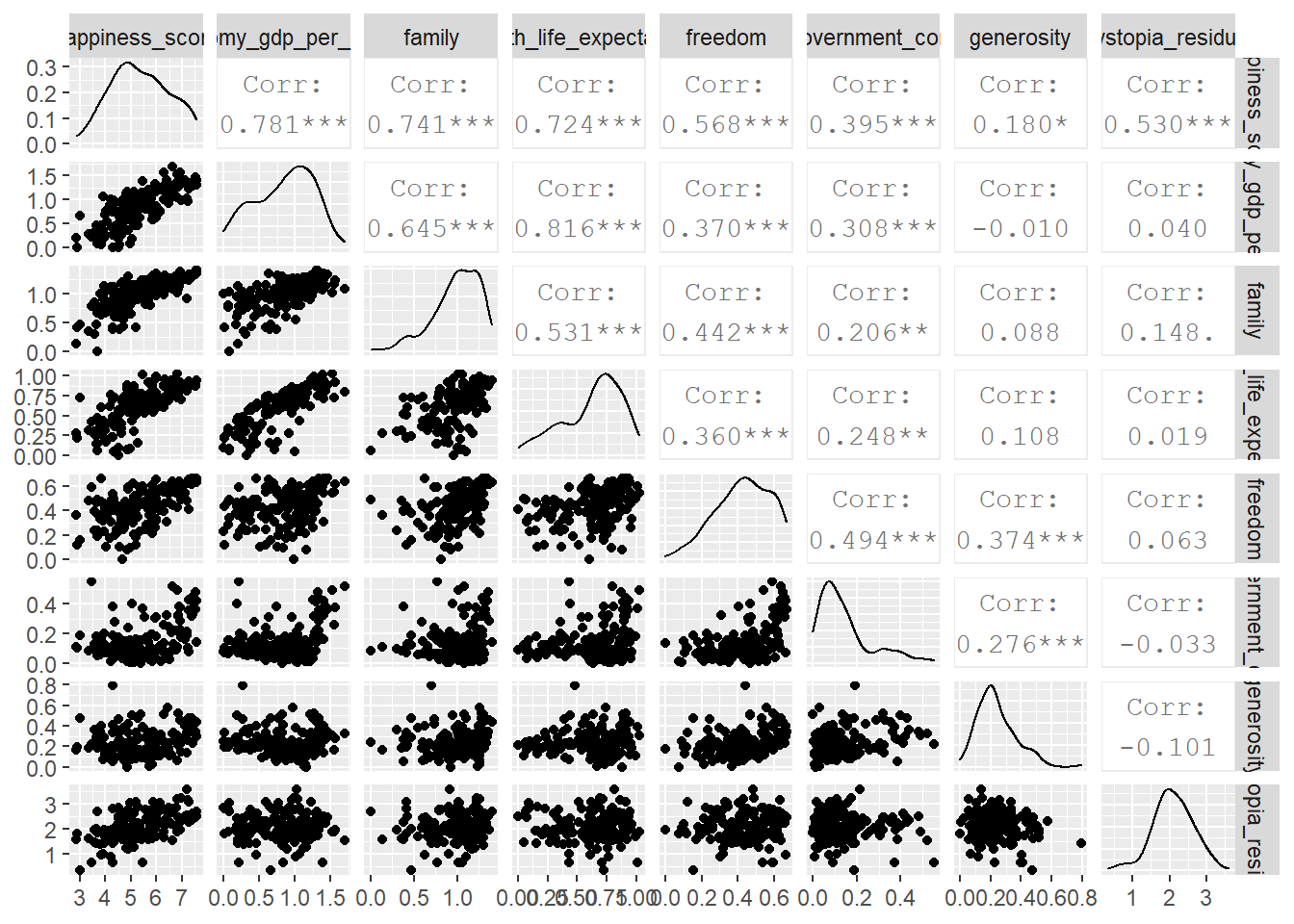
We will now choose six (6) indicators form the World Bank data, downloads their values for 2015 and see how these correlate with the overall happiness score.
# Download data for the following indicators

indicators <- c("SE.PRM.NENR",     # School enrollment, primary (% net)
                "SP.DYN.LE00.IN",  # Life expectancy
                "SI.POV.DDAY",     # Extreme poverty (% earning less than $2/day)
                "EG.ELC.ACCS.ZS",  # Access to electricity
                "SI.POV.GINI",     # GINI Index
                "NY.GDP.PCAP.KD")  # GDP per capita

happiness_data_WB <- wb(country = "countries_only", indicator = indicators, startdate = 2015, enddate = 2015)


glimpse(happiness_data_WB)
## Rows: 910
## Columns: 7
## $ iso3c <chr> "ALB", "ARE", "ARG", "ARM", "ATG", "AUS", "AUT", "AZE", "BEL", "BFA", "BGR", "BHR", "BHS", "BLR", "BLZ", "BOL",...
## $ date <chr> "2015", "2015", "2015", "2015", "2015", "2015", "2015", "2015", "2015", "2015", "2015", "2015", "2015", "2015",...
## $ value <dbl> 94.2, 93.7, 99.5, 92.7, 94.2, 97.0, 88.6, 94.1, 98.1, 69.4, 90.4, 96.5, 79.8, 94.0, 96.2, 87.3, 94.7, 93.8, 92....
## $ indicatorID <chr> "SE.PRM.NENR", "SE.PRM.NENR", "SE.PRM.NENR", "SE.PRM.NENR", "SE.PRM.NENR", "SE.PRM.NENR", "SE.PRM.NENR", "SE.PR...
## $ indicator <chr> "School enrollment, primary (% net)", "School enrollment, primary (% net)", "School enrollment, primary (% net)...
## $ iso2c <chr> "AL", "AE", "AR", "AM", "AG", "AU", "AT", "AZ", "BE", "BF", "BG", "BH", "BS", "BY", "BZ", "BO", "BR", "BB", "BN...
## $ country <chr> "Albania", "United Arab Emirates", "Argentina", "Armenia", "Antigua and Barbuda", "Australia", "Austria", "Azer...In order to get the two dataframes to combine into one, they have to have a shared column/ variable. We will merge the two datasets with a left_join() by “country”, and glimpse the structure of the resulting dataframe.
# Merge with a left_join (a) happiness data with all indicators and (b) the 2015 World Happiness index

happiness <-
  left_join(happiness_data_WB, world_happiness_2015, by="country") %>%
  na.omit()


glimpse(happiness)
## Rows: 645
## Columns: 18
## $ iso3c <chr> "ALB", "ARE", "ARG", "ARM", "AUS", "AUT", "AZE", "BEL", "BFA", "BGR", "BHR", "BLR", "BOL", "BRA...
## $ date <chr> "2015", "2015", "2015", "2015", "2015", "2015", "2015", "2015", "2015", "2015", "2015", "2015",...
## $ value <dbl> 94.2, 93.7, 99.5, 92.7, 97.0, 88.6, 94.1, 98.1, 69.4, 90.4, 96.5, 94.0, 87.3, 94.7, 88.2, 99.6,...
## $ indicatorID <chr> "SE.PRM.NENR", "SE.PRM.NENR", "SE.PRM.NENR", "SE.PRM.NENR", "SE.PRM.NENR", "SE.PRM.NENR", "SE.P...
## $ indicator <chr> "School enrollment, primary (% net)", "School enrollment, primary (% net)", "School enrollment,...
## $ iso2c <chr> "AL", "AE", "AR", "AM", "AU", "AT", "AZ", "BE", "BF", "BG", "BH", "BY", "BO", "BR", "BT", "CA",...
## $ country <chr> "Albania", "United Arab Emirates", "Argentina", "Armenia", "Australia", "Austria", "Azerbaijan"...
## $ region <chr> "Central and Eastern Europe", "Middle East and Northern Africa", "Latin America and Caribbean",...
## $ happiness_rank <dbl> 95, 20, 30, 127, 10, 13, 80, 19, 152, 134, 49, 59, 51, 16, 79, 5, 1, 27, 133, 33, 12, 67, 31, 2...
## $ happiness_score <dbl> 4.96, 6.90, 6.57, 4.35, 7.28, 7.20, 5.21, 6.94, 3.59, 4.22, 5.96, 5.81, 5.89, 6.98, 5.25, 7.43,...
## $ standard_error <dbl> 0.0501, 0.0373, 0.0461, 0.0476, 0.0408, 0.0375, 0.0336, 0.0360, 0.0432, 0.0483, 0.0541, 0.0394,...
## $ economy_gdp_per_capita <dbl> 0.879, 1.427, 1.054, 0.768, 1.334, 1.337, 1.024, 1.308, 0.258, 1.012, 1.324, 1.032, 0.681, 0.98...
## $ family <dbl> 0.804, 1.126, 1.248, 0.777, 1.309, 1.297, 0.938, 1.286, 0.852, 1.106, 1.216, 1.233, 0.978, 1.23...
## $ health_life_expectancy <dbl> 0.813, 0.809, 0.787, 0.730, 0.932, 0.890, 0.640, 0.897, 0.271, 0.766, 0.747, 0.736, 0.539, 0.69...
## $ freedom <dbl> 0.357, 0.642, 0.450, 0.198, 0.651, 0.624, 0.370, 0.585, 0.395, 0.306, 0.455, 0.379, 0.574, 0.49...
## $ trust_government_corruption <dbl> 0.06413, 0.38583, 0.08484, 0.03900, 0.35637, 0.18676, 0.16065, 0.22540, 0.12832, 0.00872, 0.306...
## $ generosity <dbl> 0.1427, 0.2643, 0.1145, 0.0785, 0.4356, 0.3309, 0.0780, 0.2225, 0.2175, 0.1192, 0.1736, 0.1105,...
## $ dystopia_residual <dbl> 1.90, 2.25, 2.84, 1.76, 2.27, 2.53, 2.00, 2.41, 1.46, 0.90, 1.74, 2.13, 2.82, 3.26, 1.64, 2.45,...We can create a histogram of happiness_score by region
ggplot(data = happiness, aes(x = happiness_score , fill=region))+
  geom_histogram()+
  # geom_smooth(se=FALSE)+
  theme_minimal()+
  facet_wrap(~region,nrow=5) +
  labs(title = '2015 World Happiness',
       x = "",
       y = "Total Happiness Score",
       caption = 'Source: Worldbank') +
  theme(legend.position="none")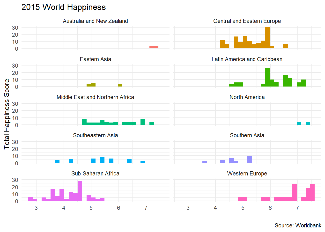
We can also create a scatterplot of happiness_score against all the indicators we have downloaded.
ggplot(data = happiness, aes(x = value, y = happiness_score , colour=indicator))+
  geom_point()+
  geom_smooth(se=FALSE)+
  theme_minimal()+
  facet_wrap(~indicator,scales="free") +
  labs(title = '2015 World Happiness',
       x = "",
       y = "Total Happiness Score",
       caption = 'Source: Worldbank') +
  theme(legend.position="none")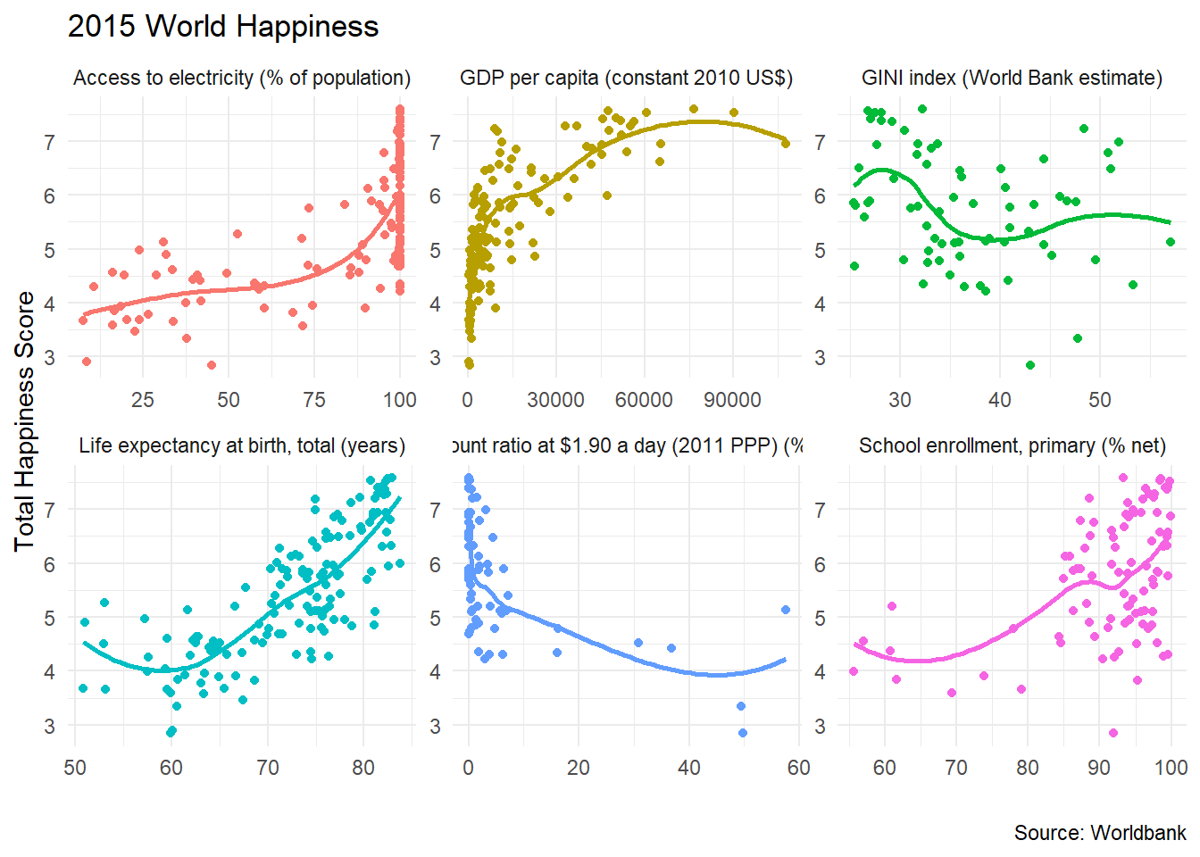
13.4 Eurostat Data with the eurostat package
The eurostat package provides access to well over 9000 datasets from the Eurostat. It may seem a challenging task to find the correct dataset, but you are essentially looking for the code that describes the dataset. We an get a table of contents, namely all of th ecodes contained in the eurostat database.
library(eurostat)
library(fpp2) # for time series decomposition
library(seasonal)
library(tmap) #mapping eurostat data

# Get Eurostat data listing
# Function get_eurostat_toc() downloads a table of contents of eurostat datasets.
# The values in column ‘code’ should be used to download a selected dataset.
toc <- get_eurostat_toc()

# Check the first 20 rows
head(toc, 20) %>%
kable()| title | code | type | last update of data | last table structure change | data start | data end | values |
|---|---|---|---|---|---|---|---|
| Database by themes | data | folder | NA | NA | NA | NA | NA |
| General and regional statistics | general | folder | NA | NA | NA | NA | NA |
| European and national indicators for short-term analysis | euroind | folder | NA | NA | NA | NA | NA |
| Business and consumer surveys (source: DG ECFIN) | ei_bcs | folder | NA | NA | NA | NA | NA |
| Consumer surveys (source: DG ECFIN) | ei_bcs_cs | folder | NA | NA | NA | NA | NA |
| Consumers - monthly data | ei_bsco_m | dataset | 29.06.2020 | 29.06.2020 | 1980M01 | 2020M06 | NA |
| Consumers - quarterly data | ei_bsco_q | dataset | 29.06.2020 | 29.04.2020 | 1990Q1 | 2020Q2 | NA |
| Business surveys - NACE Rev. 2 activity (source: DG ECFIN) | ei_bcs_bs | folder | NA | NA | NA | NA | NA |
| Industry - monthly data | ei_bsin_m_r2 | dataset | 29.06.2020 | 29.06.2020 | 1980M01 | 2020M06 | NA |
| Industry - quarterly data | ei_bsin_q_r2 | dataset | 29.06.2020 | 29.04.2020 | 1980Q1 | 2020Q2 | NA |
| Construction - monthly data | ei_bsbu_m_r2 | dataset | 29.06.2020 | 29.06.2020 | 1980M01 | 2020M06 | NA |
| Construction - quarterly data | ei_bsbu_q_r2 | dataset | 29.06.2020 | 29.04.2020 | 1981Q1 | 2020Q2 | NA |
| Retail sale - monthly data | ei_bsrt_m_r2 | dataset | 29.06.2020 | 29.06.2020 | 1984M01 | 2020M06 | NA |
| Sentiment indicators - monthly data | ei_bssi_m_r2 | dataset | 29.06.2020 | 29.06.2020 | 1980M01 | 2020M06 | NA |
| Services - monthly data | ei_bsse_m_r2 | dataset | 29.06.2020 | 29.06.2020 | 1988M01 | 2020M06 | NA |
| Services - quarterly data | ei_bsse_q_r2 | dataset | 29.06.2020 | 29.04.2020 | 2001Q2 | 2020Q2 | NA |
| Euro-zone Business Climate Indicator - monthly data | ei_bsci_m_r2 | dataset | 29.06.2020 | 29.06.2020 | 1985M01 | 2020M06 | NA |
| Financial services - monthly data | ei_bsfs_m | dataset | 29.06.2020 | 29.06.2020 | 2006M04 | 2020M06 | NA |
| Financial services - quarterly data | ei_bsfs_q | dataset | 29.06.2020 | 29.04.2020 | 2007Q3 | 2020Q2 | NA |
| Employment expectations indicator | ei_bsee_m_r2 | dataset | 29.06.2020 | 29.06.2020 | 1980M01 | 2020M06 | NA |
13.4.1 House Price Index (HPI)
The Eurostat House Price Index (HPI) measures price changes of all residential properties purchased by households (flats, detached houses, terraced houses, etc.), both new and existing, independently of their final use and their previous owners. First, we node that the code id for this dataset is teicp270. Once we know the relevant code id, we can download eurostat data using the get_eurostat(id) function.
## Rows: 1,257
## Columns: 5
## $ indic  <chr> "TOTAL", "TOTAL", "TOTAL", "TOTAL", "TOTAL", "TOTAL", "TOTAL", "TOTAL", "TOTAL", "TOTAL", "TOTAL", "TOTAL", "TOTAL",...
## $ unit   <chr> "I15_NSA", "I15_NSA", "I15_NSA", "I15_NSA", "I15_NSA", "I15_NSA", "I15_NSA", "I15_NSA", "I15_NSA", "I15_NSA", "I15_N...
## $ geo    <chr> "AT", "BE", "BG", "CY", "CZ", "DE", "DK", "EA", "EA19", "EE", "ES", "EU", "EU27_2020", "EU28", "FI", "FR", "HR", "HU...
## $ time   <date> 2017-04-01, 2017-04-01, 2017-04-01, 2017-04-01, 2017-04-01, 2017-04-01, 2017-04-01, 2017-04-01, 2017-04-01, 2017-04...
## $ values <dbl> 114.2, 104.7, 115.4, 102.7, 119.1, 113.1, 110.5, 107.8, 107.8, 108.4, 110.4, 109.0, 108.7, 109.0, 103.0, 103.4, 104....| indic | unit | geo | time | values |
|---|---|---|---|---|
| TOTAL | I15_NSA | AT | 2017-04-01 | 114.2 |
| TOTAL | I15_NSA | BE | 2017-04-01 | 104.7 |
| TOTAL | I15_NSA | BG | 2017-04-01 | 115.4 |
| TOTAL | I15_NSA | CY | 2017-04-01 | 102.7 |
| TOTAL | I15_NSA | CZ | 2017-04-01 | 119.1 |
| TOTAL | I15_NSA | DE | 2017-04-01 | 113.1 |
| TOTAL | I15_NSA | DK | 2017-04-01 | 110.5 |
| TOTAL | I15_NSA | EA | 2017-04-01 | 107.8 |
| TOTAL | I15_NSA | EA19 | 2017-04-01 | 107.8 |
| TOTAL | I15_NSA | EE | 2017-04-01 | 108.4 |
| TOTAL | I15_NSA | ES | 2017-04-01 | 110.4 |
| TOTAL | I15_NSA | EU | 2017-04-01 | 109.0 |
| TOTAL | I15_NSA | EU27_2020 | 2017-04-01 | 108.7 |
| TOTAL | I15_NSA | EU28 | 2017-04-01 | 109.0 |
| TOTAL | I15_NSA | FI | 2017-04-01 | 103.0 |
| TOTAL | I15_NSA | FR | 2017-04-01 | 103.4 |
| TOTAL | I15_NSA | HR | 2017-04-01 | 104.5 |
| TOTAL | I15_NSA | HU | 2017-04-01 | 125.5 |
| TOTAL | I15_NSA | IE | 2017-04-01 | 115.9 |
| TOTAL | I15_NSA | IS | 2017-04-01 | 130.1 |
| TOTAL | I15_NSA | IT | 2017-04-01 | 99.6 |
| TOTAL | I15_NSA | LT | 2017-04-01 | 114.5 |
| TOTAL | I15_NSA | LU | 2017-04-01 | 112.2 |
| TOTAL | I15_NSA | LV | 2017-04-01 | 119.5 |
| TOTAL | I15_NSA | MT | 2017-04-01 | 108.9 |
| TOTAL | I15_NSA | NL | 2017-04-01 | 111.4 |
| TOTAL | I15_NSA | NO | 2017-04-01 | 115.5 |
| TOTAL | I15_NSA | PL | 2017-04-01 | 105.4 |
| TOTAL | I15_NSA | PT | 2017-04-01 | 115.5 |
| TOTAL | I15_NSA | RO | 2017-04-01 | 114.3 |
| TOTAL | I15_NSA | SE | 2017-04-01 | 116.0 |
| TOTAL | I15_NSA | SI | 2017-04-01 | 111.4 |
| TOTAL | I15_NSA | SK | 2017-04-01 | 113.1 |
| TOTAL | I15_NSA | TR | 2017-04-01 | 124.3 |
| TOTAL | I15_NSA | UK | 2017-04-01 | 111.2 |
| TOTAL | PCH_Q1_NSA | AT | 2017-04-01 | 2.4 |
| TOTAL | PCH_Q1_NSA | BE | 2017-04-01 | -0.3 |
| TOTAL | PCH_Q1_NSA | BG | 2017-04-01 | 2.4 |
| TOTAL | PCH_Q1_NSA | CY | 2017-04-01 | 3.1 |
| TOTAL | PCH_Q1_NSA | CZ | 2017-04-01 | 2.5 |
Typically, the downloaded data has codes and abbreviations for all of the variables, but we can use label_eurostat to get a more verbose description.
| indic | unit | geo | time | values |
|---|---|---|---|---|
| Total | Index, 2015=100 (NSA) | Austria | 2017-04-01 | 114.2 |
| Total | Index, 2015=100 (NSA) | Belgium | 2017-04-01 | 104.7 |
| Total | Index, 2015=100 (NSA) | Bulgaria | 2017-04-01 | 115.4 |
| Total | Index, 2015=100 (NSA) | Cyprus | 2017-04-01 | 102.7 |
| Total | Index, 2015=100 (NSA) | Czechia | 2017-04-01 | 119.1 |
| Total | Index, 2015=100 (NSA) | Germany (until 1990 former territory of the FRG) | 2017-04-01 | 113.1 |
| Total | Index, 2015=100 (NSA) | Denmark | 2017-04-01 | 110.5 |
| Total | Index, 2015=100 (NSA) | Euro area (EA11-1999, EA12-2001, EA13-2007, EA15-2008, EA16-2009, EA17-2011, EA18-2014, EA19-2015) | 2017-04-01 | 107.8 |
| Total | Index, 2015=100 (NSA) | Euro area - 19 countries (from 2015) | 2017-04-01 | 107.8 |
| Total | Index, 2015=100 (NSA) | Estonia | 2017-04-01 | 108.4 |
| Total | Index, 2015=100 (NSA) | Spain | 2017-04-01 | 110.4 |
| Total | Index, 2015=100 (NSA) | European Union (EU6-1958, EU9-1973, EU10-1981, EU12-1986, EU15-1995, EU25-2004, EU27-2007, EU28-2013, EU27-2020) | 2017-04-01 | 109.0 |
| Total | Index, 2015=100 (NSA) | European Union - 27 countries (from 2020) | 2017-04-01 | 108.7 |
| Total | Index, 2015=100 (NSA) | European Union - 28 countries (2013-2020) | 2017-04-01 | 109.0 |
| Total | Index, 2015=100 (NSA) | Finland | 2017-04-01 | 103.0 |
| Total | Index, 2015=100 (NSA) | France | 2017-04-01 | 103.4 |
| Total | Index, 2015=100 (NSA) | Croatia | 2017-04-01 | 104.5 |
| Total | Index, 2015=100 (NSA) | Hungary | 2017-04-01 | 125.5 |
| Total | Index, 2015=100 (NSA) | Ireland | 2017-04-01 | 115.9 |
| Total | Index, 2015=100 (NSA) | Iceland | 2017-04-01 | 130.1 |
| Total | Index, 2015=100 (NSA) | Italy | 2017-04-01 | 99.6 |
| Total | Index, 2015=100 (NSA) | Lithuania | 2017-04-01 | 114.5 |
| Total | Index, 2015=100 (NSA) | Luxembourg | 2017-04-01 | 112.2 |
| Total | Index, 2015=100 (NSA) | Latvia | 2017-04-01 | 119.5 |
| Total | Index, 2015=100 (NSA) | Malta | 2017-04-01 | 108.9 |
| Total | Index, 2015=100 (NSA) | Netherlands | 2017-04-01 | 111.4 |
| Total | Index, 2015=100 (NSA) | Norway | 2017-04-01 | 115.5 |
| Total | Index, 2015=100 (NSA) | Poland | 2017-04-01 | 105.4 |
| Total | Index, 2015=100 (NSA) | Portugal | 2017-04-01 | 115.5 |
| Total | Index, 2015=100 (NSA) | Romania | 2017-04-01 | 114.3 |
| Total | Index, 2015=100 (NSA) | Sweden | 2017-04-01 | 116.0 |
| Total | Index, 2015=100 (NSA) | Slovenia | 2017-04-01 | 111.4 |
| Total | Index, 2015=100 (NSA) | Slovakia | 2017-04-01 | 113.1 |
| Total | Index, 2015=100 (NSA) | Turkey | 2017-04-01 | 124.3 |
| Total | Index, 2015=100 (NSA) | United Kingdom | 2017-04-01 | 111.2 |
| Total | Percentage change q/q-1 (NSA) | Austria | 2017-04-01 | 2.4 |
| Total | Percentage change q/q-1 (NSA) | Belgium | 2017-04-01 | -0.3 |
| Total | Percentage change q/q-1 (NSA) | Bulgaria | 2017-04-01 | 2.4 |
| Total | Percentage change q/q-1 (NSA) | Cyprus | 2017-04-01 | 3.1 |
| Total | Percentage change q/q-1 (NSA) | Czechia | 2017-04-01 | 2.5 |
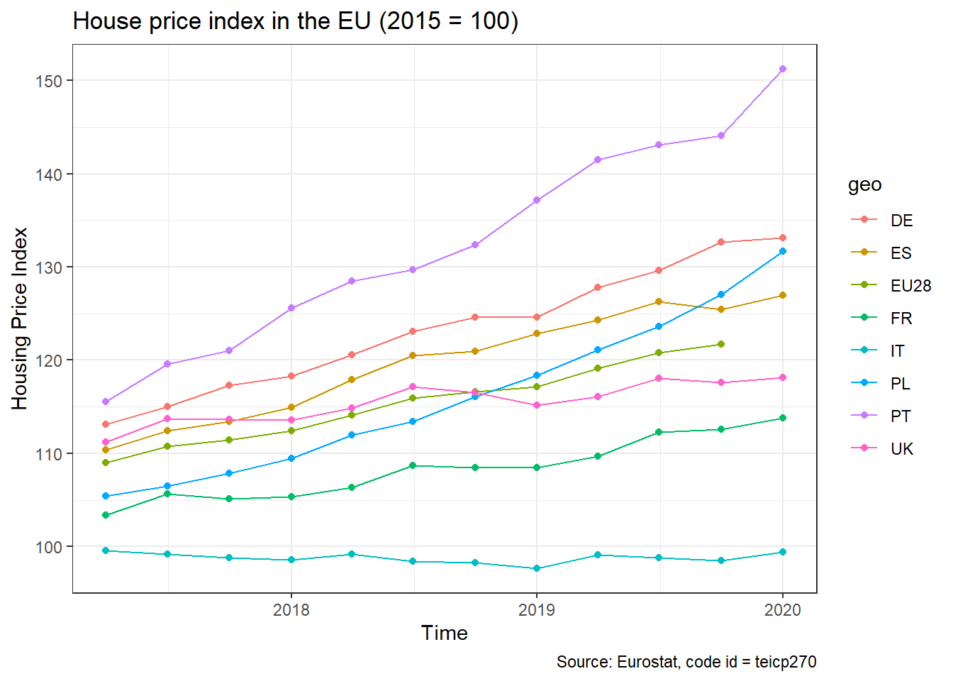
We note that our dataframe contains both the value of the index (unit = I15_NSA), as well as the percentage change (unit = PCH_Q1_NSA). We will select the I15_NSA index, a few countries and the EU-28 index, and plot the evolution of house prices over time.
hpi_data <- hpi %>%

  # choose the UK, France, Poland, Spain, Portugal, Germany, Italy, and the EU28
  filter(geo %in%  c("UK", "FR", "PL", "ES","PT", "DE","IT","EU28") ) %>%

  # choose value of the index (unit =   `I15_NSA`)
    filter(unit == "I15_NSA")

ggplot(hpi_data, aes(x=time, y=values, group=geo, colour=geo))+
  geom_point()+
  geom_line()+
  theme_bw()+
  labs(
    title= "House price index in the EU (2015 = 100)",
    x = "Time",
    y = "Housing Price Index",
    caption = "Source: Eurostat, code id = teicp270"
  )
13.4.2 Tourism Seasonality in the Meditteranean
The eurostat database has a dedicated tourism section. I wanted to check monthly nights spent at hotels– the relevant code id = tour_occ_nim in the four Meditteranean countries, Portugal, Spain, Italy, and Greece since 2000.
The code below downloads the data and plots time series plots for all countries.
# create a dataframe tourism_data that contains the eurostat data for
# code id = "tour_occ_nim", namely value of monthly nights spent at hotels
tourism_data <- get_eurostat(id="tour_occ_nim")

med_tourism <-  tourism_data %>%

  # choose Portugal, Spain, Italy, and Greece
  filter(geo %in%  c("PT", "ES", "IT", "EL" ) ) %>%

  #use label_eurostat to get verbose descriptions of codes
  label_eurostat() %>%

  # choose number of total hotel accomodations since Jan 1, 2000
  filter (c_resid == "Total",
          nace_r2 == "Hotels and similar accommodation",
          unit == "Number",
          time >= "2000-01-01") %>%

  # express values in million of nights
  mutate(values = values/1000000)

ggplot(med_tourism, aes(x=time, y=values, group=geo, colour=geo))+
  geom_point()+
  geom_line()+
  geom_smooth(se=FALSE)+
  facet_wrap(~geo)+
  theme_bw()+
  labs(title="Hotel stays in the Medditeranean, 2000-present",
       y= "Millions of nights spent in hotels",
       x = "Year",
       caption = "Source: Eurostat, code = tour_occ_nim")+
  theme(legend.position="none")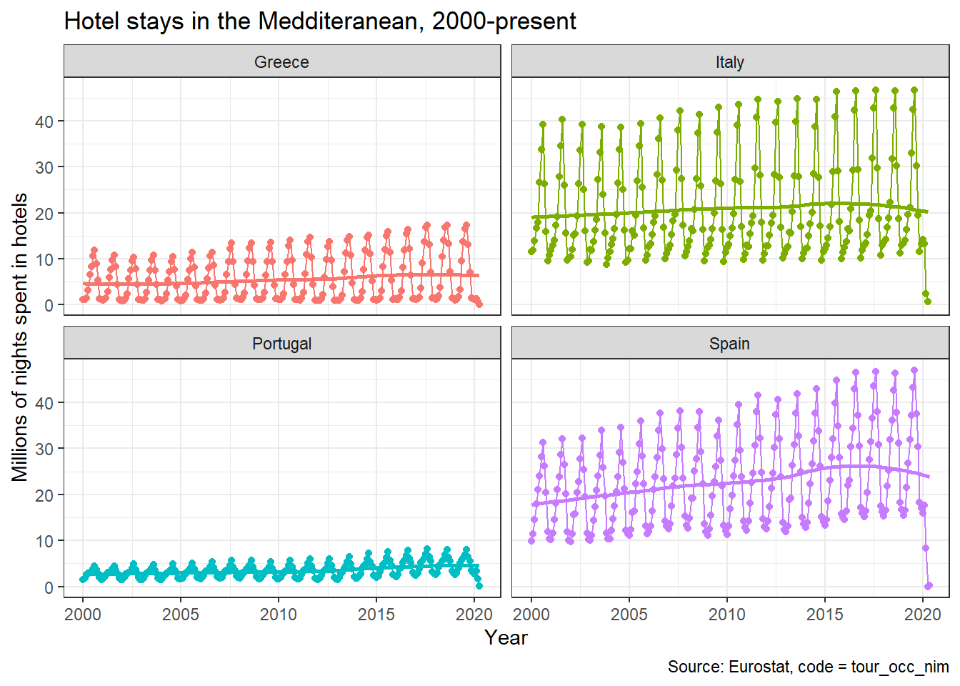
All countries exhibit the same seasonal pattern: there is a peak in July-August, and the minimum number is around December-January.
#first define **ts** (time series ) objects; one for each country

portugal_tourism <- med_tourism %>%

  #select the country you are interested in, in this case Portugal
  filter (geo == "Portugal") %>%

  #sort by time in ascending order, so  earliest observation is first
  arrange(time) %>%

  #we just want to keep the values
  select(values) %>%

  #time series (ts) starts Jan 2000 and has monthlyfrequency (12 months/yr)
  ts(start=2000, frequency = 12)


spain_tourism <- med_tourism %>%
  filter (geo == "Spain") %>%
  arrange(time) %>%
  select(values) %>%
  ts(start=2000, frequency = 12)

italy_tourism <- med_tourism %>%
  filter (geo == "Italy") %>%
  arrange(time) %>%
  select(values) %>%
  ts(start=2000, frequency = 12)

greece_tourism <- med_tourism %>%
  filter (geo == "Greece") %>%
  arrange(time) %>%
  select(values) %>%
  ts(start=2000, frequency = 12)


#Season plot for Spain and Greece: the seasonal pattern is consistent since 2000
ggseasonplot(spain_tourism, year.labels=TRUE, year.labels.left=TRUE) +
  labs(
    title = "Seasonal plot: Hotel stays in Spain",
    y = "Millions of nights spent in hotels"
  )+
    theme_bw()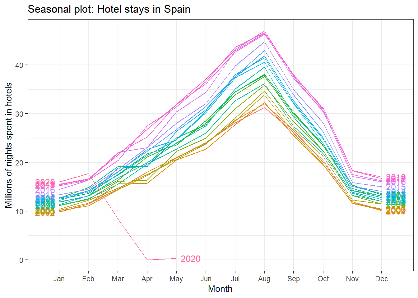
ggseasonplot(greece_tourism, year.labels=TRUE, year.labels.left=TRUE) +
  labs(
    title = "Seasonal plot: Hotel stays in Greece",
    y = "Millions of nights spent in hotels"
  )+
  theme_bw()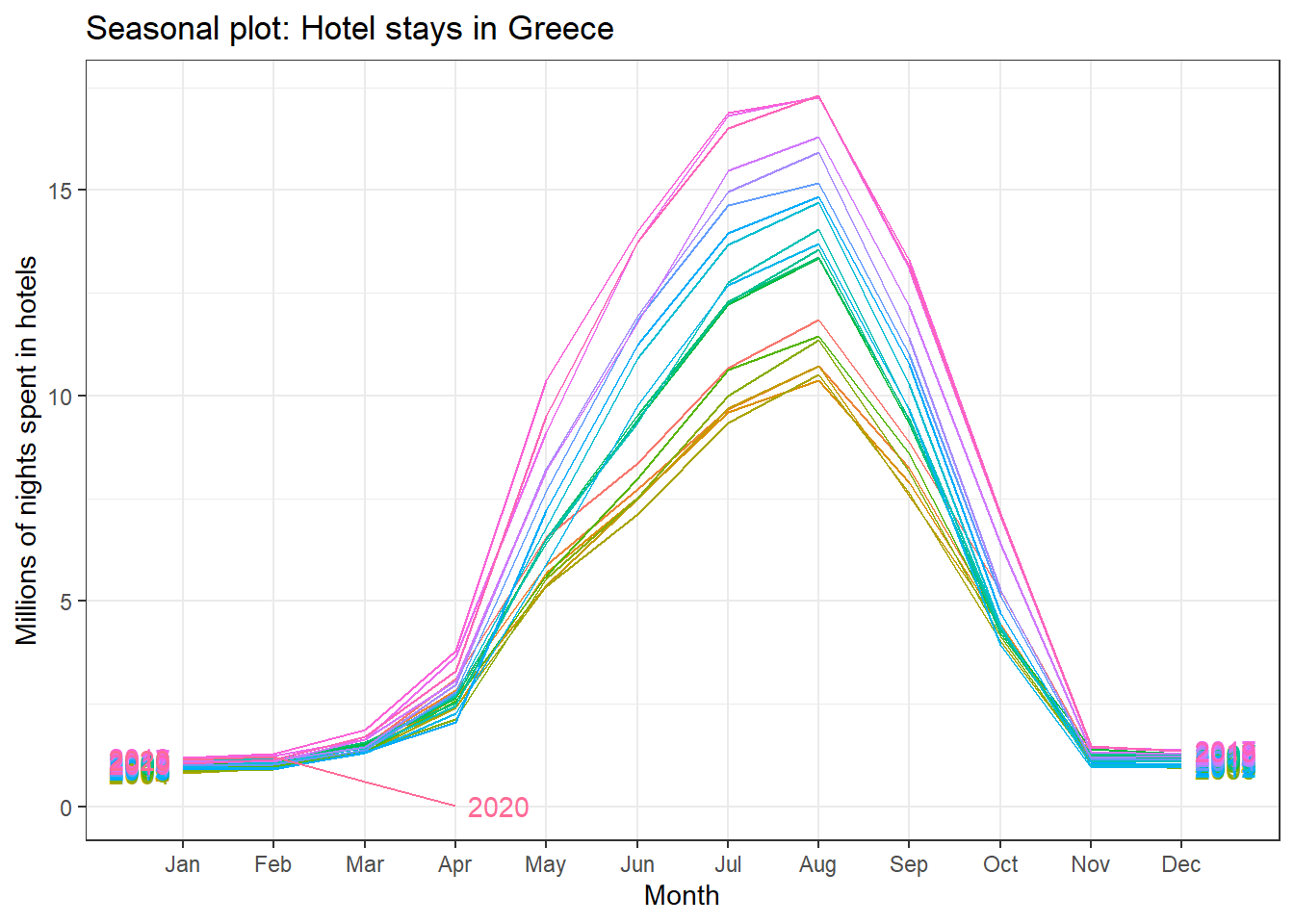
An interesting question is which country has the greatest seasonality distortion, namely, how much bigger is the summer peak from the winter bottom. For this we produce a subseries plot, one that emphasises the seasonal patterns and where the data for each season are collected together in separate mini time plots. The horizontal lines indicate the means for each month. This form of plot enables the underlying seasonal pattern to be seen clearly, and also shows the changes in seasonality over time. It is especially useful in identifying changes within particular seasons.
ggsubseriesplot(portugal_tourism)+
  labs(
    title = "Seasonal subseries plot: Hotel stays in Portugal 2000-present",
    subtitle = "Horizontal lines indicate monthly averages",
    y = "Millions of nights spent in hotels",
    caption = "Source:Eurostat"
  )+
  theme_bw()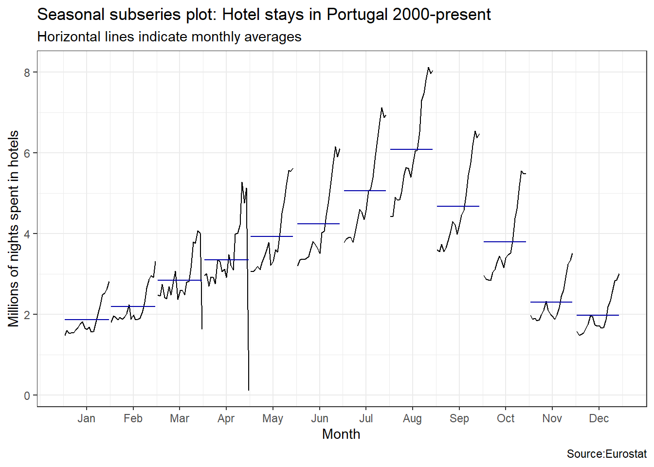
ggsubseriesplot(spain_tourism)+
  labs(
    title = "Seasonal subseries plot: Hotel stays in Spain 2000-present",
    subtitle = "Horizontal lines indicate monthly averages",
    y = "Millions of nights spent in hotels",
    caption = "Source:Eurostat"
  )+
  theme_bw()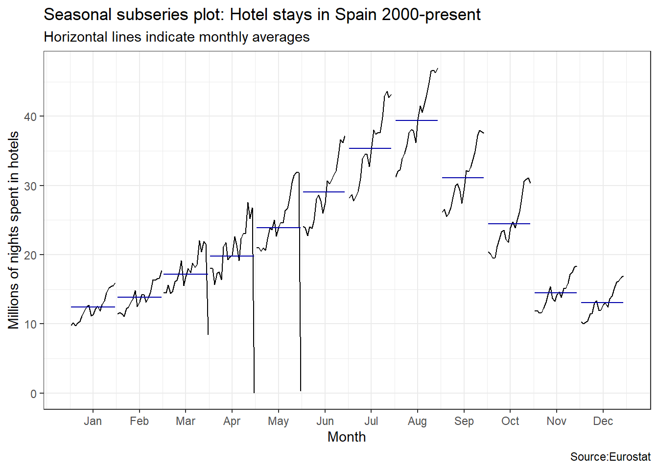
ggsubseriesplot(italy_tourism)+
  labs(
    title = "Seasonal subseries plot: Hotel stays in Italy 2000-present",
    subtitle = "Horizontal lines indicate monthly averages",
    y = "Millions of nights spent in hotels",
        caption = "Source:Eurostat"
  )+
  theme_bw()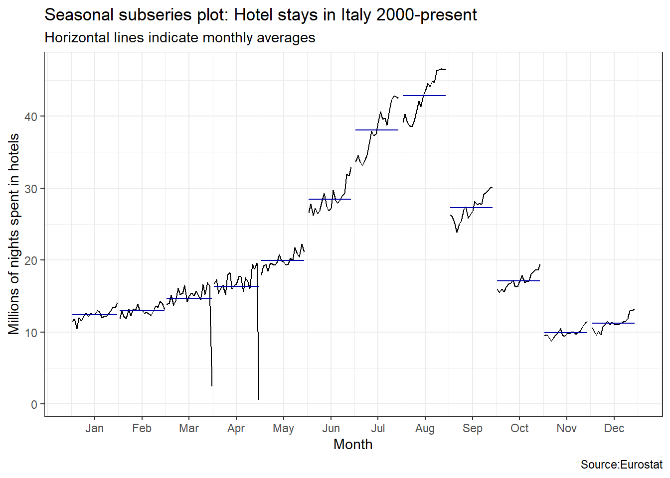
ggsubseriesplot(greece_tourism)+
  labs(
    title = "Seasonal subseries plot: Hotel stays in Greece 2000-present",
    subtitle = "Horizontal lines indicate monthly averages",
    y = "Millions of nights spent in hotels",
    caption = "Source:Eurostat"
  )+
  theme_bw()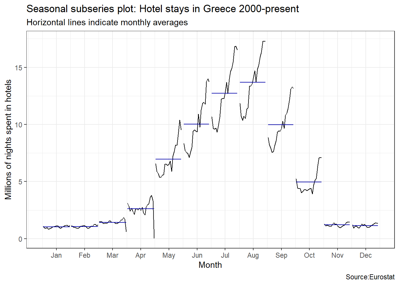
Visually, the approximate ratio of max:min averages for each of the four Mediterranean countries is as follows:
- Portugal 6:2 = 3
- Spain 39:13 = 3
- Italy 43:10 = 4.3
- Greece 13.5:1= 13.5
13.4.3 Disposable income of private households by NUTS 2 regions
Using the eurostat data, we can create maps of, e.g., disposable income at a regional level. NUTS or Nomenclature of Territorial Units for Statistics is a geocode standard for referencing subdvisions (regions, counties, districts, etc.) within a country.
We will work with the Disposable income of private households by NUTS 2 regions database
income_data <- get_eurostat(id="tgs00026") %>%
  select(geo,time,values) %>%
  dplyr::mutate(cat = cut_to_classes(values))


income_2016 <- income_data %>%
  filter(time == "2016-01-01")

# Download geospatial data from GISCO
geodata <- get_eurostat_geospatial(output_class = "sf",
                                   resolution = "60",
                                   nuts_level = 2,
                                   year = 2016)


map_data <- inner_join(geodata, income_2016)


ggplot(data=map_data) + geom_sf(aes(fill=cat),color="dim grey", size=.1) +
  scale_fill_brewer(palette = "Accent") +
  guides(fill = guide_legend(reverse=T, title = "euro")) +
  labs(title="Disposable household income in 2016",
       caption="(C) EuroGeographics for the administrative boundaries
                Map produced in R with a help from Eurostat-package <github.com/ropengov/eurostat/>") +
  theme_light() + theme(legend.position=c(.8,.8)) +
  coord_sf(xlim=c(-12,44), ylim=c(35,70))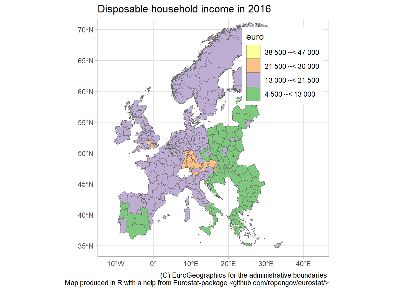
13.5 Other sources of data
- Google Dataset Search: Google indexes thousands of public datasets and you can search for them
- Kaggle Datasets: Kaggle hosts machine learning competitions and contains a large number datasets that are generally free and open to the public.
- Reddit datasets
- London datastore
- UK data and Office for National Statistics
- U.S. Government’s open data with many datasets on a range of issues
- Health statistics data in Scotland
- Data is plural: a weekly newsletter of useful/curious datasets
- François Briatte’s curated lists: Includes data from/about intergovernmental organizations (IGOs), nongovernmental organizations (NGOs), public opinion surveys, parliaments and legislatures, wars, human rights, elections, and municipalities.
- Erik Gahner’s list of political science datasetsDatasets divided by topic (governance, elections, policy, political elites, etc.), geography, etc.
13.6 Acknowledgments
- This page is derived in part from Performance Analytics with
tidyquantby Matt Dancho. - This page is derived in part from Introduction to the
wbstatsR-package by Jesse Piburn. - This page is derived in part from Tutorial (vignette) for the
eurostatR package. - Choropleths in leaflet
This page last updated on: 2020-07-14