8. Visualise data
8.1 Overview
Above all else show the data.
–Edward Tufte, The Visual Display of Quantitative Information, 2001
ggplot2 has become the de facto standard for visualising data in R. The ggplot system moves away from a defined set of graphs (e.g., scatterplot, bar chart, etc) and instead breaks graphics down to their basic components and allows you to build plots layer by layer.
“In brief… a statistical graphic is a mapping from data to aesthetic attributes (colour, shape, size) of geometric objects (points, lines, bars). The plot may also contain statistical transformations of the data and is drawn on a specific coordinates system”
– Hadley Wickham (ggplot2 creator)

It may seem verbose and unwieldy, but the idea of building a plot on a layer-by-layer basis is very powerful.
- You begin a plot by defining the dataset we will use.
- Then, we specify aesthetics, namely (x,y) coordinates, colour, size, etc.
- Finally, we choose what
geom(or geometric shape) we want to use to represent our data.
We can then add more layers, like legends, labels, facets. etc.
In the following examples, we will use the gapminder dataset with data on life expectancy lifeExp, population pop, and GDP per capita gdpPerCap for a number of countries between 1952 and 2007. We want to build a graph that shows the relationship between GDP per capita and life expectancy.
As we said, first we define the dataset we are using

We just get an empty canvas, as we haven’t done much with our dataset.
The next thing is to map aesthetics. In our case, we will map gdpPercap to the x-axis, and lifeExp to the y-axis.
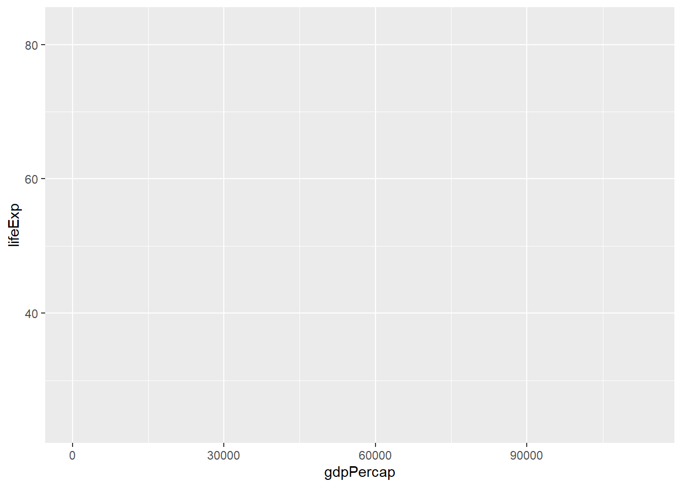
This is an improvement over the blank canvas we got earlier, as we have mapped the x- and y- axes and we see the likely ranges of both variables. However, to see the scatter plot we want, we must add a geometry; as scatter plots are a bunch of points, the relevant geometry is geom_point().
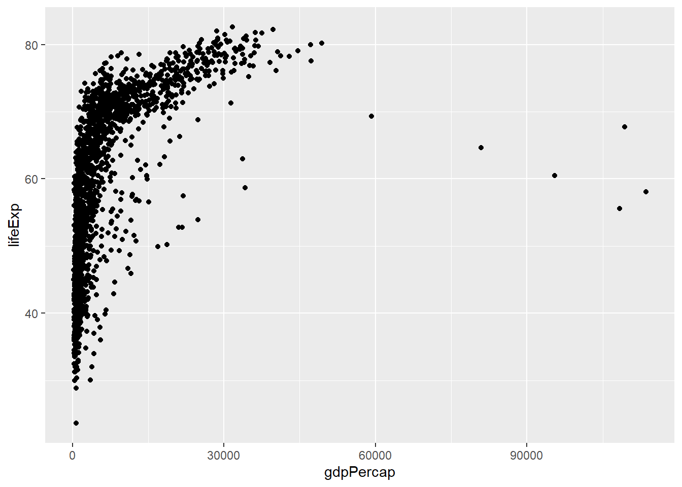
What if we wanted to colour the points by the continent each country is in? This is a change of the aesthetic properties, so we just add colour = continent.
ggplot(
  data = gapminder,
  mapping = aes(
    x = gdpPercap,
    y = lifeExp,
    colour = continent)) +
  geom_point()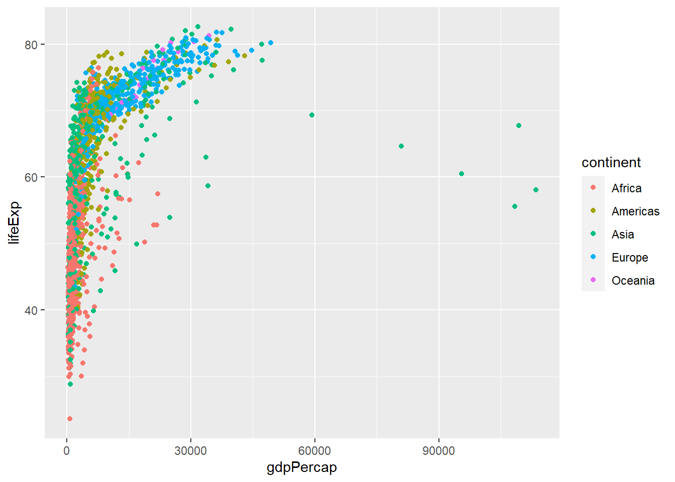
What if instead of a scatter plot we wanted to create a line plot? It would be the same code as before, but now the relevant geometry we should is geom_line insrtead of geom_point.
ggplot(
  data = gapminder,
  mapping = aes(
    x = gdpPercap,
    y = lifeExp,
    colour = continent)) +
  geom_line()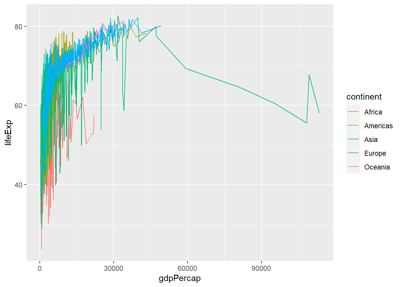
However, this is not a particularly useful plot, so let us go back to our scatter plot.
What if we wanted to have the size of each point correspond to the population of the country? This is not a geometry, but an aesthetic property. If we add size = pop, the points produced will be proportional to the country’s population, and we still have the aesthetic property colour = continent that will colour its point with the continent the country is in.
ggplot(
  data = gapminder,
  mapping = aes(
    x = gdpPercap,
    y = lifeExp,
    colour = continent,
    size = pop)) +
  geom_point()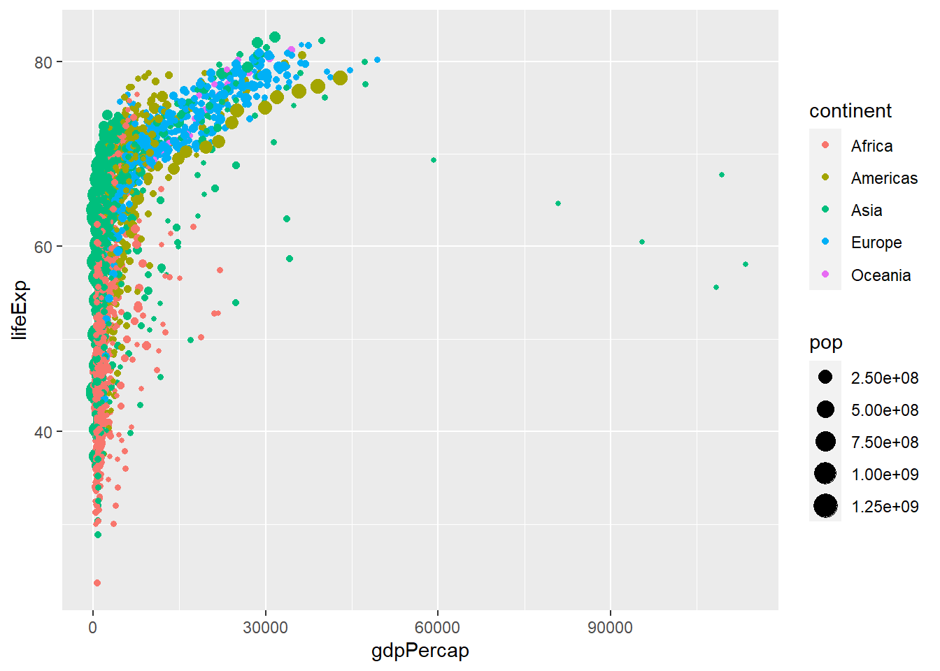
This is a more interesting graph, but given the non-linear pattern we see, we can perhaps improve it by taking the logarithm of the x-axis, GDP per capita. At the end of the commands, or layers, that make up our graph we add scale_x_log10(). This will take the logarithm of the values in the x-axis and should produce a scatterplot with a linear pattern.
ggplot(
  data = gapminder,
  mapping = aes(
    x = gdpPercap,
    y = lifeExp,
    colour = continent,
    size = pop)) +
  geom_point()+
  scale_x_log10()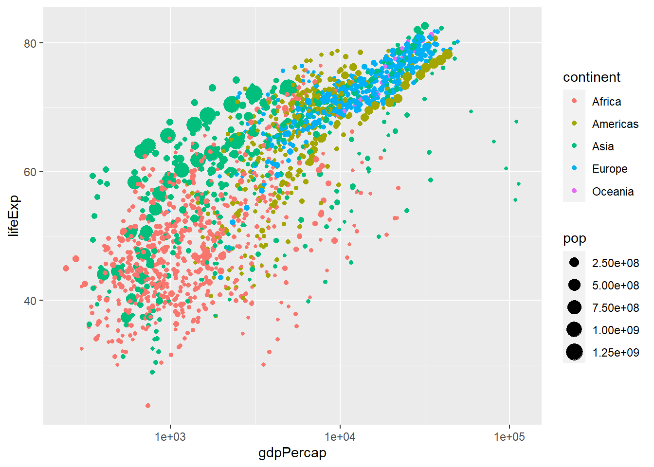
If we wanted to change the labels on the x-axis to dollars, we add labels = scales::dollar to the function scale_x_log10().
ggplot(
  data = gapminder,
  mapping = aes(
    x = gdpPercap,
    y = lifeExp,
    colour = continent,
    size = pop)) +
  geom_point()+
  scale_x_log10(labels = scales::dollar)
Any graph should be properly labelled, and we can add labels by adding another layer: labs will add the relevant labels (title, subtitle, x- and y-axes, and a caption) as shown below.
ggplot(
  data = gapminder,
  mapping = aes(
    x = gdpPercap,
    y = lifeExp,
    colour = continent,
    size = pop)) +
  geom_point() +
  scale_x_log10(labels = scales::dollar) +
  labs(title = "Life Expectancy vs GDP per capita",
       subtitle = "1952-2007",
       x = "GDP per capita",
       y = "Life Expectancy",
       caption = "Source: Gapminder"
  )+
  theme_bw()+
  NULL
Finally, we can change the default theme which is a plot on a grey background; for this graph, we haved chosen theme_minimal().
ggplot(
  data = gapminder,
  mapping = aes(
    x = gdpPercap,
    y = lifeExp,
    colour = continent,
    size = pop)) +
  geom_point() +
  scale_x_log10(labels = scales::dollar) +
  labs(title = "Life Expectancy vs GDP per capita",
       subtitle = "1952-2007",
       x = "GDP per capita",
       y = "Life Expectancy",
       caption = "Source: Gapminder"
      ) +
  theme_minimal()+
  NULL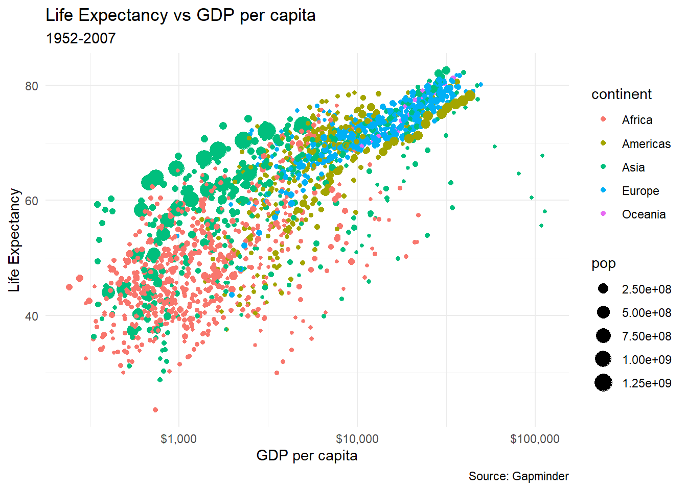
Let us revisit our simple scatter plot. Because we have too may data points, we can add alpha = 0.4 in thegeom_point()to make some of the points more transparent;alpha = 1means solid colour and opaque data points, whereas lower values ofalpha` make some points more transparent.
ggplot(
  data = gapminder,
  mapping = aes(
    x = gdpPercap,
    y = lifeExp,
    colour = continent,
    size = pop,
    )) +
  geom_point(alpha = 0.4) +
  scale_x_log10(labels = scales::dollar) +
  labs(title = "Life Expectancy vs GDP per capita",
       subtitle = "1952-2007",
       x = "GDP per capita",
       y = "Life Expectancy",
       caption = "Source: Gapminder"
      ) +
  theme_minimal()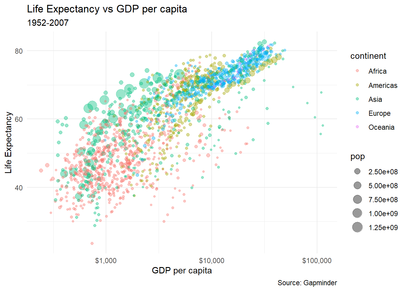
8.2 Layers
ggplot create graphics in layers. Once you define your data and the aesthetics [(x,y) coordinates, colour, size, fill, etc.], you can then add add more layers in that you keep on ‘doing’ things to the data.
In essence, each geom layer specifies
- A
geom: the graphical object to be drawn (histogram, boxplot, density plot, etc.) - A
stat: what “statistic” it is applied to - A
position: how it is placed;identity,jitter,dodge,stack,fill
Unfortunately, due to an early design mistake I called these either stat_() or geom_(). A better decision would have been to call them layer_() functions: that’s a more accurate description because every layer involves a stat and a geom. – Hadley Wickham
Position adjustments are used, as the name says, to adjust the position of each geom. The following position adjustments and their defaults are shown below:
position_identity- default of most geoms– Doesn’t adjust positionposition_jitter- default of geom_jitter. Adding random noise to a plot can sometimes make it easier to read. Jittering is particularly useful for small datasets with at least one discrete position.position_dodge- default of geom_boxplot. Dodging preserves the vertical position of an geom while adjusting the horizontal position.position_stack- default of geom_bar==geom_histogram and geom_area– it stacks bars on top of each otherposition_fill- useful for geom_bar==geom_histogram and geom_area– stacks bars and standardises each stack to have constant height
Let us create a base plot of life expectancy, coloured by continent
Nothing much happens, as we have just defined the base plot. Let us now plot a geom_histogram(), which uses position_fill as its default.
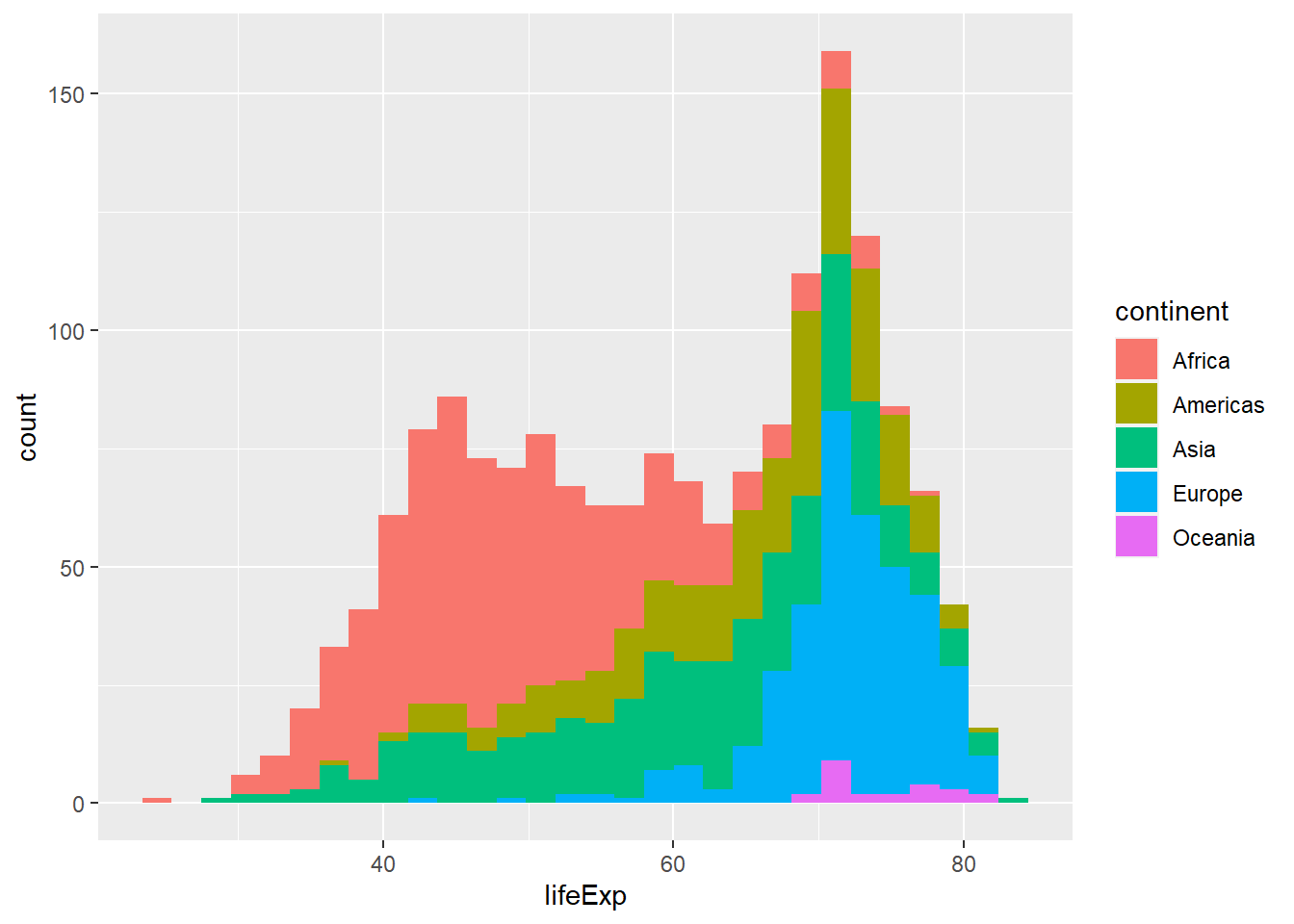
Is this a useful graph? position_stack, the deafult for geom_histogram(), stacks bars on top of each other. Look at the bar that appears right after the 70 year life expectancy. Right at the bottomw, we have a a few observations from, followed by the blue European one, the green Asia, etc. all the way to the top where you see the few red observations that correspond to Africa.
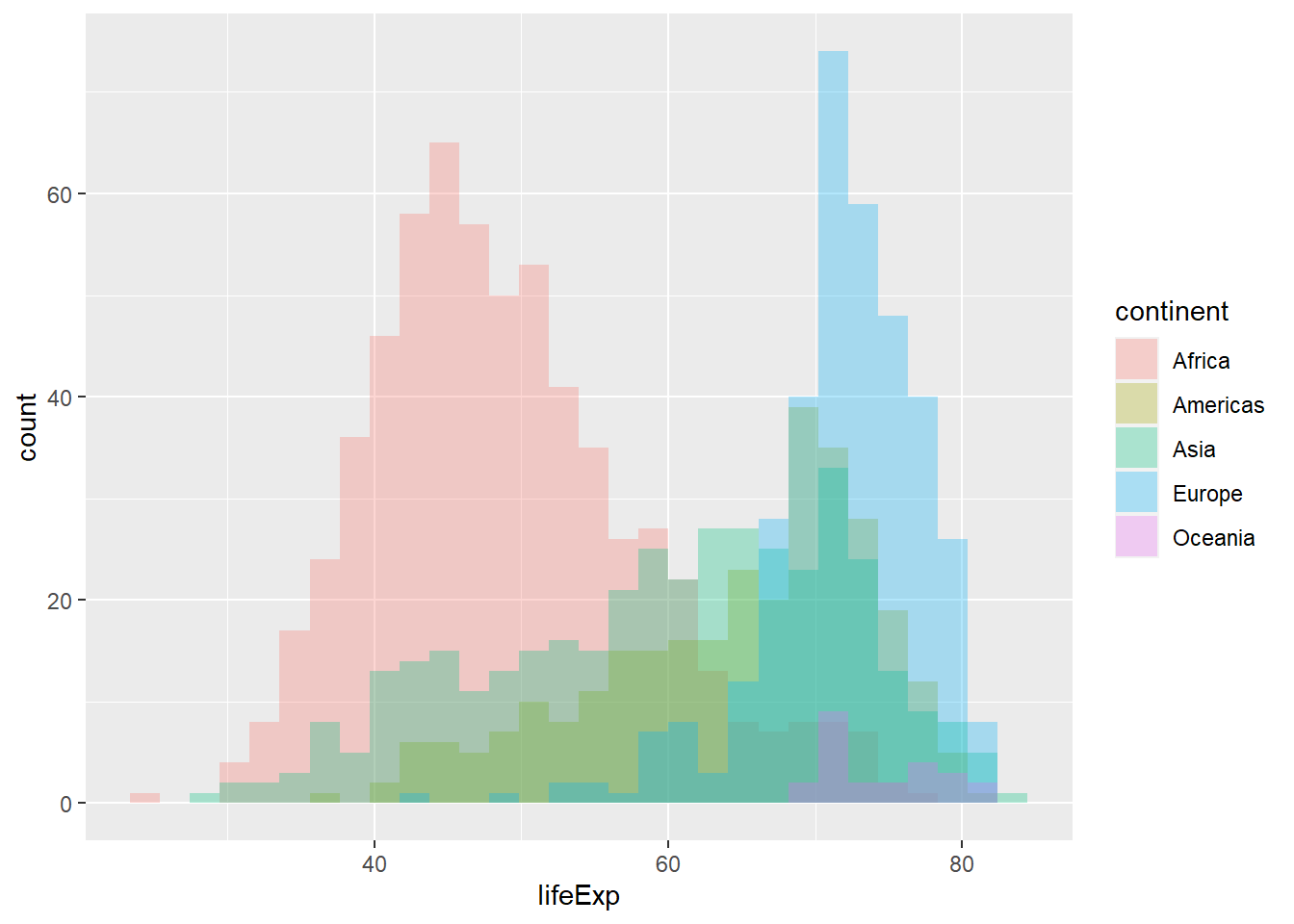
We can improve on this by using position = "identity" that doesn’t adjust position. We also use alpha = 0.3 to make the bars more transparent. We also plot a density plot, a smoothed version of a histogram using geom_density; its default position is identity and both plots are equivalent.
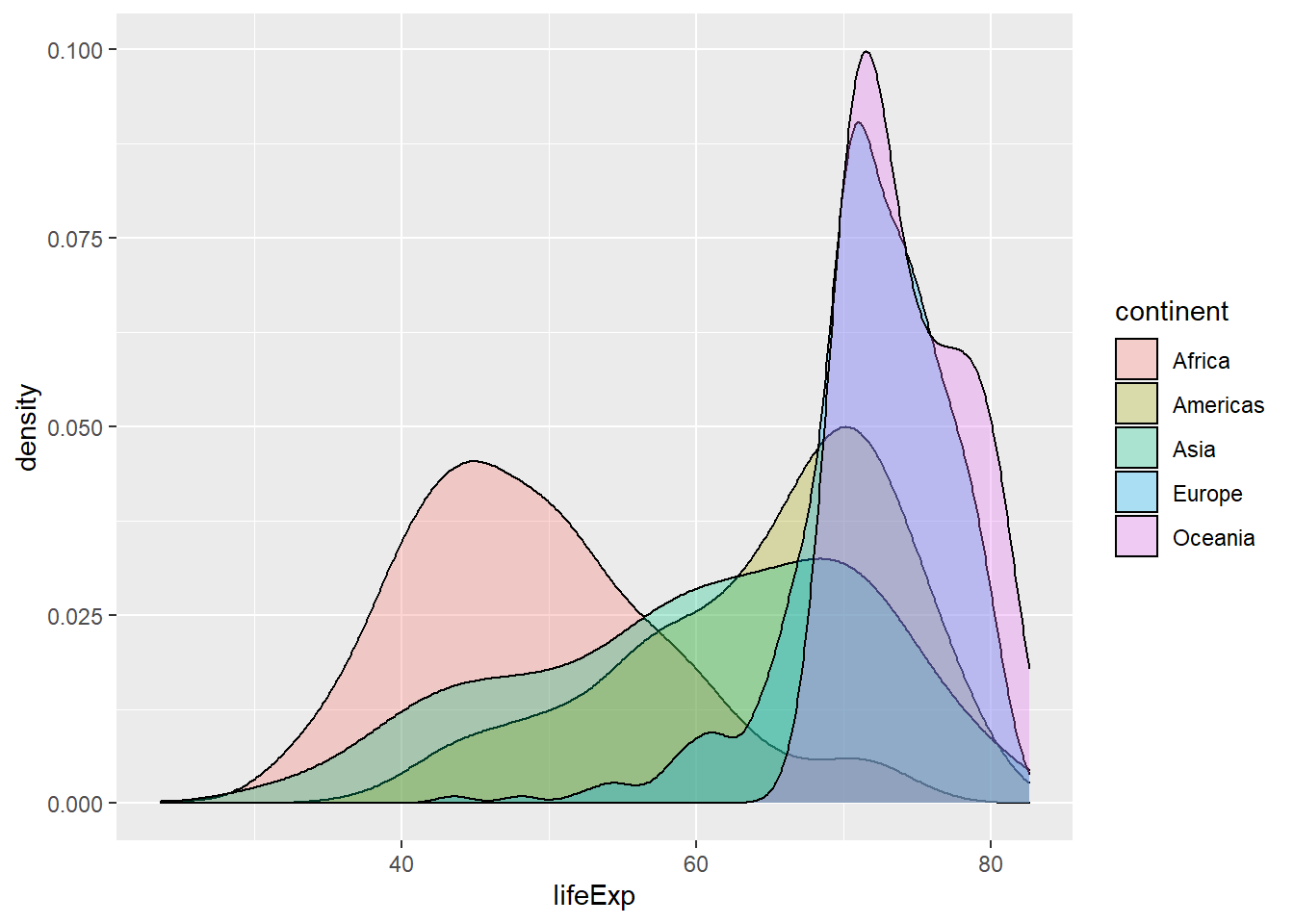
If we again think what each layer specifies
- A
geom: density plot - A
stat: density - A
position: identity
What if we change the position and we use stack for the position layer?

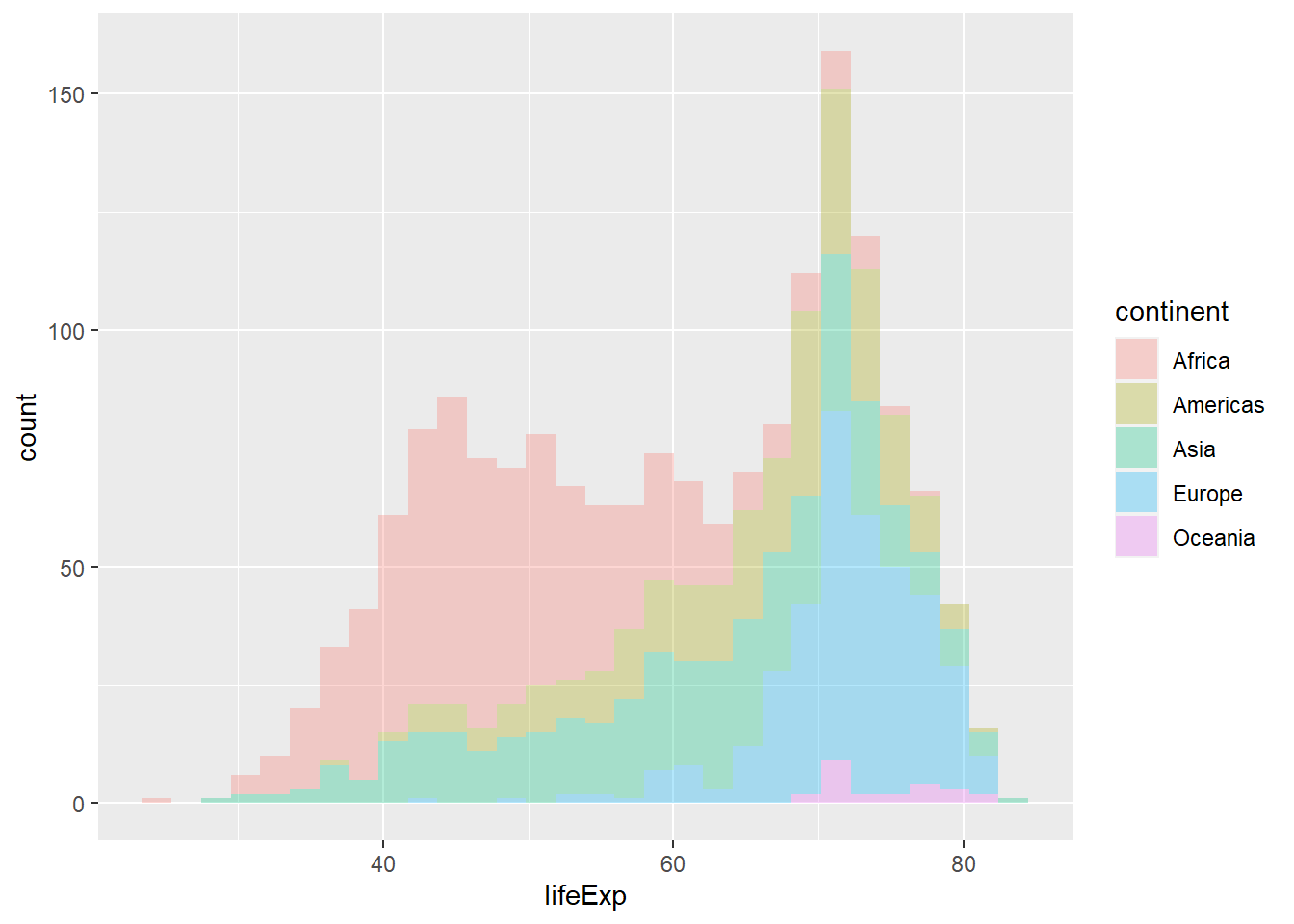
Both plots are identical; in the second one, we didn’t specify what position should be, so ggplot used the default position for a histogram, which is position = stack.
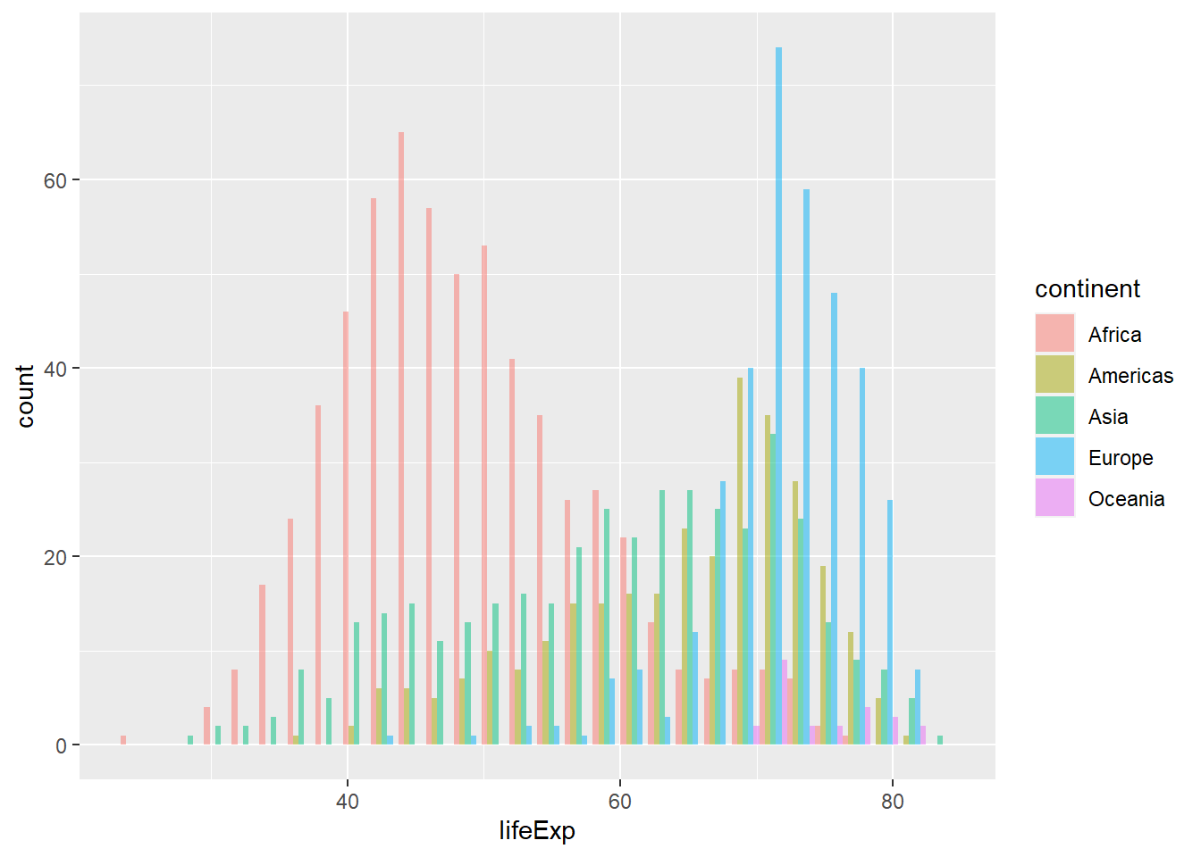
Finallt, we can also use position = "fill" which stacks bars and standardises each stack to have constant height, or position = "dodge" (to separate each continent) for the position layer

8.3 Facetting
One of the nice features of ggplot2 is a special technique called faceting that allows us to split one plot into multiple plots based on a factor included in the dataset. In the gapminder scatterplot example, we can use facetting and produce one scatter plot for each continent separately by using facet_wrap and facet_grid as shown below.
Before proceeding, we will define an object gapminder_scatterplot with the sequence of layers that gives us the ‘core’ life expectancy vs GDP scatterplot. Having stored the ‘core’ plot into an object, we can then add layers to it as needed, something which is useful for programming, as it saves you from retyping things.
facet_wrap() allows us to get the same graph, but looking at by changing another variable; in our case, we will look at the core scatterplot first by continent, and then by `year.
#define the core gapminder scatterplot of life expectancy vs GDP
# store it in an obect called `gapminder_scatterplot`
gapminder_scatterplot <-
  ggplot(
    data = gapminder,
    mapping = aes(
      x = gdpPercap,
      y = lifeExp,
      colour = continent,
      alpha = 0.2)) +
  geom_point() +
  scale_x_log10(labels = scales::dollar) +
  labs(title = "Life Expectancy vs GDP per capita, 1952-2007",
       x = "GDP per capita",
       y = "Life Expectancy",
       caption = "Source: Gapminder"
  ) +
  theme_minimal()


# We now add a new layer to our base plot: facet_wrap(~x),
# where x is the variable you want to facet by

# first, facet the scatterplot by continent
gapminder_scatterplot +
facet_wrap(~continent) 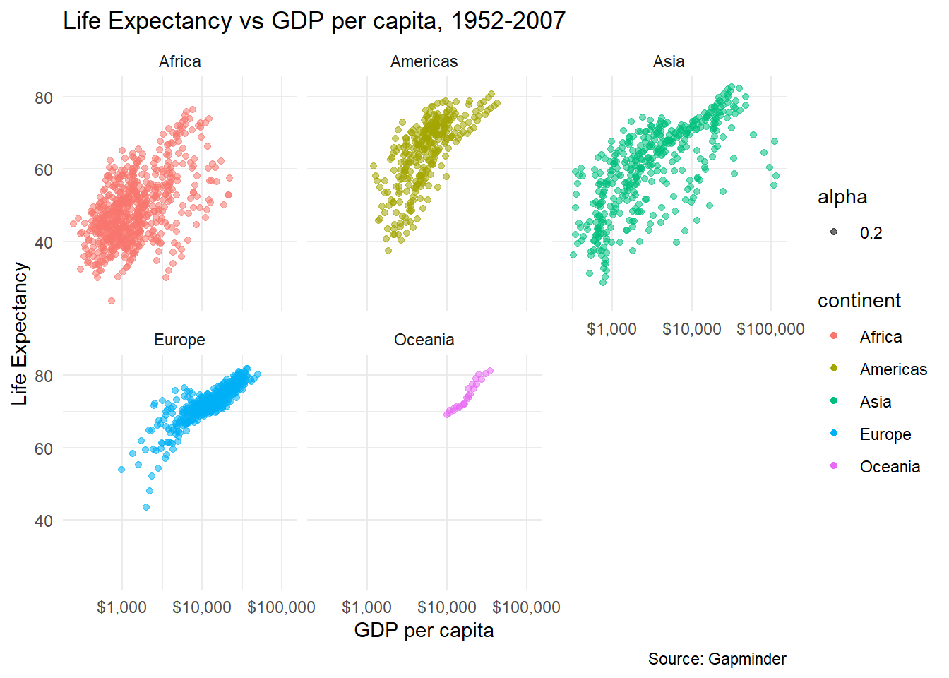
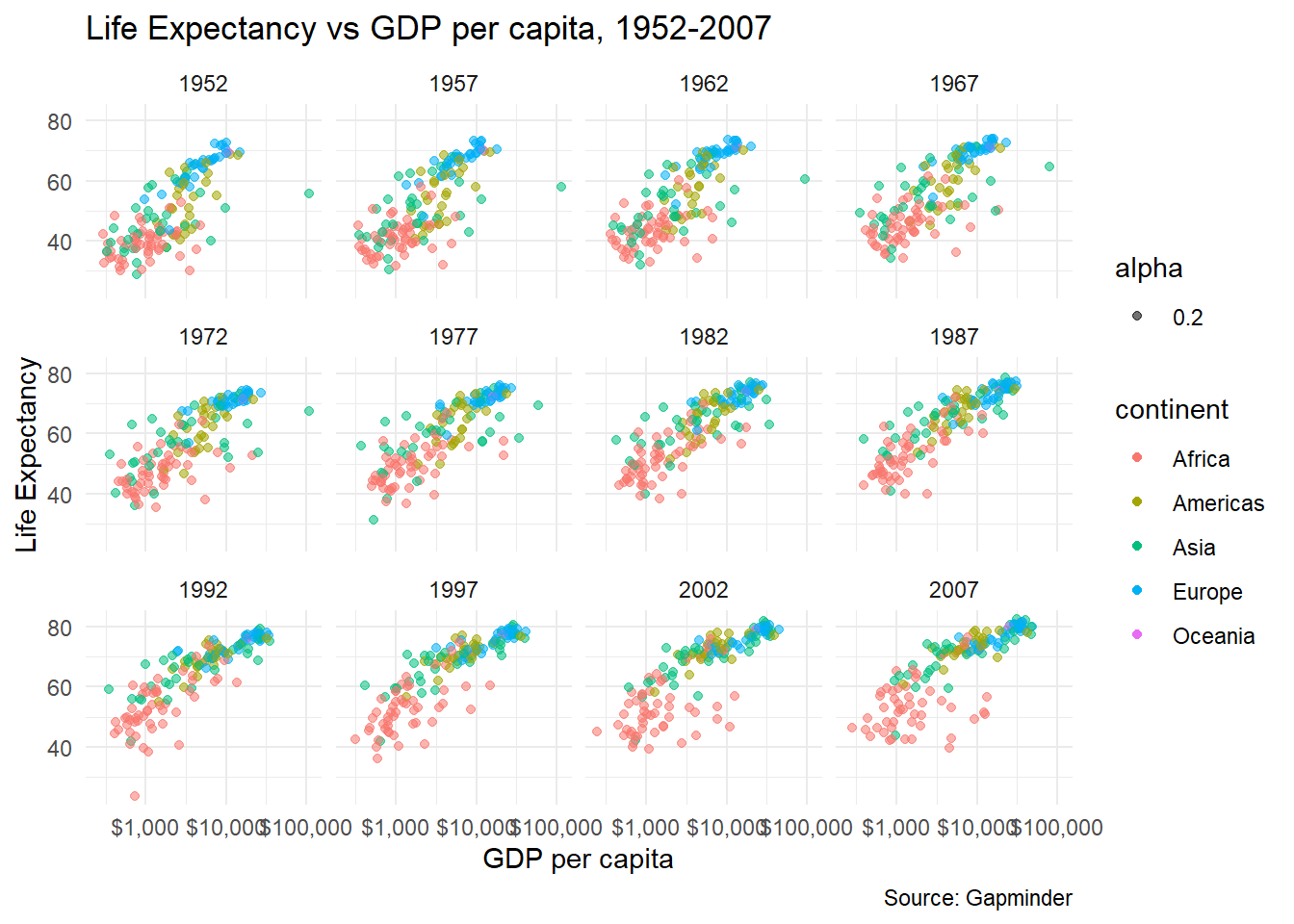
We can use the nrow argument to manually control the number of rows in the facetting. We will consider the faceting by continent plot and want to have the output in 3 rows, so nrow = 3. Also, we do not want any legends for the colours used, as ggplot will explicitly name the continents. To remove the legends, we add theme(legend.position="none") to our ggplot.
gapminder_scatterplot +
  facet_wrap(
    facets = vars(continent),
         nrow = 3) +
  theme(legend.position="none")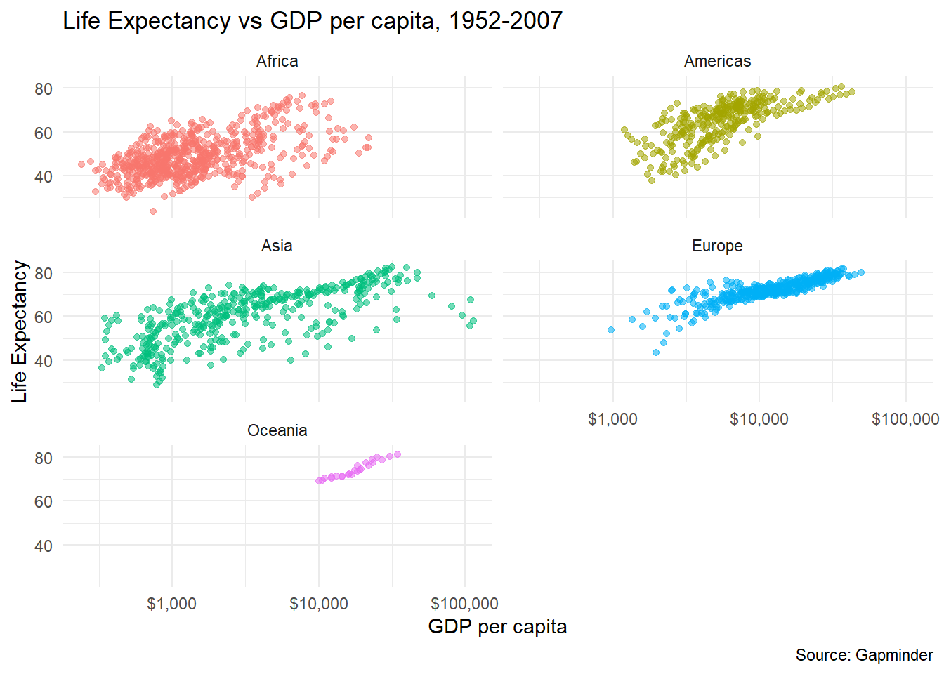
If you want to facet a plot and have its results appear in grid, we can use facet_grid(). You can define what the row and the columns in your grid should correspond to.
# use facet_grid(), where rows refer to continents
gapminder_scatterplot +
  facet_grid(vars(rows=continent)) +
  theme(legend.position="none")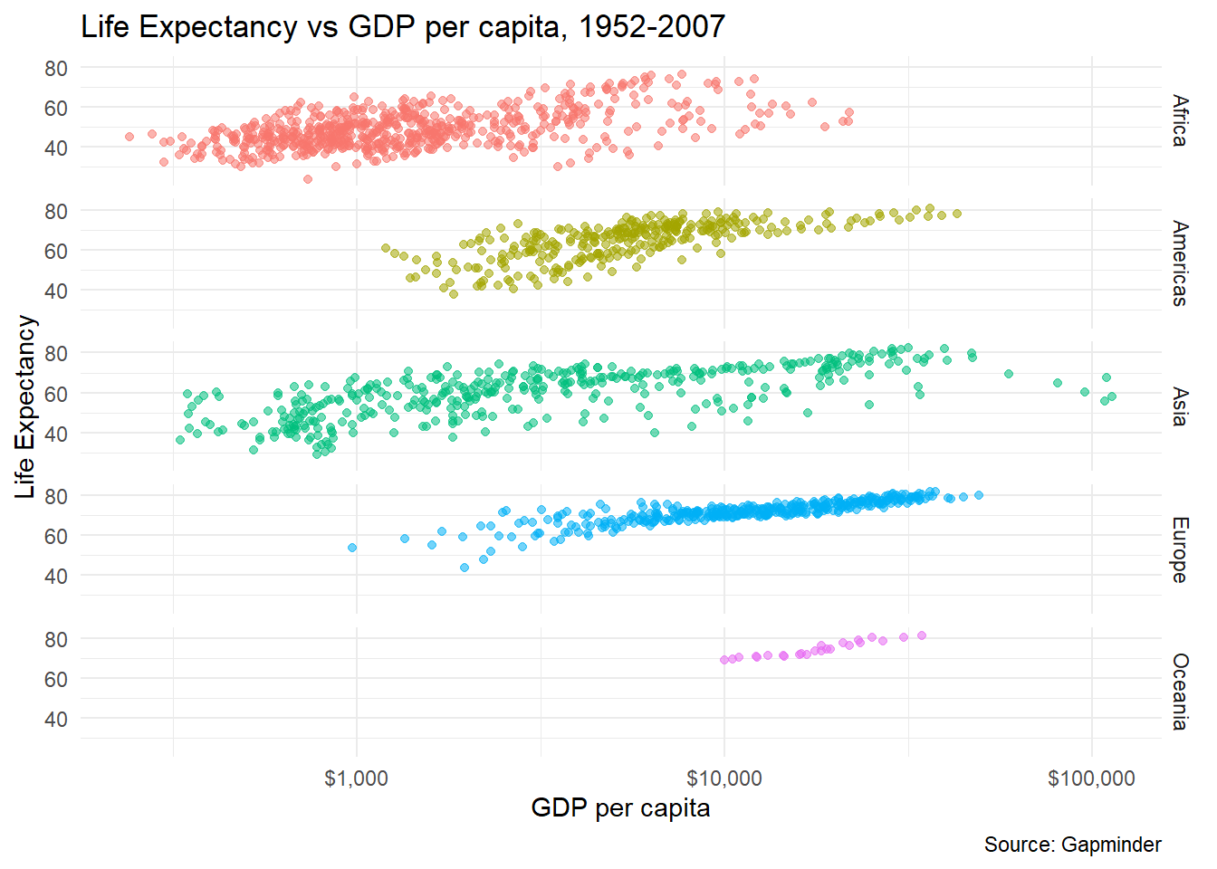
# we can create a facet_grid where you can define *both* rows and columns
# in our scatterplot, we add a facet_grid() layer where columns = continents and rows =  year
gapminder_scatterplot+
  theme_minimal(8) + # just make the font size smaller
  facet_grid(
    cols = vars(continent),
    rows = vars(year)
    ) +
  theme(legend.position="none")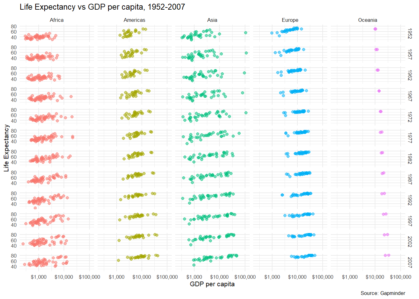
Finally, if instead of a scatter plot we wanted to create a boxplot of life expectancy by continent, we use similar aesthetics, but the relevant geometry is geom_boxplot().
ggplot(
  data = gapminder,
  mapping = aes(
    x = continent,
    y = lifeExp,
    fill = continent)) +
  geom_boxplot() +
  labs(title = "Life Expectancy among the continents, 1952-2007",
       x = " ", # Empty, as the levels of the x-variable are the continets
       y = "Life Expectancy",
       caption = "Source: Gapminder"
      ) +
  theme_minimal()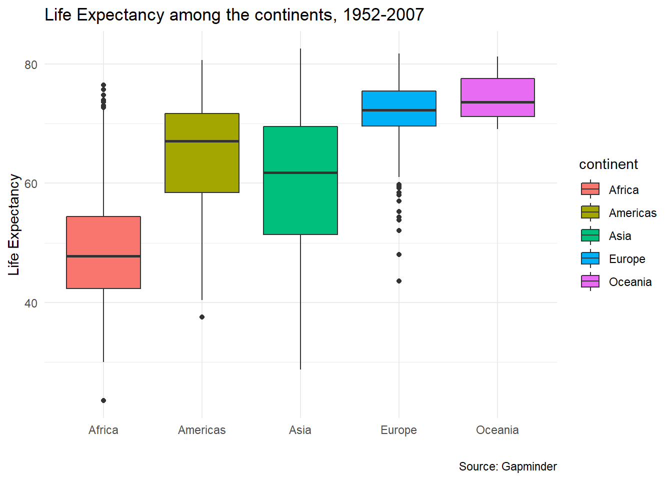
8.4 Tweaking graphics for publication quality
ggplot comes with many other options for tweaking plots to get them just the way you want for publication. These can be a bit hard to remember, but I usually look them up in R graphics cookbook and the BBC Visual and Data Journalism cookbook for R graphics, both of which have example code to cover most use cases!
In the example below, we select only those observations between 1997 and 2007, calculate the average life expectancy, average GDP per capita, and average population. We then create a new object, gapminder9707_plot which is the series of commands that make up our plot. To actually see the plot, we either use print(gapminder9707_plot) or just gapminder9707_plot.
gapminder9707 <- gapminder %>%
  group_by(continent, country) %>%
  filter(year %in% c(1997, 2002, 2007)) %>%
  summarise(avg_life = mean(lifeExp, na.rm = TRUE),
            avg_gdp = mean(gdpPercap, na.rm = TRUE),
            avg_population_millions = mean(pop/1000000, na.rm = TRUE)) %>%
  ungroup()

gapminder9707_plot <- ggplot(data = gapminder9707,
       mapping = aes(x = avg_gdp,
                     y = avg_life,
                     colour = continent,
                     size = avg_population_millions,
                     label = country)) +
  geom_point() +
  scale_x_log10(labels = scales::dollar) +
  theme_bw() +
  labs(title = "Life Expectancy vs GDP per capita, 1997-2007",
       x = "Average GDP per capita",
       y = "Average Life Expectancy",
       caption = "Source: Gapminder") +
  geom_text(nudge_y = -.8, size = 2.2, check_overlap = TRUE)+
  theme(legend.position="none")


gapminder9707_plot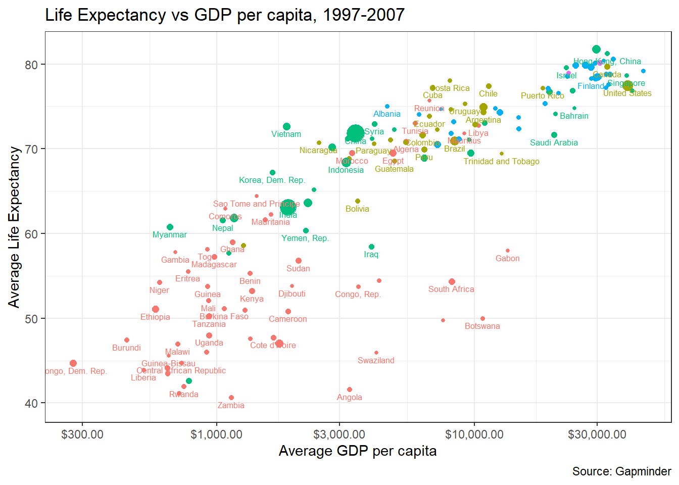
8.5 Making plots interactive using plotly
We can make our plots interactive using the plotly package, which allows us to look at each point, zoon in/out, etc. Once you load the plotly library, it is simply a matter or using the ggplotly command. Move your cursor on the graph and see what happens!
8.6 Animated Graphs
Animated graphs have recently become popular. The internet is full of tutorials and code-throughs where people explain how to do something interesting with R, so here is one if you wanted to know more about animations in R. You have to install the gganimate package and the animated graphs usually take some time to produce, as R needs to generates a number of GIF files and then create the animation, so please be patient!
8.6.1 Gapminder Animations - transition_time()
First we look at an animated boxplot of life expectancy by continent over time. The code to produce the plot is fairly straight-forward ggplot, but the last couple of lines ( transition_time(year) + ease_aes("linear")) are the ones that produce the animation.
library(gganimate)

boxplot_animation <- ggplot(data = gapminder,
       mapping = aes(x = continent,
                     y = lifeExp,
                     fill = continent)) +
  geom_boxplot() +
  theme_bw() +
  theme(legend.position="none") +
  labs(title = "Year: {frame_time}",
       x = "Continent",
       y = "Life Expectancy") +
  transition_time(year) +
  ease_aes("linear")


animate(boxplot_animation, height=600, width = 600)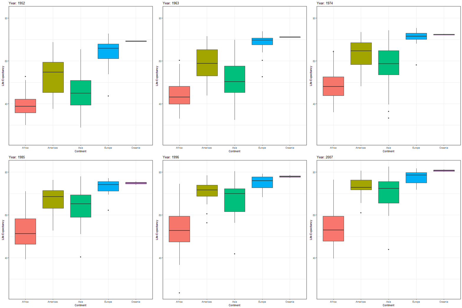
If we want to animate the evolution of the relationship between life expectancy and GDP, similar to Hans Rosling’s 200 Countries, 200 Years, 4 Minutes, we can use the code below
animation1 <- ggplot(data = gapminder,
       mapping = aes(x = gdpPercap,
                     y = lifeExp,
                     colour = continent,
                     size = pop)) +
  geom_point(alpha = 0.5) +
  scale_x_log10(labels = scales::dollar) +
  theme_bw() +
  theme(legend.position="none") +
  labs(title = "Year: {frame_time}",
       x = "GDP per capita",
       y = "Life Expectancy") +
  transition_time(year)+
  ease_aes("linear")

animate(animation1, height=600, width = 600)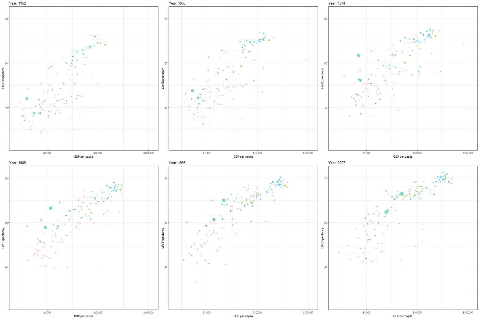
Finally, instead of one scatter plot, if we wanted to facet our animation by continent, we just add the facet_wrap(~continent) line of code as shown below
faceted_animation <- ggplot(data = gapminder,
       mapping = aes(x = gdpPercap,
                     y = lifeExp,
                     colour = continent,
                     size = pop)) +
  geom_point(alpha = 0.5) +
  scale_x_log10(labels = scales::dollar) +
  theme_bw() +
  theme(legend.position="none") +
  facet_wrap(~continent) +
  labs(title = "Year: {frame_time}",
       x = "GDP per capita",
       y = "Life Expectancy") +
  transition_time(year)+
  ease_aes("linear")

animate(faceted_animation, height=800, width = 800)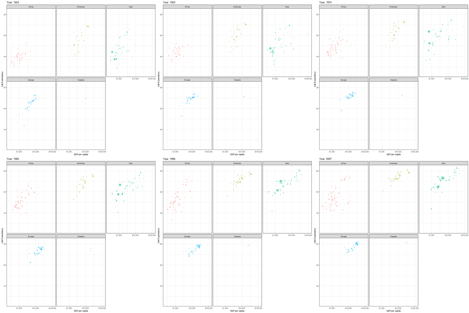
8.6.2 London Bikes Animations: transition_reveal()
London offers a bicycle hire scheme. We have downloaded some data on the number of bikes hired since the inception of the programme, and have augmented it with weather data, namely the average daily values for temperature, humidity, atmospheric pressume, windspeed, and rainfall levels.
We can create a time series plot, where we colour points and lines by season and then animate it by using + transition_time(date).
bikes_time_series_plot <-
  ggplot(
    data = bike,
    mapping = aes(
      x = date,
      y = bikes_hired,
      colour = season_name,
      group = 1
    )
  ) +
  geom_path() +
  geom_point() +
  theme_bw()

bikes_time_series_plot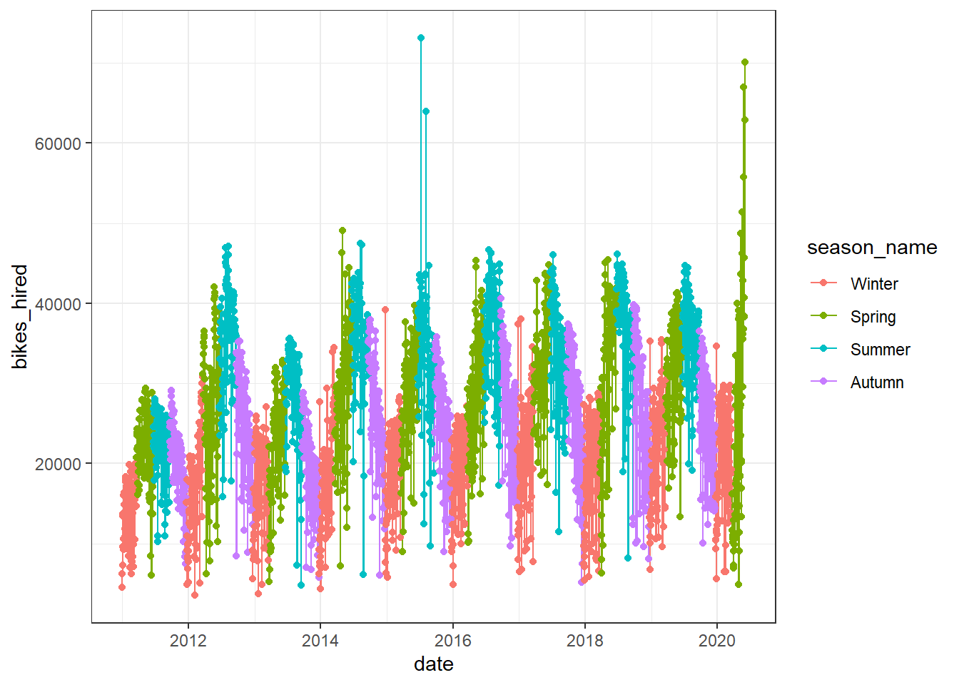
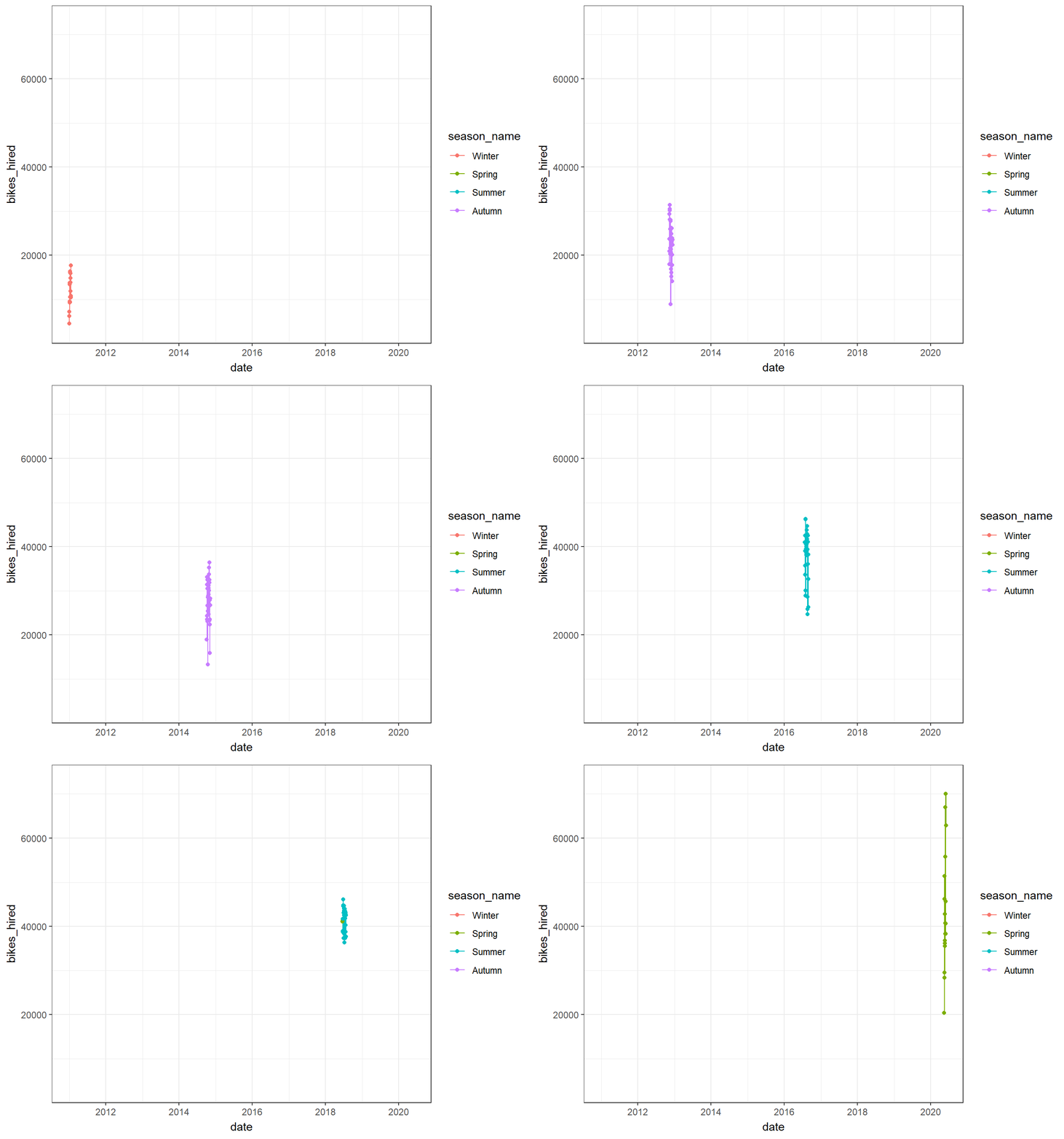
However, this just shows what happens during each time period, and it doesn’t animate the entire time series path; for this, we must use transition_reveal(date) or, alternatively, use transition_time(), but add a shadow_mark().

# Approach 2: use transition_time(date), but also add shadow_mark()
bikes_time_series_plot +
transition_time(date) +
shadow_mark(alpha = .5)
8.7 Why you should always plot your data
We have touched on the basics of ggplot visualisations, but in this section we wanted to discuss why one should always plot the data and not just rely on tables of summary statistics.
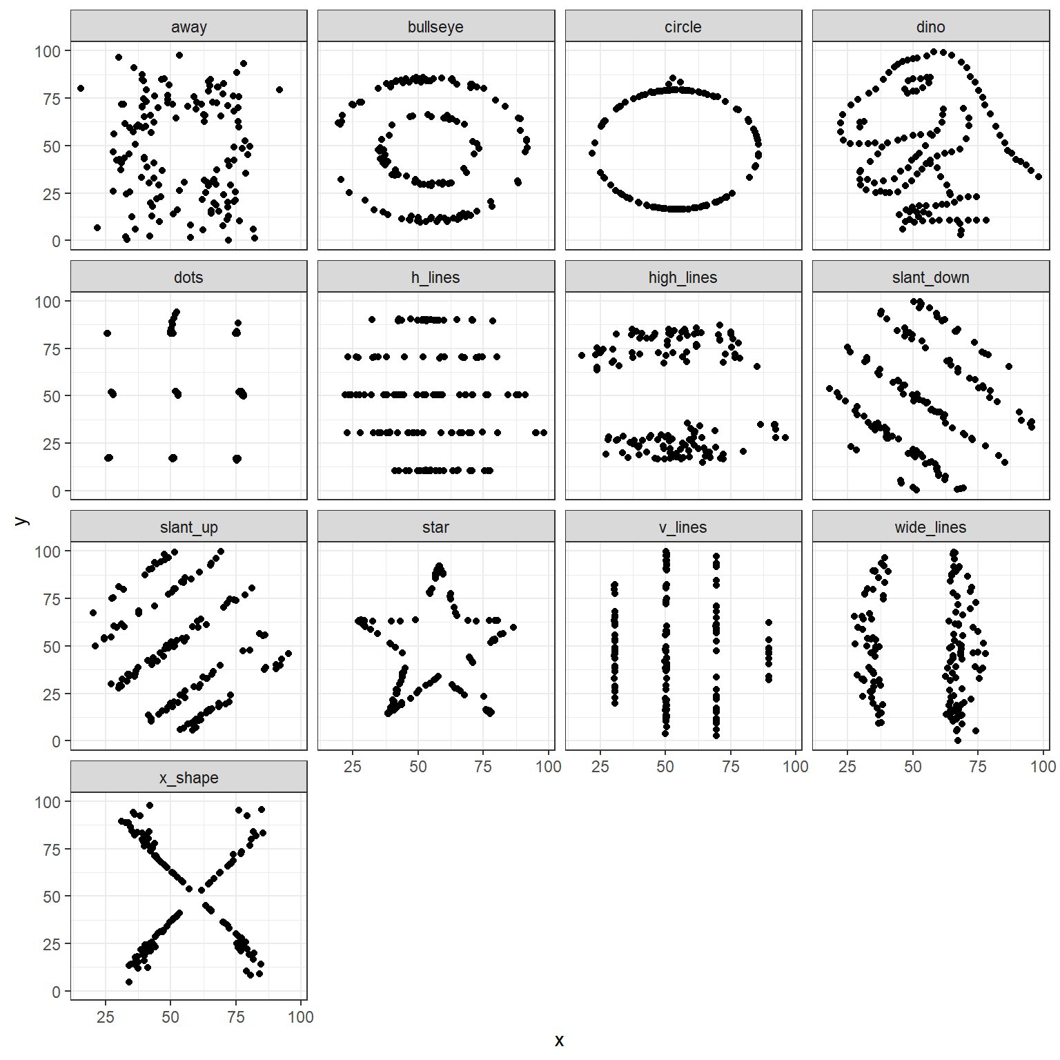
Let us consider thirteen datasets all of which have 142 observations of (x,y) values. The table below shows the average value of X and Y, the standard deviation of X and Y, as well as the correlation coefficient between X and Y.
| id | n | mean_x | mean_y | sd_x | sd_y | correlation |
|---|---|---|---|---|---|---|
| 1 | 142 | 54.3 | 47.8 | 16.8 | 26.9 | -0.064 |
| 2 | 142 | 54.3 | 47.8 | 16.8 | 26.9 | -0.069 |
| 3 | 142 | 54.3 | 47.8 | 16.8 | 26.9 | -0.068 |
| 4 | 142 | 54.3 | 47.8 | 16.8 | 26.9 | -0.064 |
| 5 | 142 | 54.3 | 47.8 | 16.8 | 26.9 | -0.060 |
| 6 | 142 | 54.3 | 47.8 | 16.8 | 26.9 | -0.062 |
| 7 | 142 | 54.3 | 47.8 | 16.8 | 26.9 | -0.069 |
| 8 | 142 | 54.3 | 47.8 | 16.8 | 26.9 | -0.069 |
| 9 | 142 | 54.3 | 47.8 | 16.8 | 26.9 | -0.069 |
| 10 | 142 | 54.3 | 47.8 | 16.8 | 26.9 | -0.063 |
| 11 | 142 | 54.3 | 47.8 | 16.8 | 26.9 | -0.069 |
| 12 | 142 | 54.3 | 47.8 | 16.8 | 26.9 | -0.067 |
| 13 | 142 | 54.3 | 47.8 | 16.8 | 26.9 | -0.066 |
Since our datasets contain values for X and Y, we can estimate 13 regression models and plot the values for each of the 13 intercepts and slope for X.
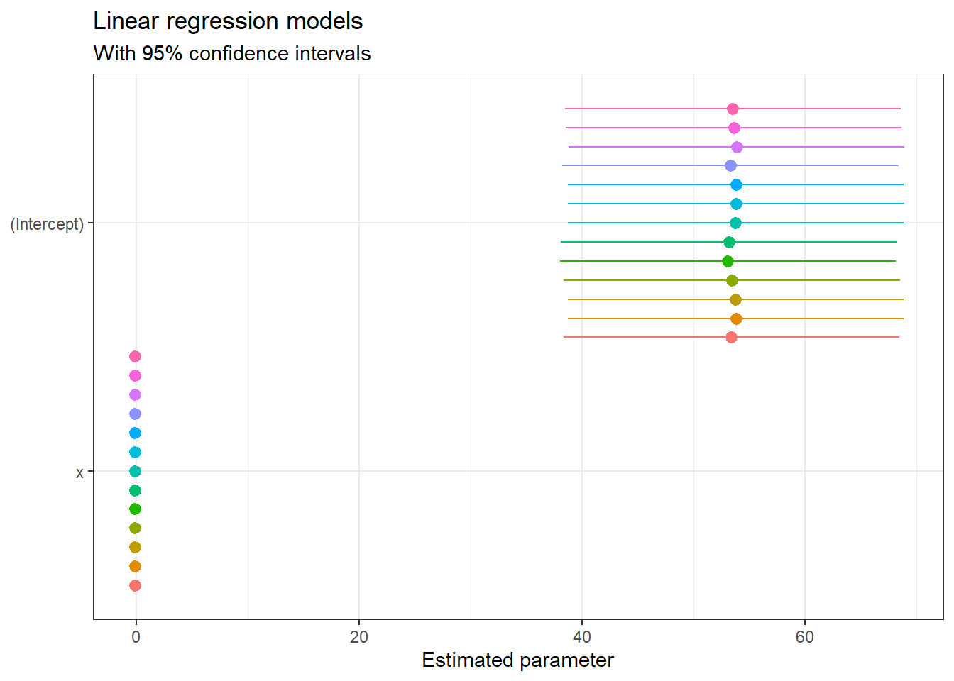
If we just looked at either the summary statistics table, or the plots of intercepts and slopes, we may be temped to conclude that the 13 datasets are either identical or very much alike. However, this is far from the truth, as this is what the 13 individual datasets look like.
We can create an animation to show how the data sets change
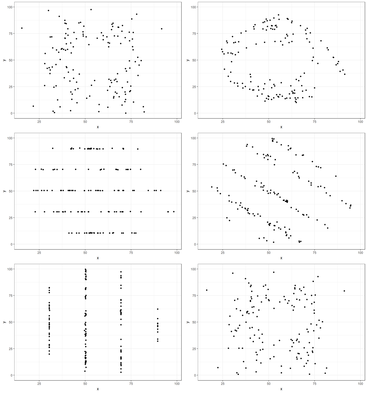
You can read more about why you should never trust summary statistics alone and should always visualize your data.
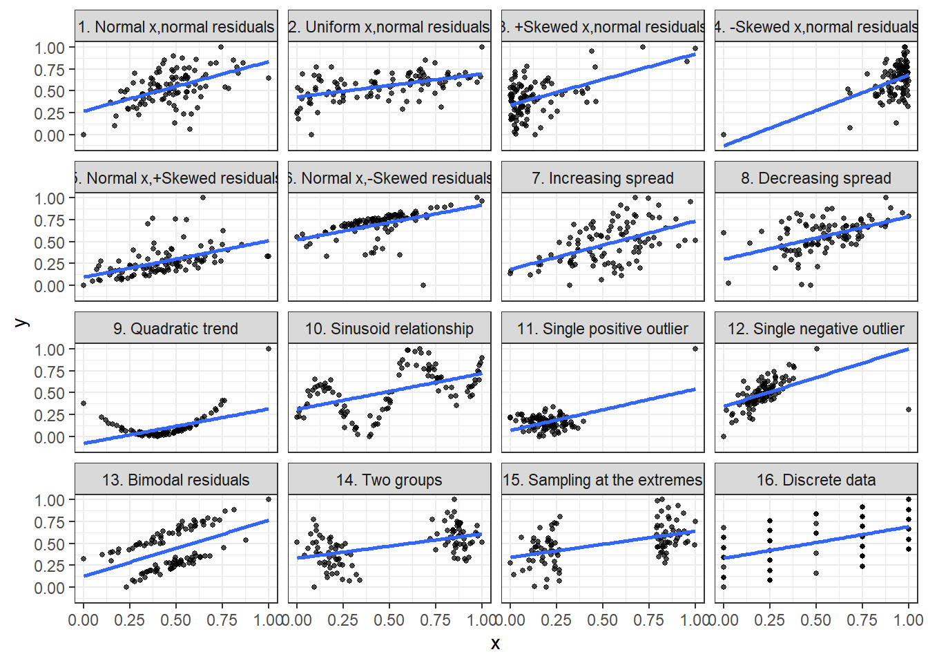
8.7.1 What data patterns can lie behind a correlation coefficient?
Jan Vanhove has written about the data patterns that can lie behind a correlation coefficient and why you should always plot and visualise a scatter plot; he has created a package, cannoball, where you specify a correlation coefficient r and a sample size n, and you get multiple scatterplots of the same correlation value, but fairly different in their scatter.
We will visualise 16 different datasets, all of which have a correlation of 0.50, and a sample of size n = 100.
8.8 RStudio’s primers for ggplot2
You can work through RStudio’s introductory primers for ggplot2; these are fairly short once you get used to the syntax of ggplot().
- RStudios’s primers on visualising data
8.9 Further resources
- Data visualisation with ggplot cheatsheet
- gganimate cheatsheet
- The Evolution of a ggplot
- Step-by-step examples of building publication-quality figures in ggplot2 from ‘Fundamentals of Data Visualization’ by Claus Wilke
This page last updated on: 2020-07-15